Science Archive:
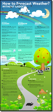
Forecast Weather Using Your Eyes
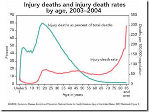
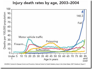
4 Jun 2010Injury and Death Rates
In: Science
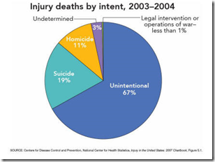
4 Jun 2010Lots of interesting charts at the CDC if you dig around. Here’s a sample – they’re a bit dated, but still worth a look:
Hurricane Season 2010
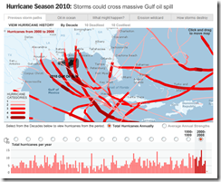
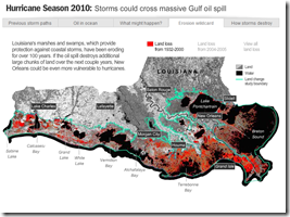
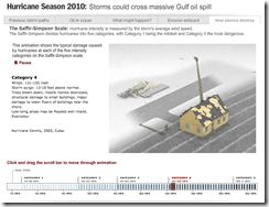
2 Jun 2010A multi-part interactive. They’ve included one of my favorites: an animation of the effects of different Hurricane Category storms.
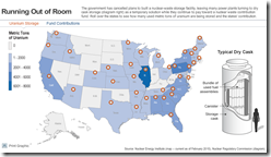
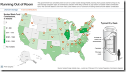
Map: Uranium Storage
In: Science
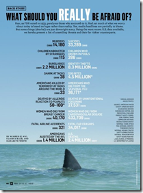
2 Jun 2010Odds of Being Killed
19 May 2010I don’t much care for the infographic, but I love weird warning signs. (via)
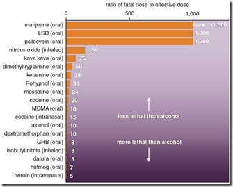
Recreational Substance Toxicity
19 May 2010I think I’d have to question some of the sources for this data. 1000 hits of LSD? Related article. (via)
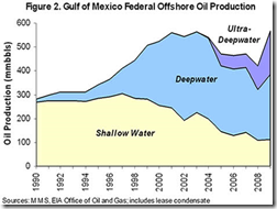
One Oil Graphic to Rule them All
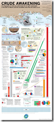
18 May 2010This one is pretty comprehensive, to say the least. (via)
FEMA Disasters 1953-2010
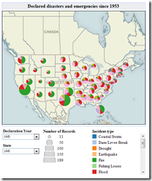
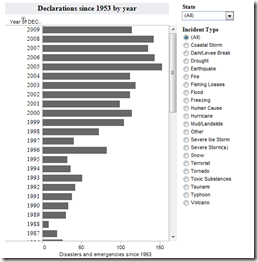
18 May 2010Filter by state, year, and type of disaster. (note: you can zoom by selecting the arrow pointer tool at the bottom). The number of disasters has apparently increased over time because we’ve changed the definition. Related story.
How High Will $200,000 Get You?
In: Science
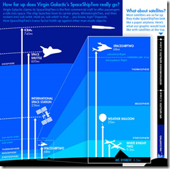
17 May 2010A nice scale diagram of where Virgin Galactic’s SpaceShipTwo will be flying. (via)
What is Chart Porn?
An addictive collection of beautiful charts, graphs, maps, and interactive data visualization toys -- on topics from around the world.
Categories
- Bailout (118)
- Chartporn Related (3)
- Commentary (21)
- Culture (669)
- Emerging Markets (66)
- Employment (245)
- Environment/weather (133)
- Finance (298)
- Food (92)
- Global Economy (373)
- Graphic Design (bad) (26)
- Graphic Design (general) (183)
- Graphic Tools (23)
- History (158)
- Housing (162)
- Humor (204)
- Innovative (183)
- Interactive (545)
- Internet/tech (97)
- Maps (578)
- News Media (34)
- Politics (329)
- Reference (97)
- Science (331)
- Source: Economist (101)
- Source: FT (92)
- Source: NYT (147)
- Source: Ritholtz (76)
- Source: USA Today (27)
- Source: Washington Post (90)
- Source: WSJ (135)
- Sports (58)
- Stock Market (74)
- Uncategorized (2)
- Updated regularly (76)
- US Economy (553)
- Video (22)
- Aram Korevaar: This chart is now being used as a projection in which countries such as China see themselves as in a [...]
- David: Welcome back Chart Porn! [...]
- J S: Thanks for the great story. Miss reading this blog. Hope to see you more active again. [...]
- jake: I lived in a DC row house for 6 years, and I'm writing this comment from my tiny 1 bedroom apartment [...]
- ronny pettersen: Hilarious and unfortunately accurate... ;-) [...]

