Science Archive:
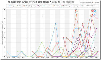
Mad Scientists: Areas of Study
23 Sep 2010WWI-II Economics and Design
In: Culture Graphic Design (general) History Politics Science
21 Sep 2010US Energy Use 2009
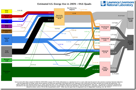
14 Sep 2010A nice sankey diagram. Americans used less energy overall due to the combined effects of the economic slowdown and increased efficiency. News release. Thanks to Terrance Kean for pointing it out.
Fire!
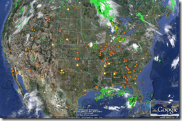
11 Aug 2010Recent blog posts on Russia’s summer of fire (Wired; Jotman) led me to the University of Maryland’s Fire Information for Resource Management System (FIRMS) which provides online or Google Earth Based maps of fires from all over the world based on satellite data.
Fires in Russia and the USA in the past 24 hours: 
FIRMs online map of the past 7 days: 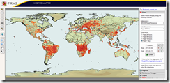
Also, apparently the fires are emitting dangerous amount of CO2 and may be radioactive: 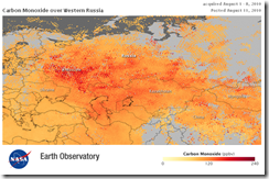
How Not to Take Ugly Portraits
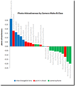
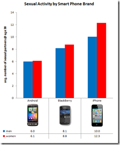
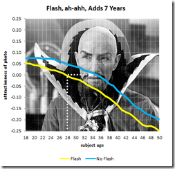
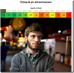
10 Aug 2010OkCupid is at it again. This time comparing user attractiveness to photo EXIF data. Findings? Panasonics will make you look better than Canons or Nikons. Iphone users have more sex. Using a flash adds 7 years to your appearance. Lower f-stops make you prettier. Taking pictures during the “golden hour” is not a myth. Have I mentioned that I love that blog?!?
Whales
In: Environment/weather Graphic Design (general) Interactive Maps Science
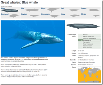
4 Aug 2010A well designed and simple interactive of the 10 “great” whale species. It conveys images, scale, history, endangered status, and region all on one screen.
Walking on the Moon: Apollo 11
3 Aug 2010Some cool map overlays showing how little of the moon we actually explored on that one day. On a soccer and baseball field: 

on a photo:
(via)
First Global Census of Marine Life
In: Environment/weather Graphic Design (bad) Interactive Maps Science
3 Aug 2010I think this project has been cursed by the data visualization gods. First, take a look at the Guardian’s interactive map below. There’s no legend to explain the colors, and the popups show a picture of just one animal (which they apparently included only because they happen to have a nice picture of it). The only information conveyed here at all is in the small bubbles at the bottom — which aren’t labeled and are presumably in percent of all marine life, but you can’t be sure because they don’t add up to 100%.
So I tracked down the original study, and their project map is actually worse! In addition to being quite possibly the most butt-ugly acronym ridden map I’ve ever seen, it has a bizarre infinity scrolling feature that allows you to view five earths at once.
But wait, there’s more: a huge interactive rotating globe that takes up 3/4s of the screen. See the tiny red dots on the map? – those are how you call up the related info that is squeezed into the small box on the left. There are other critiques, but I think I’ve picked on this poor project enough.
All of this is a shame, of course, because it looks like a very worthwhile project that has accomplished a lot of valuable work. Here is the Guardian’s related article, and the project’s press release.
Art of Complex Problem Solving
27 Jul 2010The roll-over explanations are almost detailed to a distracting level, but the overall design is superb.
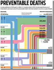
Preventable Deaths
26 Jul 2010Interactive look at 12 preventable health risks that result in six different causes of death. A very nice design — if you ignore having to manually close the popups. (via Visual Loop)
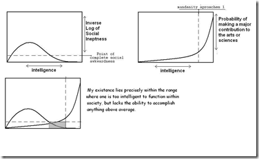
The Truth About Most Artists/Scientists
In: Employment Humor Science
25 Jul 2010I think you could make a nice series of charts like this about most careers.
(note: I couldn’t figure out which version of this was the original. I first saw it here)
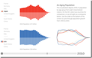
Demographics (1950-2050)
25 Jul 2010A very smooth interactive that allows you to compare the population composition of 8 countries over time. You can see some interesting trends by playing with the timeline control at the bottom — like watching the baby boom bulge move through the USA population then disappear, or the holes left in european age groups by WWII.
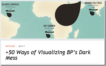
50 Ways to Visualize the Oil Spill
15 Jul 2010I’ve posted some of these before, but Inspired Mag has come up with a pretty definitive list.
What is Chart Porn?
An addictive collection of beautiful charts, graphs, maps, and interactive data visualization toys -- on topics from around the world.
Categories
- Bailout (118)
- Chartporn Related (3)
- Commentary (21)
- Culture (669)
- Emerging Markets (66)
- Employment (245)
- Environment/weather (133)
- Finance (298)
- Food (92)
- Global Economy (373)
- Graphic Design (bad) (26)
- Graphic Design (general) (183)
- Graphic Tools (23)
- History (158)
- Housing (162)
- Humor (204)
- Innovative (183)
- Interactive (545)
- Internet/tech (97)
- Maps (578)
- News Media (34)
- Politics (329)
- Reference (97)
- Science (331)
- Source: Economist (101)
- Source: FT (92)
- Source: NYT (147)
- Source: Ritholtz (76)
- Source: USA Today (27)
- Source: Washington Post (90)
- Source: WSJ (135)
- Sports (58)
- Stock Market (74)
- Uncategorized (2)
- Updated regularly (76)
- US Economy (553)
- Video (22)
- Aram Korevaar: This chart is now being used as a projection in which countries such as China see themselves as in a [...]
- David: Welcome back Chart Porn! [...]
- J S: Thanks for the great story. Miss reading this blog. Hope to see you more active again. [...]
- jake: I lived in a DC row house for 6 years, and I'm writing this comment from my tiny 1 bedroom apartment [...]
- ronny pettersen: Hilarious and unfortunately accurate... ;-) [...]

