Reference Archive:
OECD Business Cycle Clock
12 May 2009The OECD has a nifty toy, the Business Cycle Clock, where you can construct animations of business cycles for different countries. The example below shows USA Industrial Production, Business Confidence, Consumer Confidence, and a Composite Leading Indicator – the arrow heads show March 09 and the tails the previous periods. The four quadrants show downturn/slowdown/expansion/recovery. You can even throw up two different countries to compare performance. I wish there was a way to export the animations.

The Aging World
11 May 2009If recent economic data isn’t depressing enough, here’s some from the future to remind you that everyone has some nice Malthusian demographic mountains to climb in the next 20+ years.


GDP for Beginners
5 May 2009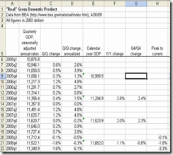 Joseph Kwak over at The Baseline Scenario has a nice explanation of how GDP is calculated, and what all those different growth rates you read in the paper mean. Of course, you could go to wikipedia for more wonk.
To Rent or Buy
23 Apr 2009For those who want to do the math on this questions, here is a nice calculator from the New York Times. Of course, most economists think prices are going to keep dropping until late 2010.

Village of 100
14 Apr 2009the design of these infographics bother my statistical aesthetic a bit, but overall they are quite effective. (From Tony Ng via FlowingData)

Market Tree Map
In: Finance Interactive Maps Reference Stock Market Updated regularly US Economy
2 Apr 2009A tree map of more than 500 stocks, updated every 15 minutes. Click on the roll-over popups to bring up a pretty detailed drill down menu.

Name Wizard
2 Apr 2009The Name Voyager is a classic (2005) interactive chart of the popularity of names from 1880 until today. Just start typing your name and the chart filters and rescales automatically.

The same people created the NameMapper, which provides a US map or timeline of the name (the timeline in particular has some nifty options):


Personal Visualizations
23 Mar 2009Last fall FlowingData ran a hilarious Personal Visualization project/contest with lots of great examples of clear design. (My personal favorite was the Bedposted application)

The Value of Letters
In: Reference Source: NYT
23 Mar 2009Not economics related, but an interesting interactive comparison of observations of a common data set over different sources. The related article is a good read.

OECD 2008 Factbook in Gapminder
13 Mar 2009Speaking of Gapminder, the OECD has it’s 2008 factbook dataset available using it:

Trend Compass
In: Interactive Reference
13 Mar 2009Software for making your own motion charts (like Gapminder)


What is Chart Porn?
An addictive collection of beautiful charts, graphs, maps, and interactive data visualization toys -- on topics from around the world.
Categories
- Bailout (118)
- Chartporn Related (3)
- Commentary (21)
- Culture (669)
- Emerging Markets (66)
- Employment (245)
- Environment/weather (133)
- Finance (298)
- Food (92)
- Global Economy (373)
- Graphic Design (bad) (26)
- Graphic Design (general) (183)
- Graphic Tools (23)
- History (158)
- Housing (162)
- Humor (204)
- Innovative (183)
- Interactive (545)
- Internet/tech (97)
- Maps (578)
- News Media (34)
- Politics (329)
- Reference (97)
- Science (331)
- Source: Economist (101)
- Source: FT (92)
- Source: NYT (147)
- Source: Ritholtz (76)
- Source: USA Today (27)
- Source: Washington Post (90)
- Source: WSJ (135)
- Sports (58)
- Stock Market (74)
- Uncategorized (2)
- Updated regularly (76)
- US Economy (553)
- Video (22)
- Aram Korevaar: This chart is now being used as a projection in which countries such as China see themselves as in a [...]
- David: Welcome back Chart Porn! [...]
- J S: Thanks for the great story. Miss reading this blog. Hope to see you more active again. [...]
- jake: I lived in a DC row house for 6 years, and I'm writing this comment from my tiny 1 bedroom apartment [...]
- ronny pettersen: Hilarious and unfortunately accurate... ;-) [...]
Read These Now
In: Commentary Finance Reference US Economy
27 Mar 2009Matt Taibbi (Hunter S Thompson successor):
The Big Takeover
Simon Johnson (former IMF Chief Economist):
The Quiet Coup