Reference Archive:
World’s Youngest Leaders
15 Jun 2009Visual Guide to Social Security
14 Jun 2009Debt, Debt, Debt, and Then You Die
14 Jun 2009A playful and informative collection of stats about the debt that people accumulate throughout life.
from creditloan.com.
(by the way, anyone ever come across stats on what amount of debt default happens because of death?)
Oil Prices 1999-2008
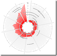
14 Jun 2009An interesting variation on the column chart. (hat-tip to Visualizing Economics for the find). Hopping through the comments and links brought up a good discussion of the design and alternatives.
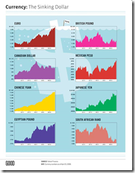
The Sinking Dollar
14 Jun 2009I generally like their simple designs, but would it kill Good to label their charts properly? (it’s national currency per dollar)
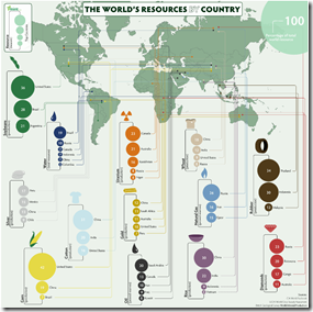
Resources by Country
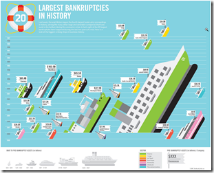
14 Jun 2009Largest Bankruptcies Ever
14 Jun 2009(Hat-tip to dataviz for the find)
USAToday Economic Outlook Index
In: Finance Housing Interactive Reference Source: USA Today Updated regularly US Economy
11 Jun 2009USA Today and IHS Global Insight have created a new USA economic outlook index based on 11 “leading” indicators. The interactive charts are very well done, with roll-over data point info, and an explanation of what each indicator means. Notes at the bottom of the page describe how the methodology differs from the Conference Board’s “leading indicators”. They plan to update it monthly. USAtoday has come a long way from the crappy charts they used to produce (ok, a lot of them are still crappy – but this one’s damn good).
(note: I spotted this one because Utah has crappy newspapers and my only option for any actual news of the world was USAToday)
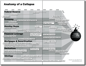
Anatomy of the Crash
In: Bailout Finance Innovative Reference Source: Ritholtz US Economy
10 Jun 2009(Sorry there haven’t been many updates lately – I’m on vacation in the Colorado mountains.) Here is a infographic from Barry Ritholtz’s book Bailout Nation that does a great job showing the different causes of the crash, and how they developed over time:
Visual Guide to the Federal Reserve
29 May 2009Economic Calendars
In: Reference
27 May 2009Want to know what the mainstream media (MSM) will be talking about this week? Take a look at calendars of economic data releases. In addition to showing the schedule of releases, many show predictions, consensus forecasts, past values, and color code the over/unders. They are available at a number of places. here are a few:
FXStreet (my favorite: interactive drill-downs to historical data; nifty filters)
Credit Crisis Indicators
In: Global Economy Reference Source: NYT Updated regularly US Economy
27 May 2009The NYT maintains a tool showing the latest updates for five credit market indicators (3mo Treasuries, Libor, Ted spread, 30-day commercial paper, and high yield bond yields). Sometimes I just want a quick look at the latest numbers.
Note: Similarly, their Markets page and Economy pages provide clean up-to-date presentations on a variety of indicators.
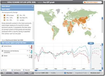
IMF Datamapper Updated with 2009-14 Projections
26 May 2009Updated with data from the latest World Economic Outlook report. Allows drill down, country and aggregate comparisons (via the chart at the bottom), and animation of the last 29 years (to watch the world change). You can also view other datasets (BOP, etc).
(more) OECD Composite Leading Indicators
12 May 2009I just noticed that the front page FT graphics I posted earlier today were actually just chopped versions of figures from the OECD’s press release. You also might notice that this analysis covers six non-OECD countries (Brazil, China, India, Indonesia, Russian Federation and South Africa). Here’s the Raw data if you want to dig.
What is Chart Porn?
An addictive collection of beautiful charts, graphs, maps, and interactive data visualization toys -- on topics from around the world.
Categories
- Bailout (118)
- Chartporn Related (3)
- Commentary (21)
- Culture (669)
- Emerging Markets (66)
- Employment (245)
- Environment/weather (133)
- Finance (298)
- Food (92)
- Global Economy (373)
- Graphic Design (bad) (26)
- Graphic Design (general) (183)
- Graphic Tools (23)
- History (158)
- Housing (162)
- Humor (204)
- Innovative (183)
- Interactive (545)
- Internet/tech (97)
- Maps (578)
- News Media (34)
- Politics (329)
- Reference (97)
- Science (331)
- Source: Economist (101)
- Source: FT (92)
- Source: NYT (147)
- Source: Ritholtz (76)
- Source: USA Today (27)
- Source: Washington Post (90)
- Source: WSJ (135)
- Sports (58)
- Stock Market (74)
- Uncategorized (2)
- Updated regularly (76)
- US Economy (553)
- Video (22)
- Aram Korevaar: This chart is now being used as a projection in which countries such as China see themselves as in a [...]
- David: Welcome back Chart Porn! [...]
- J S: Thanks for the great story. Miss reading this blog. Hope to see you more active again. [...]
- jake: I lived in a DC row house for 6 years, and I'm writing this comment from my tiny 1 bedroom apartment [...]
- ronny pettersen: Hilarious and unfortunately accurate... ;-) [...]


