Reference Archive:
From Ritholtz. more of a timeline quiz than a chart.
1. Tulip Mania
2. South Sea /Mississippi Company Bubbles
3. Railway Mania
4. Florida Speculative Building Mania
5. Roaring 1920s/1929
6. Poseidon Bubble
7. Gold
8. Japanese Asset Bubble
9. Dot Com/Tech/Telecoms
10. Global Real Estate/Credit Bubble
11. China/Shanghai Index Stock Bubble
12. Commodity Bubble
13. Oil Bubble
14. Leverage/Derivative/Financial Bubble
Airline Fees
8 Jul 2009As you plan your summer vacations, a useful table. Spotted by Dataviz. (note the flight change and baggage fees – why does anyone fly those airlines anymore?)
Fancy Debt Clock
In: Finance Innovative Reference Updated regularly US Economy
8 Jul 2009Always depressing, this version of the debt clock includes running values of many different kinds of debt, GDP, trade deficits, unfunded liabilities, and other ways we are shooting ourselves in the foot every day. The “about” section is pretty bleak on source details (to put it mildly). Thanks to my friend Jenny Butler for the link.
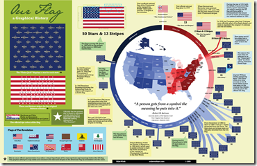
History of Our Flag
5 Jul 2009One more July 4th themed infographic to end the weekend. Spotted by CoolInfographics.
Ok, enough war and money. Here are two (stunningly similar) infographics on what goes into all those fireworks. Have a nice holiday weekend everyone!
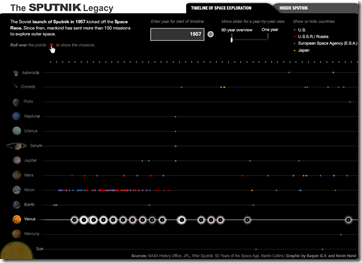
Space
2 Jul 2009From the Neolithic till today, filter by country, zoom in to specific historic events, or take a journey based on certain topics. Very well done, from the BBC.
USA Today Economic Outlook Index (June edition)
In: Finance Housing Interactive Reference Source: USA Today Updated regularly US Economy
29 Jun 2009Updated June 24th. The best part is the lower chart showing the latest data for each of the 11 “leading indicators”.
Detailed Timelines of the Financial Crisis
In: Bailout Finance Global Economy Interactive Reference Updated regularly US Economy
29 Jun 2009Ok, obviously it’s NY Fed day at ChartPorn. Interactive PDF files (click on events to jump to more details) provide a detailed list of policy actions and events. It is supposedly updated the 1st of every month.
There is both a domestic version, organized by Fed Policy Actions/Market Events/Other Policy Actions:
And an international (G7) version, organized by Bank Liability Guarantees/Liquidity and Rescue Interventions/Other Market Interventions:
Global Boiling
25 Jun 2009Have you taken the time to follow the detailed science behind the global warming debate? Me neither. But I’m starting to read the “Global Climate Change Impacts in the United States” report, which has a number of very effective data visualizations, in addition to laying out all the different climate change arguments. (Thanks to my friend Brad Johnson for pointing out the report.)
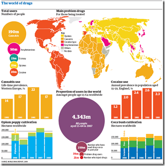
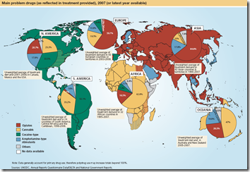
World Drug Report
25 Jun 2009Below is a chart from the UNODC’s 2009 World Drug Report. I focus a lot on media sources and blogs, but a lot of great information visualization is being done by NGOs/thinks tanks/etc.
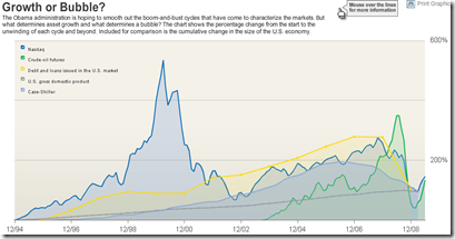
Bubbles 1994-2009
In: Bailout Finance Housing Reference Source: WSJ Stock Market US Economy
18 Jun 2009A good chart of US bubbles. The print version (p.A8, 6/18/09) had much better aesthetics. but the data are the same. Related article.
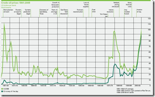
Crude Oil Prices 1861-2008
18 Jun 2009Some chart-junk here (raining data points? really?).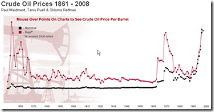
Infectious greed has another version, with historical annotations and some interesting comments:
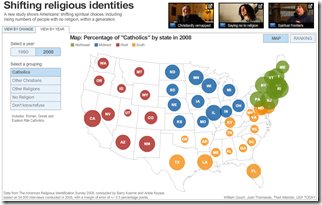
US Religion Map
16 Jun 2009I should probably send this over to Junk Charts for a proper critique. The transition animations are pretty, and the topic is interesting, but damn there just isn’t anything actually informative popping out at me here that seems worth all that effort. Maybe the data just wasn’t “deep” enough in detail.
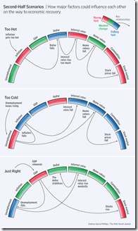
Perfect Landing
In: Bailout Employment Finance Housing Innovative Reference Source: WSJ
15 Jun 2009Ritholtz spotted this nice WSJ graphic on the importance of executing the Fed’s recession exit strategy just right. Related WSJ article.
What is Chart Porn?
An addictive collection of beautiful charts, graphs, maps, and interactive data visualization toys -- on topics from around the world.
Categories
- Bailout (118)
- Chartporn Related (3)
- Commentary (21)
- Culture (669)
- Emerging Markets (66)
- Employment (245)
- Environment/weather (133)
- Finance (298)
- Food (92)
- Global Economy (373)
- Graphic Design (bad) (26)
- Graphic Design (general) (183)
- Graphic Tools (23)
- History (158)
- Housing (162)
- Humor (204)
- Innovative (183)
- Interactive (545)
- Internet/tech (97)
- Maps (578)
- News Media (34)
- Politics (329)
- Reference (97)
- Science (331)
- Source: Economist (101)
- Source: FT (92)
- Source: NYT (147)
- Source: Ritholtz (76)
- Source: USA Today (27)
- Source: Washington Post (90)
- Source: WSJ (135)
- Sports (58)
- Stock Market (74)
- Uncategorized (2)
- Updated regularly (76)
- US Economy (553)
- Video (22)
- Aram Korevaar: This chart is now being used as a projection in which countries such as China see themselves as in a [...]
- David: Welcome back Chart Porn! [...]
- J S: Thanks for the great story. Miss reading this blog. Hope to see you more active again. [...]
- jake: I lived in a DC row house for 6 years, and I'm writing this comment from my tiny 1 bedroom apartment [...]
- ronny pettersen: Hilarious and unfortunately accurate... ;-) [...]


