Politics Archive:
Obama’s Tax Deal
8 Dec 2010A nice graphic from the Washington Post breaks down the cost components of the tentative agreement, and the projected economic impact.
The Deficit Reduction Commission
3 Dec 2010A clear multi-part description of the recommendations of the National Commission of Fiscal Responsibility and Reform. There are some pretty aggressive changes being proposed. Unfortunately, Congress is unlikely to implement many of them.
Balance the US Budget
30 Nov 2010Another “You Make the Cuts” interactive, this one from the FT. Set your targets, select your cuts, and then see who is affected.
Note: Some FT features require a subscription.
Airport Security Timeline
In: Politics
21 Nov 2010How Would You Fix the Budget?
15 Nov 2010The NYT presents you with a number of options for cutting the deficit and displays the cumulative effect in 2015 and 2030. (related article on project methodology)
Who Voted for Who
In: Politics
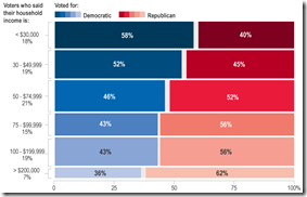
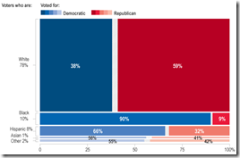
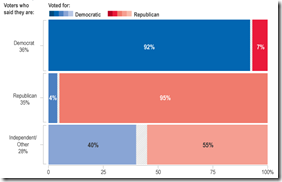
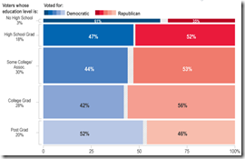
4 Nov 2010A look at votes broken down by party, income, gender, education, age, and race (based on exit polling). Some of the results are very interesting: For example, I would have expected the income and education bias to be even higher.
2010 Election Results
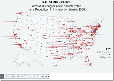
3 Nov 2010As usual, the best graphical analysis comes from the New York Times. Click through this map to understand the big shifts in the clearest possible way.
100 Years of US Government and Economy
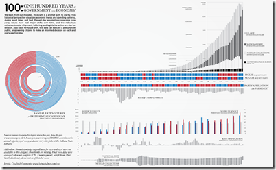
2 Nov 2010A comprehensive timeline of parties and indicators. (via)
The Burden of Public Debt
2 Nov 2010A pretty slick interactive look at the numbers from the FT (though I’m not sure what some of the subtle animations really accomplish).
(note: Some Financial Times features require a subscription to view)
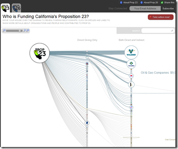
This is an interesting design for examining funding sources using a zoomable SVG network. (by Skye Bender-deMoll)
Election Forecast Map
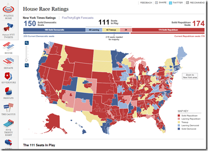
1 Nov 2010Interactive map of forecasts from the NYT’s FiveThirtyEight blog, covering all the races. (via Ritholtz)
Deaths in Iraq
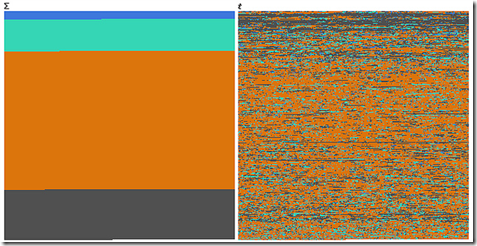
29 Oct 2010An interesting example of how completely different data can look when visualized over time versus when it is categorized.
Blue = *Friendly*, Green = *Host* Nation, Orange = Civilians, Grey = Enemies.
First one is function of sum, second one is function of time, or how you can dilute the media impact of a massacre by killing a few people each day for 6 years.
Based on the Guardian’s analysis of the Wikileaks data.
Balance the UK Budget
In: Interactive Politics
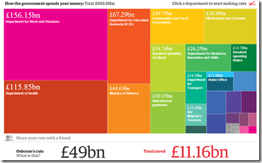
21 Oct 2010A cool interactive treemap tool lets you suggest what programs to cut in each spending category. (kind of like this one from the spring). This type of presentation should be a standard component in all accounting software.
Obama is a Gay Mexican Gangster Terrorist
In: Politics
15 Oct 2010As evidenced by the below Colorado billboard, the imagery rhetoric is getting a bit ridiculous. I am only surprised that they somehow missed putting a nazi or sickle/hammer in there somewhere. On the other hand, it is a classic demonstration of the strong emotional response that images and design can evoke.
Tea Party Faces, Beefs, and Races
In: Interactive Maps Politics
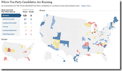
15 Oct 2010Faces and names, organized loosely by their complaints. Also, a map of where they are running and what the polls are saying.
What is Chart Porn?
An addictive collection of beautiful charts, graphs, maps, and interactive data visualization toys -- on topics from around the world.
Categories
- Bailout (118)
- Chartporn Related (3)
- Commentary (21)
- Culture (669)
- Emerging Markets (66)
- Employment (245)
- Environment/weather (133)
- Finance (298)
- Food (92)
- Global Economy (373)
- Graphic Design (bad) (26)
- Graphic Design (general) (183)
- Graphic Tools (23)
- History (158)
- Housing (162)
- Humor (204)
- Innovative (183)
- Interactive (545)
- Internet/tech (97)
- Maps (578)
- News Media (34)
- Politics (329)
- Reference (97)
- Science (331)
- Source: Economist (101)
- Source: FT (92)
- Source: NYT (147)
- Source: Ritholtz (76)
- Source: USA Today (27)
- Source: Washington Post (90)
- Source: WSJ (135)
- Sports (58)
- Stock Market (74)
- Uncategorized (2)
- Updated regularly (76)
- US Economy (553)
- Video (22)
- Aram Korevaar: This chart is now being used as a projection in which countries such as China see themselves as in a [...]
- David: Welcome back Chart Porn! [...]
- J S: Thanks for the great story. Miss reading this blog. Hope to see you more active again. [...]
- jake: I lived in a DC row house for 6 years, and I'm writing this comment from my tiny 1 bedroom apartment [...]
- ronny pettersen: Hilarious and unfortunately accurate... ;-) [...]


