Politics Archive:
Tax Breaks vs Budget Cuts
In: Politics
28 Feb 2011This table compares 10 US social safety-net programs being targeted for elimination by congress, and proportionately sized tax breaks for corporations/wealthy. Thanks to Sean Speer for the link.
Google and Eyebeam have created a $10,000 dataviz challenge for designers to visualize how individual federal income taxes are spent. The site includes details, data, and a few cool examples, like the one below that lets you input your income and see how the government shelled out your shekels. Submissions are due by March 27, 2011. (Thanks to Melissa Mac for the link!)
An inspirational British version:
and a excellent interactive chart one that let’s you examine the changing income inequality in the united states (and probably the only good use I’ve seen of a pie chart in a long time):
It’s the Inequality Stupid
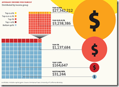
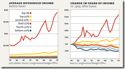
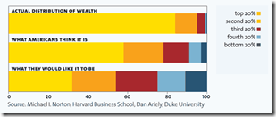
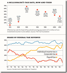
22 Feb 2011“Eight charts that explain everything that’s wrong with America”, from Mother Jones. (Thanks to Matt Brown for the link!)
Egypt Twitter Network
16 Feb 2011US Budget 1981-2012
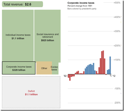
15 Feb 2011Here are some interactive tools to let you explore the President’s recent budget proposal, where that money comes from, and where it goes. First, from the Washington Post, a look at 30 years of budgets: Revenue is on the left, expenses on the right; click on any box to see the percentage change since 1981; bars are colored by the president’s party.
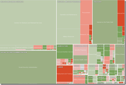
Next, a more detailed treemap from the NYT, but only covering the 2012 values and change from 2010.
Tahrir Square: Spontaneous Community
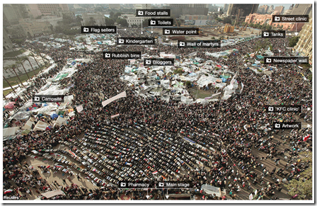
14 Feb 2011This interactive photo-map of Tahrir Square from the BBC highlights the creative ways the community organized itself, from news to medical care to flag merchants.
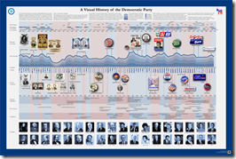
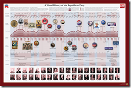
Visual History of the Democrat and Republican Parties
In: Politics
14 Feb 2011Two more beautifully detailed historical timelines from the good people at Timeplots – these can also be purchased as posters, if you have a wonk in need.
Southern Democrats (1964-2010)
8 Feb 2011The Economist produced this annotated video-graphic of mapped donut charts illustrating the dominance of southern democrats in the 1960s, and their subsequent decline.
Global Debt (1880-2009)
In: Finance Global Economy History Interactive Maps Politics
7 Feb 2011The IMF has released a new database of sovereign debt-to-gdp ratios for 174 countries, going back as far as 1880 (for G7 countries).
The data shows how government debt has risen and fallen over the years as important events, such as wars and stock market crashes, affect a country’s decisions about when to save and when to spend. It turns out the relationship between debt and economic growth has changed over time; historically, fast growing countries had low debt ratios, while slow growers struggled under higher debt. In the past 30 years that relationship has altered as advanced economies’ debt levels have risen and their economies have grown.The data also debunks some old clichés, for example that African countries have the highest debt levels. In fact, low income countries in Africa today have lower debt ratios than do advanced economies in Europe and North America.
The below charts appear in a slightly slow, but interesting, IMF You-tube video:
The data can also be explored and exported using the IMF’s DataMapper (note the links at the bottom of the mapper to the related working paper and dataset):
What Causes Gun Deaths?
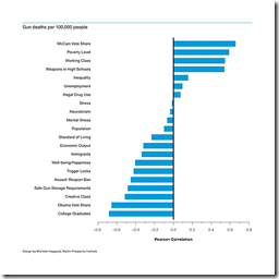
17 Jan 2011Richard Florida and Charlotta Mellander of the Atlantic took a crack at examining the statistical relationship between gun related deaths and several commonly associated causes.
Firearm-related deaths were positively associated with states that voted for McCain (.66) and negatively associated with states that voted for Obama (-.66).
[.] fatal gun violence is less likely to occur in richer states with more post-industrial knowledge economies, higher levels of college graduates, and tighter gun laws. Factors like drug use, stress levels, and mental illness are much less significant than might be assumed.
The authors correctly point out the difference between correlation and causation, and I have problems with some of the indicators used, but this analysis is one step closer to reality than most of the other crap articles floating around our news media lately on this topic. As usual with politically fiery articles like this, the comments are an entertaining read. Thanks to Tom Dawkins for the link!
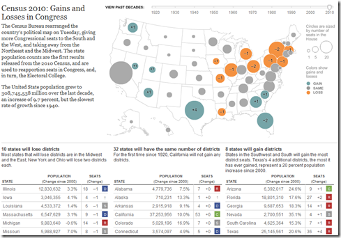
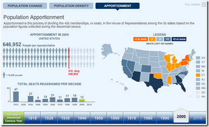
10 states will lose congressional districts (mostly in the northeast) ; 8 will gain (mostly in the south and southwest), and the other 32 will stay the same. The tables below the map show the change in state populations since 2000. You can also use the timeline to view the re-apportionments back to 1920. (related article; related NYT political blog; Census press release)
And the official total? There are 308,745,538 people in the United States.
More Party Animals
16 Dec 2010Ok, I’m swerving off the chart meme a bit — but I love the graphic design of the More Party Animals site.
More Party Animals is an apolitically-political idea of a heartfelt disenchantment with the status quo. As the current system continues to polarize this country, we strongly believe America is in need of a wider selection of political parties.
Battling Tax Agreement Charts
In: Politics
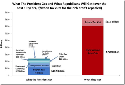
15 Dec 2010A good article by Jonathan Chait comparing two charts on the costs of the proposed tax agreement: one from the White House, and one from Moveon.org. (The difference between the two is whether the tax cuts for the rich are actually allowed to expire in 2012)
White house:
Moveon:
2010 Election: No Mandate
In: Politics
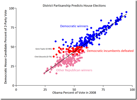
13 Dec 2010If you had one thing, and one thing only, to predict which Democratic House incumbents would lose their seats in 2010, what would you take? The amount of money they raised? Their TARP vote? Their health care vote? Whether they had a Tea Party opponent? A Nazi reenactor opponent?
The best predictor by far is none of those. It is simply how Democratic their district is.
Here is an related entertaining rant about how stupid MSM and Americans are. (thanks to David Cramer for point it out!)
Census Map (1910-2010)
13 Dec 2010The 2010 data isn’t being released until next week, but the Census Bureau has pre-staged a very nice multi-part interactive map displaying state level data and related congressional apportionments from 1910-2010. (thanks to Samantha O’Neil for the link!)
What is Chart Porn?
An addictive collection of beautiful charts, graphs, maps, and interactive data visualization toys -- on topics from around the world.
Categories
- Bailout (118)
- Chartporn Related (3)
- Commentary (21)
- Culture (669)
- Emerging Markets (66)
- Employment (245)
- Environment/weather (133)
- Finance (298)
- Food (92)
- Global Economy (373)
- Graphic Design (bad) (26)
- Graphic Design (general) (183)
- Graphic Tools (23)
- History (158)
- Housing (162)
- Humor (204)
- Innovative (183)
- Interactive (545)
- Internet/tech (97)
- Maps (578)
- News Media (34)
- Politics (329)
- Reference (97)
- Science (331)
- Source: Economist (101)
- Source: FT (92)
- Source: NYT (147)
- Source: Ritholtz (76)
- Source: USA Today (27)
- Source: Washington Post (90)
- Source: WSJ (135)
- Sports (58)
- Stock Market (74)
- Uncategorized (2)
- Updated regularly (76)
- US Economy (553)
- Video (22)
- Aram Korevaar: This chart is now being used as a projection in which countries such as China see themselves as in a [...]
- David: Welcome back Chart Porn! [...]
- J S: Thanks for the great story. Miss reading this blog. Hope to see you more active again. [...]
- jake: I lived in a DC row house for 6 years, and I'm writing this comment from my tiny 1 bedroom apartment [...]
- ronny pettersen: Hilarious and unfortunately accurate... ;-) [...]


