Politics Archive:
Female World Leaders
29 Sep 2011US State Budget Gaps
In: Finance Interactive Internet/tech Politics Source: FT US Economy
27 Sep 2011What is shocking to me is that there are 12 states with no shortfall.
Note: Some Financial Times features require a subscription.
Tax Break Breakdown
In: Innovative Interactive Politics Source: Washington Post US Economy
19 Sep 2011To be cliché: the truth may surprise you. This is a great look at the “loopholes” in our tax system, point by point. You can filter by kind of break, compare individual vs corporate, find out when they were first implemented, and see how they all add up. However, I really wish the lines in the main bar graph had matched width with the amount of the break (with the y-axis being billions of $) – at first glance that’s what I thought was going on. I’m also not sure how I feel about things like “employer contributions to health care” being considered a break. (related article)
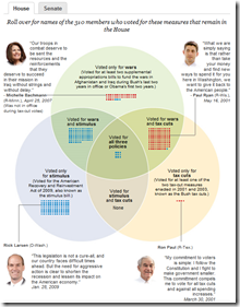
Republican Candidates Venn Diagram
In: Politics Source: NYT
23 Aug 2011Deficit has a Numerator and Denominator
1 Aug 2011Ok, I’m pretty bored with the debt graphics, but Barry Ritholtz today had a few that illustrate the problem quite well.
This one makes clear our deficit is as much a result of falling revenue as it is of rising spending:
The same numbers in percent of GDP make sense when you take the recession shading into account:
I highly recommend you read the article and discussion over there.
Job-Killing Taxes!
29 Jul 2011I keep hearing from Republicans that eliminating tax breaks and loopholes for corporations will cut jobs. The truth is that corporations are experiencing huge profits, and are not hiring. I did a quick and dirty chart over at Fred to illustrate this:
if I had the time I’d look into sector breakdowns and who is currently enjoying these tax loopholes – maybe someone else wants to do it?
Here’s another way of looking at it:
The profits are also not being passed on to employees: The long-term perspective below shows the degree to which the working man is currently getting the shaft:
(These later two charts are via)
Debt Debt Debt Goose!
29 Jul 2011Four perfect graphs from the NYT (as usual) putting the debt crisis into perspective.
Thanks to Kanal Eliezer for sending in the link!
How Much is That Again?
28 Jul 20111hour 55min to Pay your Taxes
In: Politics
26 Jul 2011This graphic illustrates the average amount of time people work each day to pay their taxes, and where it goes. (via)
Dodd-Frank Implementation
22 Jul 2011An interesting chart on different benchmarks that are required by the Bill. At closer inspection though, you realize all it does is describe the sections and count the requirements. It would have been nice if you could drill down and see the details of each of the colored lines, for example. The main impression remains, however: the Bill’s implementation is very complicated – which I suppose is in contrast to the wide agreement that it doesn’t actually solve any of our financial systems’ problems.
Budget Hero
18 Jul 2011American Public Media created a fun online game where you try to balance the budget by selecting priorities and playing policy cards. The interface is amusing, but does take a few minutes to grasp – watch the introduction. (via)
Try Your Hand at Saving Social Security
18 Jun 2011Interactive tool from the WSJ. Select benefit reductions, tax increases, and/or benefit increases to see if you can make it solvent. (note: to get around WSJ paywall, google search for “saving social security wsj” then jump to the tool using the result there)
What is Causing the Deficit?
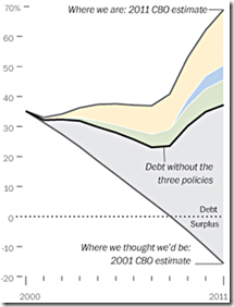
14 Jun 2011A number of these charts have been making the rounds, using different measures. Some of the projections obviously have to be taken with a grain of salt, but the basic message appears to be that letting the Bush era tax cuts expire would relieve a lot of budget pressure. Each of the links below go to fairly in-depth blog posts.

US Military Spending
10 Jun 2011What is Chart Porn?
An addictive collection of beautiful charts, graphs, maps, and interactive data visualization toys -- on topics from around the world.
Categories
- Bailout (118)
- Chartporn Related (3)
- Commentary (21)
- Culture (669)
- Emerging Markets (66)
- Employment (245)
- Environment/weather (133)
- Finance (298)
- Food (92)
- Global Economy (373)
- Graphic Design (bad) (26)
- Graphic Design (general) (183)
- Graphic Tools (23)
- History (158)
- Housing (162)
- Humor (204)
- Innovative (183)
- Interactive (545)
- Internet/tech (97)
- Maps (578)
- News Media (34)
- Politics (329)
- Reference (97)
- Science (331)
- Source: Economist (101)
- Source: FT (92)
- Source: NYT (147)
- Source: Ritholtz (76)
- Source: USA Today (27)
- Source: Washington Post (90)
- Source: WSJ (135)
- Sports (58)
- Stock Market (74)
- Uncategorized (2)
- Updated regularly (76)
- US Economy (553)
- Video (22)
- Aram Korevaar: This chart is now being used as a projection in which countries such as China see themselves as in a [...]
- David: Welcome back Chart Porn! [...]
- J S: Thanks for the great story. Miss reading this blog. Hope to see you more active again. [...]
- jake: I lived in a DC row house for 6 years, and I'm writing this comment from my tiny 1 bedroom apartment [...]
- ronny pettersen: Hilarious and unfortunately accurate... ;-) [...]


