Politics Archive:
Charting the Euro Zone Crisis
20 Dec 2011Iraq and Afghanistan Casualties
In: Graphic Design (bad) Interactive Maps Politics Source: Washington Post Source: WSJ
19 Dec 2011There are a lot of these graphs out there. What I like about this presentation from the WSJ is that each dot in each bar can be clicked on for a short biography of the person who died – a nice combination of information and gravitas.
CNN’s tool maps out where they came from and where they died, and provides an area for others to leave memories for each fallen. While information rich, this one felt very sterile to me, and I couldn’t find anyone that had the “memories” section filled in.
The NYT’s went strangely artsy, with a digitized mosaic menu of the fallen’s faces:
The Washington Post’s Faces of the Fallen feature does a good job of presenting summary information, as well as photos of each soldier:
And the Huffington post comes up with the least interactive, self-identified as interactive (ALL CAPS IN THE TITLE!!!), series of charts I’ve even seen. Pretty sad.
Economists’ Favorite Charts of 2011
14 Dec 2011These 11 charts appeared on BBC, so they are very Euro-centric, but there are still some gems. My favorite:
For a long time the perception was that the creation of the euro meant sovereign risk was effectively the same across all countries. That of course proved to be wrong. The Lehman’s crisis and financial meltdown that followed affected the deficits and debt levels of different countries in different ways. Interestingly it is much the same countries now with very high yields as it was pre-euro, suggesting little has changed fundamentally in a decade.
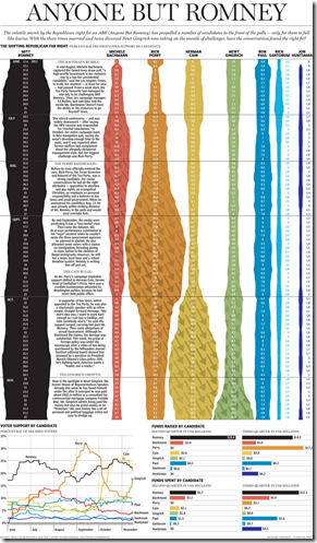
Anyone But Romney
In: Politics
2 Dec 2011A nice illustration of the popularity swings among Republican presidential nominees. (via)
Presidential Primary Calendar
1 Dec 2011An interesting comparison of state primary and caucus dates 2000-2012, both for the Democrats and Republicans. You can watch Iowa and New Hampshire keep moving back the opening day to stay before other states trying to steal the spotlight. The bad news: Super Tuesday isn’t until March 6th – so we have 3 more months to go of lame media coverage of the Republican field.
Greek Crisis Videographics
23 Nov 2011This jumps around a little too much for my taste – but it is a good example of using simple facts to put things in perspective.
Here’s a slightly more in depth, much more tongue-in-cheek version (from two years ago):
Finally, an even more tongue in cheek SNL skit about which god is in charge of Greek finance:
How (un)Popular is Congress?
16 Nov 2011Congress is less popular than the IRS, lawyers, banks, and Nixon – but just above Fidel Castro. Hahaha!.
Opinion polls are probably the mostly worthless statistics out there. However, they can sometimes be amusing: In the 1990s, Michael Moore’s television show “TV Nation” paid for a number of entertaining polls to be professionally conducted:
65% of all Americans believe that frozen pizza will never be any good and there’s nothing science can do about it.
15% of Americans wish Dennis Hopper would go back on drugs.
29% of Americans believe that Elvis was right to shoot TV sets.
60% of Americans say that if they could push a button that would make Larry King disappear, they would “keep pushing it and not stop.”
17% of college graduates would punch themselves really hard in the face for $50.
16% of all Americans believe that the world is out to get them. Of those, 46% are gun owners.
Death and Taxes 2012
In: Politics US Economy
8 Nov 2011Jess Bachman has updated his beautiful visualization of the United States budget. He’s been doing this for several years, so the design is very solid and accurate.
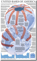
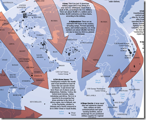
United Bases of America
2 Nov 2011Shoe Throwing Index
24 Oct 2011This is a strange little tool: an interactive index to middle east unrest.
Move the sliders to ascribe different weightings to the various indicators that may influence instability (since the values shown are rounded, they may not always add up to exactly 100). Lock individual sliders by clicking the checkboxes. Roll over the chart to see indicators for each country.
Occupy George
19 Oct 2011Hacking money with graphics to draw attention to economic inequalities. I love that they included accurate titles and legends. (via Ritholtz)
10 Essential Fiscal Charts
14 Oct 201110 beautiful charts from the Pew Charitable Trusts’ Fiscal Analysis Initiative, examining the United States Debt and the challenges facing Congress’ Super Committee.
What Wall Street Protesters are Angry About – in Charts
In: Bailout Employment Finance Politics Stock Market US Economy
14 Oct 2011A series of 30+ charts on unemployment, wages, corporate profits, income inequality, debt, taxes, and bailouts from the Business Insider. It’s actually quite an accurate compendium, and the narrative annotation spices up what are otherwise pretty dry charts from the St. Louis Fed (note: if you’ve never used the FRED data/graphing system, you should really go play with it – they even have an APP now). I particularly like the sequence where they illustrate that banks are borrowing money from the FED at basically zero interest rates, and using it to buy treasuries. Hilarious.
The US Military – Maybe Not What You Think
5 Oct 2011Pew Research Center released a study on civilian and military views in the post 9/11 era. Headline MSM coverage (MSNBC; CNN) has focused on the finding that 1-out-of-3 veterans say the wars were not worth fighting – but the report actually contains a treasure trove of interesting graphics about our military.
The complete study in PDF format can be found here.
Leader Timeline
3 Oct 2011Interesting photo timeline design idea. To be fair, they should have used a linear scale. (via; thanks to David Cramer for the link).
What is Chart Porn?
An addictive collection of beautiful charts, graphs, maps, and interactive data visualization toys -- on topics from around the world.
Categories
- Bailout (118)
- Chartporn Related (3)
- Commentary (21)
- Culture (669)
- Emerging Markets (66)
- Employment (245)
- Environment/weather (133)
- Finance (298)
- Food (92)
- Global Economy (373)
- Graphic Design (bad) (26)
- Graphic Design (general) (183)
- Graphic Tools (23)
- History (158)
- Housing (162)
- Humor (204)
- Innovative (183)
- Interactive (545)
- Internet/tech (97)
- Maps (578)
- News Media (34)
- Politics (329)
- Reference (97)
- Science (331)
- Source: Economist (101)
- Source: FT (92)
- Source: NYT (147)
- Source: Ritholtz (76)
- Source: USA Today (27)
- Source: Washington Post (90)
- Source: WSJ (135)
- Sports (58)
- Stock Market (74)
- Uncategorized (2)
- Updated regularly (76)
- US Economy (553)
- Video (22)
- Aram Korevaar: This chart is now being used as a projection in which countries such as China see themselves as in a [...]
- David: Welcome back Chart Porn! [...]
- J S: Thanks for the great story. Miss reading this blog. Hope to see you more active again. [...]
- jake: I lived in a DC row house for 6 years, and I'm writing this comment from my tiny 1 bedroom apartment [...]
- ronny pettersen: Hilarious and unfortunately accurate... ;-) [...]


