Politics Archive:
Obama vs Romney – Decide Who Wins!
27 Jun 2012Click on each state in the map with your predictions, and the running total at the bottom will tell you who wins! You can also cycle through the results of elections 1789-2008, which is entertaining if you read the little election facts at the bottom of each map.
Personally, it kind of reminded me of playing Risk on the computer back in college.
Journalists Killed 1992-2011
In: News Media Politics
8 Jun 2012I love that the content was pulled together and includes the names of the victims – but you can barely read the names, and often can’t tell how the countries and names line up.
How Would You Cut Defense?
18 May 2012The NYT presents a list of options for you to decide how to trim defense spending. As usual, it’s not quite as easy as you might think – but I still got it up over $800 billion. I like this interactive way of educating people about budget issues.
50 Years of Government Spending
In: Politics US Economy
18 May 2012I usually don’t like viewing stacked bars over time – it’s too hard to see what’s changing. This one still isn’t perfect, but the deficiencies are moderated somewhat by clear labels and only having the three columns. Content wise, it’s pretty fascinating too.
The Rise of the Filibuster
15 May 2012To understand this chart you have to be quite the congressional procedure wonk. I think they should at least have to go back to having to talk the whole time. While standing on one foot. In uncomfortable shoes. With their mom watching.
Women in Parliament
15 May 2012We’ve looked at female world leaders before. Here are some stats on representation (well, what is supposed to be representation).
Evolution of a Political Map
13 Apr 2012A nice progression of intermediate steps in preparing a newspaper map of Santorum’s campaign, using R.
Geography of Government Benefits
26 Mar 2012Share of income that comes from government programs, broken down by type of benefit. (related article)
From the 2012 Military Balance report. (via)
There’s also a 2012 Chart of Conflict – but I couldn’t find a decent sized image on their site. I think they want you to buy it.
Ryan’s New Budget
21 Mar 2012There’s are a lot of nonsense charts and projections in Paul Ryan’s new House Republican budget, but rather than get into political arguments, I’ll just post the ones I thought were actually insightful:
TSA: Grope and Pillage
In: Politics
15 Mar 2012Some interesting facts and timelines about the Transportation Services Administration. I usually don’t post these types of info-posters anymore, but the timeline in particular caught my eye
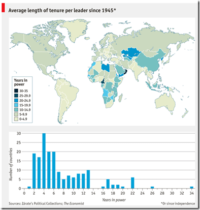
Country Tenure
7 Mar 20122012 Economic Freedom Map
In: Finance Global Economy History Interactive Maps Politics Updated regularly
6 Mar 2012I’m not a fan of the Heritage Foundation, and the one time I dug into the data of their Economic Freedom Index I found that they occasionally compare apples and oranges to get around data scarcity – BUT: they do put a large research effort into the report each year. The below interactive map is well executed – but you should drill down to country level data to get a feel for what is really being measured (click on a country, then the “learn more about this country” link that pops up in the lower left. Why this requires two steps I have no idea).
A wonderful post over at The Big Picture that takes both liberals and conservatives to the wood shed over their abuse of economic indicators and charts that show correlation but not causation.
Note: The comments over there are worth a read as well.
Corporate Taxes Paid
In: Politics
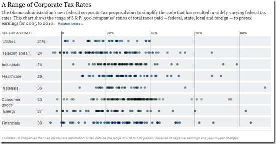
24 Feb 2012Nice chart from the NYT showing average S&P 500 company tax rates 2005-10: total taxes (fed,state,local,foreign) over pre-tax earnings, by sector. A weighted average dot would have been nice for each sector. (related article)
What is Chart Porn?
An addictive collection of beautiful charts, graphs, maps, and interactive data visualization toys -- on topics from around the world.
Categories
- Bailout (118)
- Chartporn Related (3)
- Commentary (21)
- Culture (669)
- Emerging Markets (66)
- Employment (245)
- Environment/weather (133)
- Finance (298)
- Food (92)
- Global Economy (373)
- Graphic Design (bad) (26)
- Graphic Design (general) (183)
- Graphic Tools (23)
- History (158)
- Housing (162)
- Humor (204)
- Innovative (183)
- Interactive (545)
- Internet/tech (97)
- Maps (578)
- News Media (34)
- Politics (329)
- Reference (97)
- Science (331)
- Source: Economist (101)
- Source: FT (92)
- Source: NYT (147)
- Source: Ritholtz (76)
- Source: USA Today (27)
- Source: Washington Post (90)
- Source: WSJ (135)
- Sports (58)
- Stock Market (74)
- Uncategorized (2)
- Updated regularly (76)
- US Economy (553)
- Video (22)
- Aram Korevaar: This chart is now being used as a projection in which countries such as China see themselves as in a [...]
- David: Welcome back Chart Porn! [...]
- J S: Thanks for the great story. Miss reading this blog. Hope to see you more active again. [...]
- jake: I lived in a DC row house for 6 years, and I'm writing this comment from my tiny 1 bedroom apartment [...]
- ronny pettersen: Hilarious and unfortunately accurate... ;-) [...]


