Politics Archive:
Rising Health Insurance Costs
In: Interactive Maps Politics
13 Sep 2009Roll over a state to compare costs in 1996 to 2006. Colors show number of uninsured workers (should have shown percentages).
Guantanamo Tracker
10 Sep 2009AP seems very into tracking things lately. thankfully they are doing it in interesting ways. This one shows Guantanamos population, and lists what is happening with each detainee as Guantanamo is phased out.
Potus Maximus
In: Interactive Politics Source: Washington Post Updated regularly
10 Sep 2009A treemap of how Obama has spent his time in office, by topic (apparently based on his official schedule). Updated daily by the Washington Post.
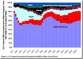
Federal Research and Development Dollars
In: Politics US Economy
21 Aug 2009From a Wired blog post about the space program.
Kennedy Family Tree
12 Aug 2009Nice piece of genealogy from the Washington Post. Related article.
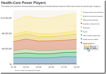
Unhealthy Lobbying
6 Aug 2009Another presentation of data on lobbying from the health-care industry. The roll-overs almost save this from being a pointless chart (it needs a much longer time period).
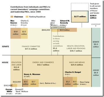
Health Care Reform Lobbying
27 Jul 2009A tree map of where the money is flowing. Related article.
(from Kelso’s Corner)
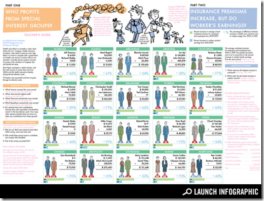
Health Care Lobbying
In: Innovative Politics
14 Jul 2009A Teacher’s guide showing how much money Senators received from the health care industry. The interesting (appalling) part is the little bar graphs under each State comparing increases in health care premiums to increases in workers’ incomes.
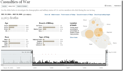
Casualties of War
In: Culture Graphic Design (general) Innovative Interactive Maps Politics Source: NYT
2 Jul 2009The breakdown by age, race, branch, and type of duty is fascinations, and the adjustable time scale is a nice touch.
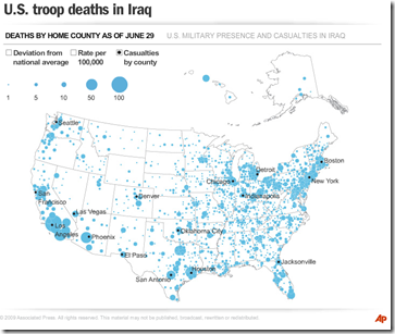
US Troop Deaths in Iraq
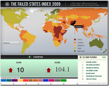
2 Jul 2009Failed States Index 2009
2 Jul 2009Produced by Foreign Policy. Lots of good analysis in this years report.
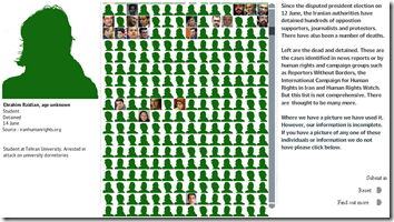
Iran’s (not Iraq’s) Dead and Detained
In: Politics
30 Jun 2009The Guardian put together this interactive display of those who have been killed or arrested since the Iranian election:
World Refugees
22 Jun 2009What is Chart Porn?
An addictive collection of beautiful charts, graphs, maps, and interactive data visualization toys -- on topics from around the world.
Categories
- Bailout (118)
- Chartporn Related (3)
- Commentary (21)
- Culture (669)
- Emerging Markets (66)
- Employment (245)
- Environment/weather (133)
- Finance (298)
- Food (92)
- Global Economy (373)
- Graphic Design (bad) (26)
- Graphic Design (general) (183)
- Graphic Tools (23)
- History (158)
- Housing (162)
- Humor (204)
- Innovative (183)
- Interactive (545)
- Internet/tech (97)
- Maps (578)
- News Media (34)
- Politics (329)
- Reference (97)
- Science (331)
- Source: Economist (101)
- Source: FT (92)
- Source: NYT (147)
- Source: Ritholtz (76)
- Source: USA Today (27)
- Source: Washington Post (90)
- Source: WSJ (135)
- Sports (58)
- Stock Market (74)
- Uncategorized (2)
- Updated regularly (76)
- US Economy (553)
- Video (22)
- Aram Korevaar: This chart is now being used as a projection in which countries such as China see themselves as in a [...]
- David: Welcome back Chart Porn! [...]
- J S: Thanks for the great story. Miss reading this blog. Hope to see you more active again. [...]
- jake: I lived in a DC row house for 6 years, and I'm writing this comment from my tiny 1 bedroom apartment [...]
- ronny pettersen: Hilarious and unfortunately accurate... ;-) [...]

