Politics Archive:
Income Inequality
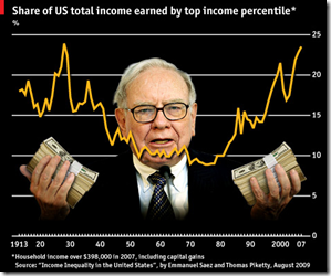
8 Oct 2009As usual, Michael Moore isn’t completely right, but the distribution of income growth isn’t what it used to be.
Two-thirds of the country’s total gains in the five years to 2007 accrued to the top 1%, whereas the bottom 90th percentile saw only 12% of the extra income.
G20 Financial Support
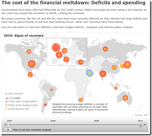
5 Oct 2009It’s unclear what the vintage of the data is, but the below map shows G20 crisis spending. Thanks to Silona for the heads up.
Who Knew?
30 Sep 2009It turns out the Economist has a series of very well produced explanatory videographics on a variety of economic and political topics:
People Still Try to Ban Books?
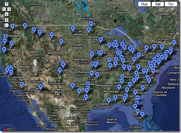
30 Sep 2009A map of cases where people tried to get books removed from libraries or reading lists 2007-2009. Click on the items to drill down to descriptions of the different cases. Scary! Spotted at one of my newest favorite blogs: Sociological Images.
The World According to Ronald Reagan
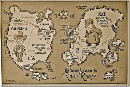
30 Sep 2009An oldie but a goodie, dug up by Kelso’s Corner.
Real Competition
30 Sep 2009Good has put together a good data filled map illustrating how little regional competition there is between insurance companies.
EU Expenditure
In: Emerging Markets Global Economy Interactive Maps Politics
24 Sep 2009EU 2007 spending by country, or on a map. (via)
G20 Pittsburgh
21 Sep 2009Interactive tool for grasping what the G20 has said, and done, over the last three summits.
In depth G20 coverage from the FT is available here.
Company Political Contributions
18 Sep 2009Click on a logo to sort all companies in that sector by party contributions, then click again for pop-up details. I love this both because I like the object oriented use of the logos, and the data results are very interesting to browse this way.
Global Debt
In: Global Economy Interactive Maps Politics Source: Economist
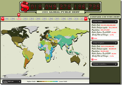
18 Sep 2009From the Economist, an interactive map and clock of global debt (1999-2011). Spotted over at Infectious Greed.
UK Government Spending
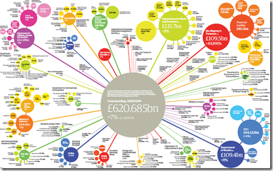
16 Sep 2009Click below for the PDF. There’s also an audio annotated interactive version. From the Guardian.
Terrorism Worry Tree
15 Sep 2009Why have there been no more 9/11’s? Click on each of the theories to bring up the relevant essay, and make up your own mind.
Hot Air Inventory
In: Humor Interactive Politics
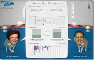
15 Sep 2009Compare any two members of the 110th (2007-08) US congress, by amount of words spoken, votes, and even a nice little word cloud.
Homeland Insecurity
In: Humor Interactive Politics
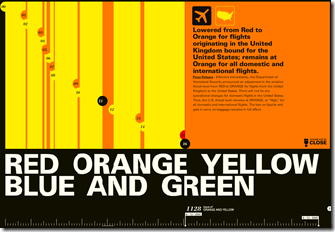
13 Sep 2009An interactive timeline of the US terror alert level. I was just flying last week and wondering how long we had been on Orange (high) with nothing happening. Spotted at Information Aethestics.
and because it seems relevant, a favorite from Wondermark:
What is Chart Porn?
An addictive collection of beautiful charts, graphs, maps, and interactive data visualization toys -- on topics from around the world.
Categories
- Bailout (118)
- Chartporn Related (3)
- Commentary (21)
- Culture (669)
- Emerging Markets (66)
- Employment (245)
- Environment/weather (133)
- Finance (298)
- Food (92)
- Global Economy (373)
- Graphic Design (bad) (26)
- Graphic Design (general) (183)
- Graphic Tools (23)
- History (158)
- Housing (162)
- Humor (204)
- Innovative (183)
- Interactive (545)
- Internet/tech (97)
- Maps (578)
- News Media (34)
- Politics (329)
- Reference (97)
- Science (331)
- Source: Economist (101)
- Source: FT (92)
- Source: NYT (147)
- Source: Ritholtz (76)
- Source: USA Today (27)
- Source: Washington Post (90)
- Source: WSJ (135)
- Sports (58)
- Stock Market (74)
- Uncategorized (2)
- Updated regularly (76)
- US Economy (553)
- Video (22)
- Aram Korevaar: This chart is now being used as a projection in which countries such as China see themselves as in a [...]
- David: Welcome back Chart Porn! [...]
- J S: Thanks for the great story. Miss reading this blog. Hope to see you more active again. [...]
- jake: I lived in a DC row house for 6 years, and I'm writing this comment from my tiny 1 bedroom apartment [...]
- ronny pettersen: Hilarious and unfortunately accurate... ;-) [...]








Economic Theories Explained with Stick Figures
In: Commentary Humor Politics
2 Oct 2009