Politics Archive:
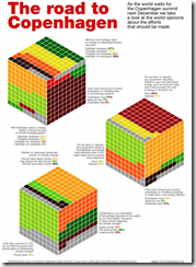
World Opinions on Climate Change
29 Oct 2009An interesting use of 3d cubes to display polling results. The polling questions are also much better constructed than the usual “do you think climate change is happening?”
Obama Tracker
26 Oct 2009An odd little tool – it’s a timeline of major economic, domestic policy, and foreign policy events and developments. It’s not clear to me what use the bars are. Perhaps a calendar would have been better?
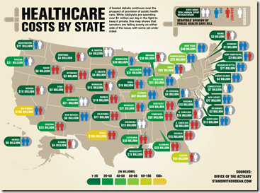
Health Care Demographics
25 Oct 2009The content is interesting, but I’m posting it just as much for being a good example of “many smalls” design, in this case small maps. (via)
Health Spending Map
In: Maps Politics US Economy
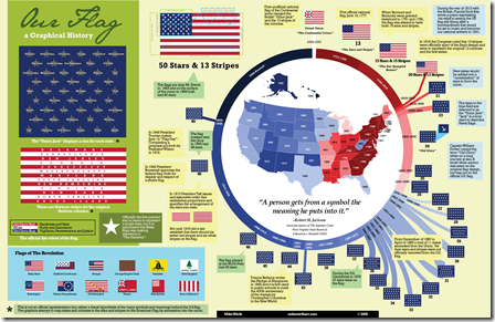
20 Oct 2009Stars and Stripes
20 Oct 2009More trivia than you can shake a flag at. (via)
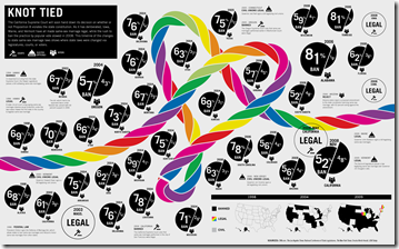
History of Gay Marriage
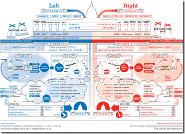
20 Oct 2009Two Party Statistics
In: Politics
20 Oct 2009A wonderful infographic from Information is Beautiful, from David’s upcoming book The Visual Miscellaneum. Also, an interesting bit of political trivia: Switzerland and the United States are the only countries where red=right wing and blue=liberal; every where else it’s the other way around.
BBC G20
In: Bailout Emerging Markets Finance Global Economy Interactive Maps Politics US Economy
19 Oct 2009A bit dated as these were prepared in the lead up to the Pittsburgh summit a few weeks ago. Worth passing on nonetheless.
A checklist of the G20’s April London Summit pledges and whether they’ve been fulfilled. Included some nice graphics on IMF and tax reforms.
G20 Stimulus and Fiscal Deficit map. Use the slider to look at the changes 2007-2010. Mouse over a country to view popup data details.
Pay Ratios
16 Oct 2009How long would you have to work to earn as much as a top CEO. This infographic uses three different salaries for comparison (minimum wage, average worker, POTUS).
Blog Action Day 2009: Climate Change
15 Oct 2009In honor of today being 2009’s Blog Action Day, I present below a series of recent climate change visualizations:
First up, “Kyoto: Who’s on Target”, which uses interesting nested circles for indicators of compliance. (via)
From the Washington Post, an interactive view of carbon emissions from G20 countries (either total or per capita) with a slider to move from 1950 through 2006. Easily missed, you can also click on a countries name on a list below that bubble chart (or on the “country profile” tab) to drilldown to individual countries. The October 5 part of the “special report” also contained a nice overview map.
Next, a treemap of cumulative CO2 emissions (1751-2006):
Breathing Earth‘s CO2 emissions simulator:
another interactive CO2 emissions map:
and if you doubt what effects CO2 levels are having, and whether global warming is something to worry about, please go read the “Global Climate Change Impacts in the United States” report.
or take a look at the Climate Orb, which is gathering stories of environmental impacts around the globe:
Cultural Memes
14 Oct 2009Sometimes a good graphic design takes on a life of it’s own.
of course, the original was based on a great photograph:
and if you want to you can make your own.
Health Care Bill Comparison
14 Oct 2009An interactive descriptive comparison of the provisions of the different health care bills in congress, with additional info on the White House’s preferences.
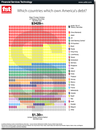
US Debt
13 Oct 2009Health Care Bill Comparison
13 Oct 2009Nuclear Weapons
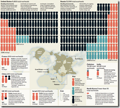
8 Oct 2009A decent infographic of nuclear weapons around the world. Having watched a documentary last weekend on what would happen to Washington DC after just a small detonation, I found this graphic and accompanying article interesting (I thought China had more, for example). (via)
What is Chart Porn?
An addictive collection of beautiful charts, graphs, maps, and interactive data visualization toys -- on topics from around the world.
Categories
- Bailout (118)
- Chartporn Related (3)
- Commentary (21)
- Culture (669)
- Emerging Markets (66)
- Employment (245)
- Environment/weather (133)
- Finance (298)
- Food (92)
- Global Economy (373)
- Graphic Design (bad) (26)
- Graphic Design (general) (183)
- Graphic Tools (23)
- History (158)
- Housing (162)
- Humor (204)
- Innovative (183)
- Interactive (545)
- Internet/tech (97)
- Maps (578)
- News Media (34)
- Politics (329)
- Reference (97)
- Science (331)
- Source: Economist (101)
- Source: FT (92)
- Source: NYT (147)
- Source: Ritholtz (76)
- Source: USA Today (27)
- Source: Washington Post (90)
- Source: WSJ (135)
- Sports (58)
- Stock Market (74)
- Uncategorized (2)
- Updated regularly (76)
- US Economy (553)
- Video (22)
- Aram Korevaar: This chart is now being used as a projection in which countries such as China see themselves as in a [...]
- David: Welcome back Chart Porn! [...]
- J S: Thanks for the great story. Miss reading this blog. Hope to see you more active again. [...]
- jake: I lived in a DC row house for 6 years, and I'm writing this comment from my tiny 1 bedroom apartment [...]
- ronny pettersen: Hilarious and unfortunately accurate... ;-) [...]

