Politics Archive:
Cost of Getting Sick
23 Nov 2009GE has put together an interactive toy for looking at how expensive different illnesses are at different ages. Use the slider at the bottom to pick the age. “Wedges are colored by chronic condition and wedge size (angle), represents the percentage of patients with the condition. Wedge length from center to edge is cost. The lightly colored portions are personal cost and the darkly colored are insurer cost.” (via FlowingData) Robert Kosara has a detailed critique of the chart over at eagereyes.
Ethics vs Salary
20 Nov 2009summary: ethics doesn’t pay well. actually, according to this, nothing pays very well. More data is probably needed.
UK Government Salaries
17 Nov 2009From the Queen on down. Click on “fullscreen” to vew a large zoomable version. Related Guardian article. (via)
Who is Paying Taxes
In: Politics US Economy
17 Nov 2009You always see these stats chopped apart to make one side or other happy – it’s nice to see it just laid out clearly.
Europe’s Finance Ministers
16 Nov 2009Marijuana Legalization
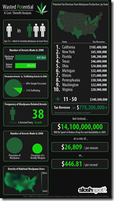
16 Nov 2009Infographic on potential tax receipts and savings. (via)
Exploding Empires (1800-2004)
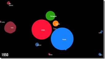
16 Nov 2009A strange visualization of the decline of imperialism – colonies explode out as they are granted independence. (via)
Political Map
15 Nov 2009White House Salaries
In: Politics
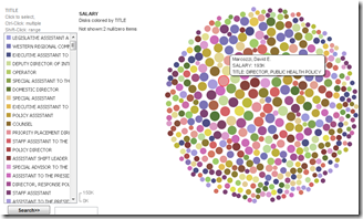
14 Nov 2009It’s hard to keep up with all the data sets that make it up onto many eyes.
Government Spending
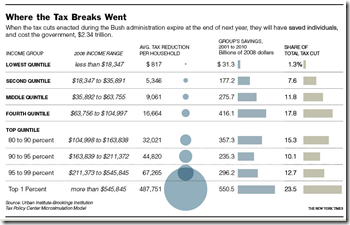
5 Nov 2009The Breaks
2 Nov 2009Bush’s tax breaks (which expire next year). It’s in dollar terms, so a little misleading, but still interesting. Related article. (via Sociological Images)
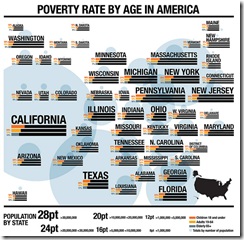
Poverty in America
30 Oct 2009An interesting way to show geographic data that is obviously weighted by population – the author created a cloud of rough geographic position, but varied the size of the graphs by population.
Global Life and Death
29 Oct 2009A data packed international comparison of health statistics. I give Good a lot of grief for the design of some of their infographics, but this one is well done. (via Simple Complexity)
What is Chart Porn?
An addictive collection of beautiful charts, graphs, maps, and interactive data visualization toys -- on topics from around the world.
Categories
- Bailout (118)
- Chartporn Related (3)
- Commentary (21)
- Culture (669)
- Emerging Markets (66)
- Employment (245)
- Environment/weather (133)
- Finance (298)
- Food (92)
- Global Economy (373)
- Graphic Design (bad) (26)
- Graphic Design (general) (183)
- Graphic Tools (23)
- History (158)
- Housing (162)
- Humor (204)
- Innovative (183)
- Interactive (545)
- Internet/tech (97)
- Maps (578)
- News Media (34)
- Politics (329)
- Reference (97)
- Science (331)
- Source: Economist (101)
- Source: FT (92)
- Source: NYT (147)
- Source: Ritholtz (76)
- Source: USA Today (27)
- Source: Washington Post (90)
- Source: WSJ (135)
- Sports (58)
- Stock Market (74)
- Uncategorized (2)
- Updated regularly (76)
- US Economy (553)
- Video (22)
- Aram Korevaar: This chart is now being used as a projection in which countries such as China see themselves as in a [...]
- David: Welcome back Chart Porn! [...]
- J S: Thanks for the great story. Miss reading this blog. Hope to see you more active again. [...]
- jake: I lived in a DC row house for 6 years, and I'm writing this comment from my tiny 1 bedroom apartment [...]
- ronny pettersen: Hilarious and unfortunately accurate... ;-) [...]

