Politics Archive:
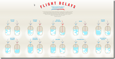
Flight Delays
13 Jan 2010Percent of departures canceled or delayed during the holidays year-on-year. Two problems with this one: Why show an increase in delays as a reduction in the volume of the containers? And the comparison is pretty much useless without factoring the weather in somehow – especially if you’re trying to use the results to analyze new security measures.
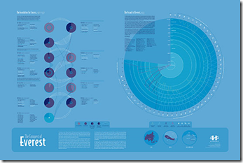
History Shots
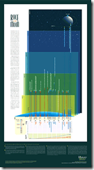
12 Jan 2010History Shots has a number of beautiful classically designed infographics that are very much worth browsing (and/or putting up on your wall).
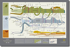
Conquest of Everest: the expeditions leading up to the successful 1953 assault.
Supreme Court History
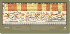
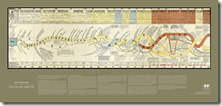
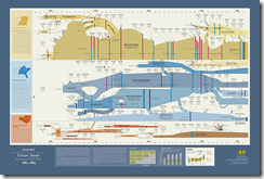
12 Jan 2010Comprehensive visualization of the US Supreme Court. It works best as an office poster, obviously – and can be purchased that way for your lawyer friends. It’s the first project from TimePlots – I look forward to more good things from them in the future
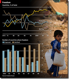
Freedom Still in Decline
12 Jan 2010Based on Freedom House’s 2010 survey.
2010 House Elections
8 Jan 2010The infamous election maps begin to spawn… This one includes fairly detailed analysis of the close races.
Major Trends and Events 1750-2100
In: Culture Global Economy History Politics Reference Science
8 Jan 2010Would make a good poster. Some of the predictions are questionable, of course. (via)
Israel/Palestine Conflict
8 Jan 2010Health Reform
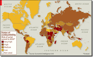
28 Dec 20092010 Social Unrest
28 Dec 2009Jail Birds
22 Dec 2009Some basic facts about prisons in the United States. (via VizWorld)
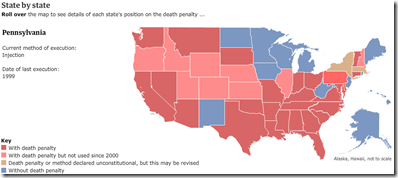
Death Penalty
14 Dec 2009Afghanistan Timeline
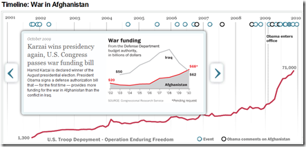
2 Dec 2009A nice tool from the Washington Post, includes graphs on troop deployment, war funding, death tolls, and comparisons to other conflicts.
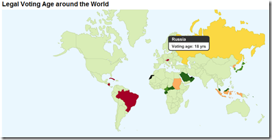
Legal Voting Age
23 Nov 2009What is Chart Porn?
An addictive collection of beautiful charts, graphs, maps, and interactive data visualization toys -- on topics from around the world.
Categories
- Bailout (118)
- Chartporn Related (3)
- Commentary (21)
- Culture (669)
- Emerging Markets (66)
- Employment (245)
- Environment/weather (133)
- Finance (298)
- Food (92)
- Global Economy (373)
- Graphic Design (bad) (26)
- Graphic Design (general) (183)
- Graphic Tools (23)
- History (158)
- Housing (162)
- Humor (204)
- Innovative (183)
- Interactive (545)
- Internet/tech (97)
- Maps (578)
- News Media (34)
- Politics (329)
- Reference (97)
- Science (331)
- Source: Economist (101)
- Source: FT (92)
- Source: NYT (147)
- Source: Ritholtz (76)
- Source: USA Today (27)
- Source: Washington Post (90)
- Source: WSJ (135)
- Sports (58)
- Stock Market (74)
- Uncategorized (2)
- Updated regularly (76)
- US Economy (553)
- Video (22)
- Aram Korevaar: This chart is now being used as a projection in which countries such as China see themselves as in a [...]
- David: Welcome back Chart Porn! [...]
- J S: Thanks for the great story. Miss reading this blog. Hope to see you more active again. [...]
- jake: I lived in a DC row house for 6 years, and I'm writing this comment from my tiny 1 bedroom apartment [...]
- ronny pettersen: Hilarious and unfortunately accurate... ;-) [...]

