Politics Archive:
Tax Calculator
5 Feb 2010A fun toy for examining historic US tax rates and government expenditure. You put in your income and it graphs the amount of taxes you pay and breaks down what the government spent it on. As usual on this type of stuff, there are pages and pages of comments arguing about the methodology and what it all means. (via).
and in honor of those tax arguments:
(originally from here)
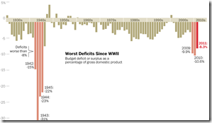
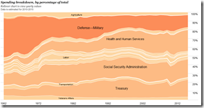
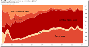
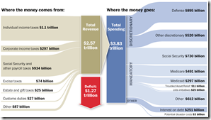
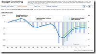
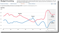
One more. This time with feeling! Ok, maybe not. But this one has some great historical perspectives: Deficits, spending by agency, revenue, etc (and you can click on the area charts to drill down). Great work by the Washington Post!
Deficits (all the charts below go to the same link – click on the tabs at the top to go through them on the WP site).
Spending by agency:
Revenue:
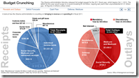
The budget:
More Obama Budget
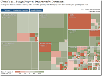
1 Feb 2010Interactive treemap from the NYT – you can zoom/drill into the details, “hide” mandatory spending, and rollovers popup the 2010-11 values and change. Thanks to Andrea Noble for the heads up!
Obama 2011 Budget
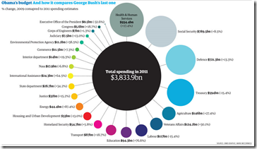
1 Feb 2010Obama’s Budget
In: Politics US Economy
1 Feb 20102011 vs 2009 (George Bush’s last one). They also have the dataset of spending by department since 1962.
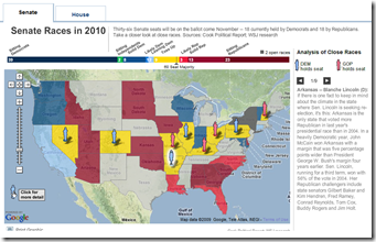
Election 2010
In: Maps Politics Source: WSJ
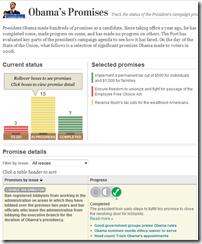
31 Jan 2010Obama Promise Tracker
27 Jan 2010Progress made on 25 promises made during the election. Click on a promise to see details and related articles at the bottom. Nice work by the Washington Post.
Why the Latest Supreme Court Ruling Sucks
In: Politics
25 Jan 2010Top political donors 1989-2010. It’s just going to get worse. (via)
Obama Approval Ratings
20 Jan 2010Interactive timeline of approval since inauguration. Some dates are annotated. Apparently the Guardian used the Real Clear Politics rating (2nd chart), which is an average of many different polls – nice! And while we’re at it, USAToday’s Approval Tracker allows you to compare presidents’ ratings since Truman and is updated regularly.
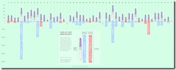
Abortions by State
20 Jan 2010Abortions per live birth, and total abortions, with color coding whether a state voted republican or democratic in the last election.
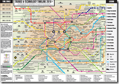
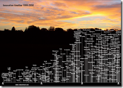
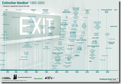
Trends
In: Culture Environment/weather Global Economy Politics Science
19 Jan 2010Nowandnext.com has a number of interesting timelines. Thanks to Sam Freund for pointing them out!
What is Chart Porn?
An addictive collection of beautiful charts, graphs, maps, and interactive data visualization toys -- on topics from around the world.
Categories
- Bailout (118)
- Chartporn Related (3)
- Commentary (21)
- Culture (669)
- Emerging Markets (66)
- Employment (245)
- Environment/weather (133)
- Finance (298)
- Food (92)
- Global Economy (373)
- Graphic Design (bad) (26)
- Graphic Design (general) (183)
- Graphic Tools (23)
- History (158)
- Housing (162)
- Humor (204)
- Innovative (183)
- Interactive (545)
- Internet/tech (97)
- Maps (578)
- News Media (34)
- Politics (329)
- Reference (97)
- Science (331)
- Source: Economist (101)
- Source: FT (92)
- Source: NYT (147)
- Source: Ritholtz (76)
- Source: USA Today (27)
- Source: Washington Post (90)
- Source: WSJ (135)
- Sports (58)
- Stock Market (74)
- Uncategorized (2)
- Updated regularly (76)
- US Economy (553)
- Video (22)
- Aram Korevaar: This chart is now being used as a projection in which countries such as China see themselves as in a [...]
- David: Welcome back Chart Porn! [...]
- J S: Thanks for the great story. Miss reading this blog. Hope to see you more active again. [...]
- jake: I lived in a DC row house for 6 years, and I'm writing this comment from my tiny 1 bedroom apartment [...]
- ronny pettersen: Hilarious and unfortunately accurate... ;-) [...]


