Politics Archive:
Understand Health Reform
In: Interactive Politics
12 Mar 2010A nice interactive tool from the AP that explains the health reform bills, including a “you” filter that explains what provisions will affect you based on your age and current insurance.
1870 Census Maps
10 Mar 201054 maps and charts. The level of detail and sophistication is pretty damn impressive for the period. (again from Radical Cartography — can you tell I’m digging through that site? Love it.)
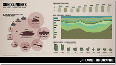
Global Arms Trade
10 Mar 2010Gay Partnerships in USA
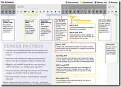
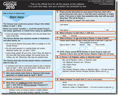
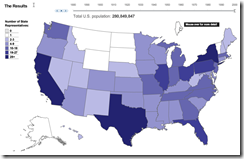
9 Mar 2010The Census
8 Mar 2010The Economist produces quality audio annotated presentations on a number of topics. Here are a few recent ones:
Asia’s Growing Economic Power (a historical perspective) 
State Revenue
In: Politics US Economy
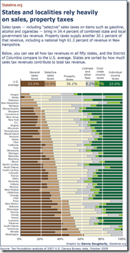
19 Feb 2010Where states get their money from. An interesting distribution. (via)
Job Openings in Congress
In: Politics Source: WSJ
19 Feb 2010European Health Care
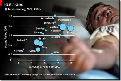
19 Feb 2010THE private provision of health care comes in several forms across Europe. In Germany and the Netherlands it provides coverage for those not on government schemes; in Britain and Ireland it duplicates state-run systems; and in France it tops up cover from official programmes. . A study by the Boston Consulting Group concludes that countries relying mainly on insurance-such as France, Germany and the Netherlands-provide better care than those, like Britain, Italy and Spain, that are chiefly funded by taxes and which spend less on health care as a proportion of GDP.
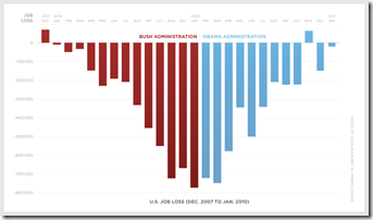
Job Losses
17 Feb 2010A slightly politicized look. (via FlowingData)
Medicine vs Terrorists
16 Feb 2010A little outside Chartporn’s normal bailiwick, but I like to make note of effective graphic design when I find it.
Israeli Settlements in the West Bank
9 Feb 2010An impressively detailed mapping analysis of settlements in disputed territories over time. Related article.
Obama’s Bank Reform Plan
In: Bailout Finance Politics Source: FT Stock Market US Economy
9 Feb 2010The FT has an audio annotated slideshow explaining the proposal.
(note, to get around FT’s registration try this link)
What is Chart Porn?
An addictive collection of beautiful charts, graphs, maps, and interactive data visualization toys -- on topics from around the world.
Categories
- Bailout (118)
- Chartporn Related (3)
- Commentary (21)
- Culture (669)
- Emerging Markets (66)
- Employment (245)
- Environment/weather (133)
- Finance (298)
- Food (92)
- Global Economy (373)
- Graphic Design (bad) (26)
- Graphic Design (general) (183)
- Graphic Tools (23)
- History (158)
- Housing (162)
- Humor (204)
- Innovative (183)
- Interactive (545)
- Internet/tech (97)
- Maps (578)
- News Media (34)
- Politics (329)
- Reference (97)
- Science (331)
- Source: Economist (101)
- Source: FT (92)
- Source: NYT (147)
- Source: Ritholtz (76)
- Source: USA Today (27)
- Source: Washington Post (90)
- Source: WSJ (135)
- Sports (58)
- Stock Market (74)
- Uncategorized (2)
- Updated regularly (76)
- US Economy (553)
- Video (22)
- Aram Korevaar: This chart is now being used as a projection in which countries such as China see themselves as in a [...]
- David: Welcome back Chart Porn! [...]
- J S: Thanks for the great story. Miss reading this blog. Hope to see you more active again. [...]
- jake: I lived in a DC row house for 6 years, and I'm writing this comment from my tiny 1 bedroom apartment [...]
- ronny pettersen: Hilarious and unfortunately accurate... ;-) [...]


