Politics Archive:
European Dominoes
3 May 2010How the PIIGS are connected. An interactive from the Guardian.
Global Interest Rate Tracker
In: Finance Global Economy Interactive Maps Politics Source: WSJ Updated regularly US Economy
26 Apr 2010Central bank rates from 2004-present (updated 4/20). See how countries are exiting from their stimulus policies.
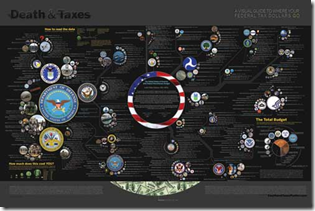
Death and Taxes 2011
In: Politics US Economy
26 Apr 2010Wallstats has released their annual visualization of the President’s discretionary budget. Lots of interesting information and a great example of how good design can get even better over time.
US Income Tax Brackets (1910-10)
In: Politics US Economy
23 Apr 2010Another nice visualization from Stephen over at weathersealed.
UK Party Lines
15 Apr 2010Interactive guide to the views of the Labour, Conservative, and Liberal Democrat parties on various issues.
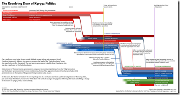
Revolving Door of Kyrgyz Politics
In: Politics
15 Apr 2010Ok, I don’t really care much about Kyrgyz politics, but this is a well designed chart. It would be interesting to see something similar for US administrations.
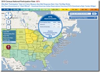
Census Participation Map
In: Interactive Maps Politics
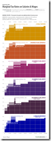
12 Apr 2010Marginal Tax Rates
In: Politics US Economy
9 Apr 2010Many Bills: US Legislation Library
8 Apr 2010IBM has coupled with Many Eyes to create a visualization warehouse of US Congressional legislation. It’s a pretty complicated tool, so definitely watch the “quick tour”. Pick a search word and go exploring. You can explode just the relevant parts, view earlier versions, read the whole thing, and save them as favorites.
UK Swing
8 Apr 2010Lots of people appear to be concerned with the potential “swing” in the upcoming UK elections.
BBC’s interactive “Swingometer”: 
Opinion polls (with nice interactive features): 
I don’t know who copied who, but the Guardian also has it’s own “swingometer” (move the dot on the little pie chart on the right to adjust swing amount) and interactive poll-chart. 
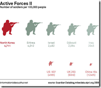
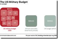
The Global Military
5 Apr 2010A great series of charts by Information is Beautiful for the Guardian.
What is Chart Porn?
An addictive collection of beautiful charts, graphs, maps, and interactive data visualization toys -- on topics from around the world.
Categories
- Bailout (118)
- Chartporn Related (3)
- Commentary (21)
- Culture (669)
- Emerging Markets (66)
- Employment (245)
- Environment/weather (133)
- Finance (298)
- Food (92)
- Global Economy (373)
- Graphic Design (bad) (26)
- Graphic Design (general) (183)
- Graphic Tools (23)
- History (158)
- Housing (162)
- Humor (204)
- Innovative (183)
- Interactive (545)
- Internet/tech (97)
- Maps (578)
- News Media (34)
- Politics (329)
- Reference (97)
- Science (331)
- Source: Economist (101)
- Source: FT (92)
- Source: NYT (147)
- Source: Ritholtz (76)
- Source: USA Today (27)
- Source: Washington Post (90)
- Source: WSJ (135)
- Sports (58)
- Stock Market (74)
- Uncategorized (2)
- Updated regularly (76)
- US Economy (553)
- Video (22)
- Aram Korevaar: This chart is now being used as a projection in which countries such as China see themselves as in a [...]
- David: Welcome back Chart Porn! [...]
- J S: Thanks for the great story. Miss reading this blog. Hope to see you more active again. [...]
- jake: I lived in a DC row house for 6 years, and I'm writing this comment from my tiny 1 bedroom apartment [...]
- ronny pettersen: Hilarious and unfortunately accurate... ;-) [...]


