Politics Archive:
The Shadow Congress
3 Jun 2010A map of Congressmen who are now lobbyists. Related article. (via)


Maps: Iraq and Afghanistan Casualties
In: Interactive Maps Politics
1 Jun 2010An extremely well designed dual-map interface that shows individual casualties – where they lived and where they were killed. Clicking on any dot brings up a photo and detailed information about the person. You can view coalition deaths by scrolling the map to those countries. There’s even a place to leave notes about each person. (via)

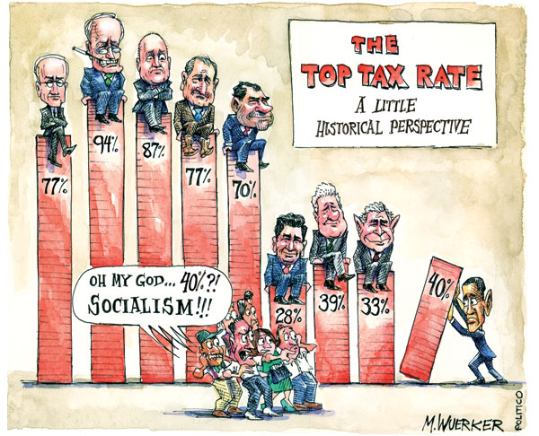
How Laws are Made
In: Politics
28 May 2010A very nice design – and accurate as far as I can tell. (via)

The Drug War
24 May 2010Menu of charts on spending, threat, and consumption from AP.


Terrorist Attacks: 1970-2010
19 May 2010In America:

I wished Good had provided more detail on some of the earlier small ones – which led me to the Global Terrorism Database project and the cool interactive tool below (covering all countries).

Thai Politics Timeline
18 May 2010I really like the design.

Underfunded State Pensions
18 May 2010Yay! Another few trillion dollars to worry about. Related article.


Superb 2010 US Election Map
In: Interactive Maps News Media Politics Source: Washington Post Updated regularly
6 May 2010The Washington Post’s new “Post Politics” online section has an excellent map of elections (Senate, House, and Governor), all updated regularly. Click around for a while – there are a large number of filters, drill downs, and highlights to play with.

The Economist Redraws Europe
4 May 2010A new Europe, using completely arbitrary and amusing reasoning:

Deficit Busters
4 May 2010Select a UK political party, then choose what programs cuts you would make to lower the deficit – then see the effects of those cuts. Why have we never seen one of these in the United States?

Hmmmm. turns out there have been some attempts in the US.
From the LA Times on the California budget: 
From the Congressional Budget Office: 
Massachusetts budget calculator (from 2008, I think)

Anyone know of better ones?
You’ve probably seen the “Afghanistan Stability” chart below, and some of the commentary (e.g. – Guardian or the discussion at FlowingData). My personal favorite is the parody by John Stewart below which extends to Patton, Star Wars, and beyond.

| The Daily Show With Jon Stewart | Mon – Thurs 11p / 10c | |||
| Afghanistan Stability Chart | ||||
| ||||


What is Chart Porn?
An addictive collection of beautiful charts, graphs, maps, and interactive data visualization toys -- on topics from around the world.
Categories
- Bailout (118)
- Chartporn Related (3)
- Commentary (21)
- Culture (669)
- Emerging Markets (66)
- Employment (245)
- Environment/weather (133)
- Finance (298)
- Food (92)
- Global Economy (373)
- Graphic Design (bad) (26)
- Graphic Design (general) (183)
- Graphic Tools (23)
- History (158)
- Housing (162)
- Humor (204)
- Innovative (183)
- Interactive (545)
- Internet/tech (97)
- Maps (578)
- News Media (34)
- Politics (329)
- Reference (97)
- Science (331)
- Source: Economist (101)
- Source: FT (92)
- Source: NYT (147)
- Source: Ritholtz (76)
- Source: USA Today (27)
- Source: Washington Post (90)
- Source: WSJ (135)
- Sports (58)
- Stock Market (74)
- Uncategorized (2)
- Updated regularly (76)
- US Economy (553)
- Video (22)
- Aram Korevaar: This chart is now being used as a projection in which countries such as China see themselves as in a [...]
- David: Welcome back Chart Porn! [...]
- J S: Thanks for the great story. Miss reading this blog. Hope to see you more active again. [...]
- jake: I lived in a DC row house for 6 years, and I'm writing this comment from my tiny 1 bedroom apartment [...]
- ronny pettersen: Hilarious and unfortunately accurate... ;-) [...]