Politics Archive:
Congressional Conversation Index
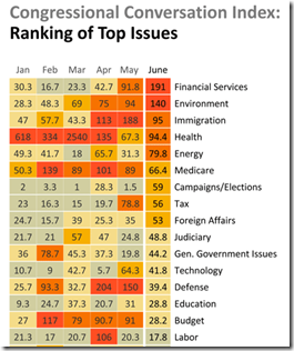
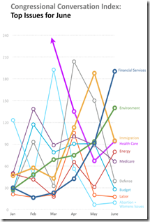
16 Jul 2010The Congressional Conversation Index tracks what topics people are contacting their Representatives about, produced by a joint effort between Fireside21 and the Adfero Group. (thanks to Brad Johnson for the link)
Vacuous Supreme Court Nomination Hearings
15 Jul 2010DCA Flight Restrictions
7 Jul 2010Ever wonder why you can’t fly directly into Washington’s DCA airport (which is on the metro and only 15 minutes away from downtown, and have to fly into BWI or IAD instead (45 minutes away, if you’re lucky)? It’s all based on agreements with the Virginia locals on how many long distance flights are allowed to land. Congress is considering stretching that boundary a bit (which I am in complete favor of). Related article.
How Stupid are Americans?
6 Jul 2010Sovereign Debt Levels 1980-2009
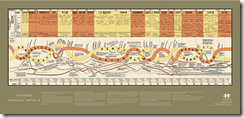
1 Jul 2010British Political Parties (1830-2010)
28 Jun 2010Education Documentary Trailer
21 Jun 2010Video infographics seem to be a growing trend. Here’s a well animated one in the form of a promotional for the education documentary “Waiting for Superman” (by Davis Guggenheim, who did An Inconvenient Truth). Note: if you want to see the whole movie, it is being shown as part of this weeks Silverdocs Film Festival in Washington, DC.
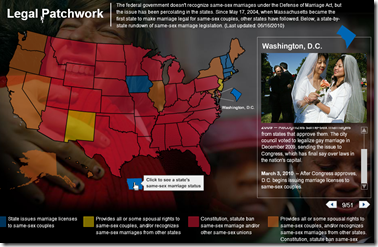
Map: Same-Sex Marriage Laws
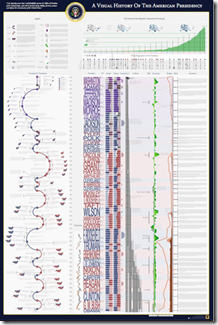
16 Jun 2010Visual History of the American Presidency
13 Jun 2010More beautifully detailed work from Timeplots.
Emerging Africa: in Depth
In: Emerging Markets Environment/weather Global Economy Interactive Maps Politics Source: FT
9 Jun 2010Several interactive graphics related to the FT’s June 2010 “in depth” analysis of Africa.
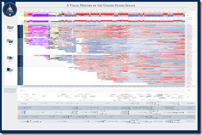
Visual History of the US Senate (1789-2010)
4 Jun 2010A very detailed visualization from the good people at Timeplots.
What is Chart Porn?
An addictive collection of beautiful charts, graphs, maps, and interactive data visualization toys -- on topics from around the world.
Categories
- Bailout (118)
- Chartporn Related (3)
- Commentary (21)
- Culture (669)
- Emerging Markets (66)
- Employment (245)
- Environment/weather (133)
- Finance (298)
- Food (92)
- Global Economy (373)
- Graphic Design (bad) (26)
- Graphic Design (general) (183)
- Graphic Tools (23)
- History (158)
- Housing (162)
- Humor (204)
- Innovative (183)
- Interactive (545)
- Internet/tech (97)
- Maps (578)
- News Media (34)
- Politics (329)
- Reference (97)
- Science (331)
- Source: Economist (101)
- Source: FT (92)
- Source: NYT (147)
- Source: Ritholtz (76)
- Source: USA Today (27)
- Source: Washington Post (90)
- Source: WSJ (135)
- Sports (58)
- Stock Market (74)
- Uncategorized (2)
- Updated regularly (76)
- US Economy (553)
- Video (22)
- Aram Korevaar: This chart is now being used as a projection in which countries such as China see themselves as in a [...]
- David: Welcome back Chart Porn! [...]
- J S: Thanks for the great story. Miss reading this blog. Hope to see you more active again. [...]
- jake: I lived in a DC row house for 6 years, and I'm writing this comment from my tiny 1 bedroom apartment [...]
- ronny pettersen: Hilarious and unfortunately accurate... ;-) [...]

