Politics Archive:
Global Competitiveness Report 2010-11
In: Employment Finance Global Economy Interactive Maps Politics Updated regularly
10 Sep 2010The World Economic Forum has a number of interactive tools for examining the results of it’s Global Competitiveness Report. You can view the aggregate index or any of the many (very interesting) sub-components as maps, bar charts, scatter plots, rankings, or individual profiles. FYI – The United States has slipped from 2nd to 4th overall.
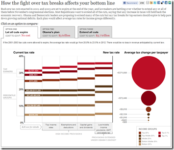
Bush’s Tax Cuts by the Numbers
18 Aug 2010A very well done interactive of how people will be affected by the expiration of the 2001/03 tax breaks, as well as a what Obama is proposing.
The History of Social Security
16 Aug 2010Roll over the timeline to see how funding, eligibility, and benefits have changed over the last 75 years. However, I think AP got the beneficiaries numbers completely wrong – the 2009 total is more like 52 million (source).
Correct graph:
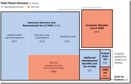
US Fiscal Stimulus
12 Aug 2010Includes the recent $26 billion state aid package. Related article.
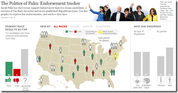
As much as I hate to draw more attention to anything this woman has to say, I thought some of you wonks might find this interesting in the run-up to this November.
To counterbalance the bad taste that left in my throat, I’ll give another shoutout to the WashPost’s overall Campaign tracker, which is excellent:
If You Were on the Supreme Court
29 Jul 2010For each of six questions, your answers will be compared to public opinion polls and recent decisions of the supreme court.
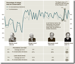
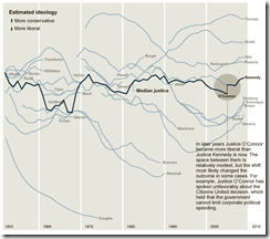
How Conservative is the US Supreme Court?
29 Jul 2010The Roberts Court has issued conservative decisions at a slightly higher rate than the Rehnquist or the Burger Courts. [Related article]
Thanks to epetrela for the link!
Global Executions
29 Jul 2010Yikes! Anybody want to re-jigger this to per-capita? Or does that not really matter in this case? Thoughts?
Why Nothing Gets Done in Washington DC
In: Politics
28 Jul 2010I’ve lived in DC for 25 years – this timeline is completely accurate. It’s a lot of sound and fury that produces nothing more than clever dinner party conversations. (via)
Reforming the Global Financial System
In: Finance Global Economy Interactive Maps Politics Source: FT
28 Jul 2010From Dodd-Frank to Basel III, this graphic explains the current plans for global financial regulatory reform in advanced economies, from the US to the eurozone.
(note: some FT items require a subscription – you can view up to 10 articles a month for free)
Durham Univeristy’s International Boundaries Research Unit (IBRU) maintains some interesting maps and history.
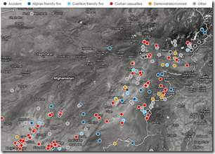
Map: Wikileaks Afghan Incidents
In: Interactive Maps Politics
26 Jul 2010Interactive map of 300 accidents, friendly fires, civilian casualties, and demonstrations. Drill down to detailed reports.
Top Secret America
19 Jul 2010Interactive exploration of the 45 Government agencies, 2000+ companies, and 854,000+ people working on government security. Part of the Washington Post’s 3-part series on the growth of national security infrastructure since 9/11.
The Financial Overhaul Bill: What Does it Fix?
16 Jul 2010Energy Subsidies
16 Jul 2010Turns out we massively subsidize oil companies with huge tax breaks, despite their equally huge profits. (via the Big Picture)
What is Chart Porn?
An addictive collection of beautiful charts, graphs, maps, and interactive data visualization toys -- on topics from around the world.
Categories
- Bailout (118)
- Chartporn Related (3)
- Commentary (21)
- Culture (669)
- Emerging Markets (66)
- Employment (245)
- Environment/weather (133)
- Finance (298)
- Food (92)
- Global Economy (373)
- Graphic Design (bad) (26)
- Graphic Design (general) (183)
- Graphic Tools (23)
- History (158)
- Housing (162)
- Humor (204)
- Innovative (183)
- Interactive (545)
- Internet/tech (97)
- Maps (578)
- News Media (34)
- Politics (329)
- Reference (97)
- Science (331)
- Source: Economist (101)
- Source: FT (92)
- Source: NYT (147)
- Source: Ritholtz (76)
- Source: USA Today (27)
- Source: Washington Post (90)
- Source: WSJ (135)
- Sports (58)
- Stock Market (74)
- Uncategorized (2)
- Updated regularly (76)
- US Economy (553)
- Video (22)
- Aram Korevaar: This chart is now being used as a projection in which countries such as China see themselves as in a [...]
- David: Welcome back Chart Porn! [...]
- J S: Thanks for the great story. Miss reading this blog. Hope to see you more active again. [...]
- jake: I lived in a DC row house for 6 years, and I'm writing this comment from my tiny 1 bedroom apartment [...]
- ronny pettersen: Hilarious and unfortunately accurate... ;-) [...]


