Politics Archive:
Our Old Congress
13 Oct 2010Who Owns Congress
In: Politics
12 Oct 2010A seating chart of the Senate and House, organized by who they have accepted the most campaign contributions from. The person by person descriptions are interesting.
Gay Sex vs Straight Sex
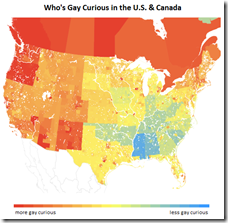
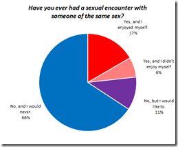
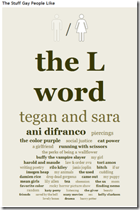
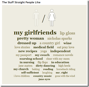
12 Oct 2010OkTrends has analyzed it’s database of user behavior to examine several rumors about homosexual behavior, compared to heterosexuals. Not surprisingly, none of them are true. The whole article is fascinating.
Google Election Maps
In: Interactive Maps Politics
12 Oct 2010The New Campaign Money Paradigm
In: Politics Source: NYT
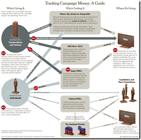
12 Oct 2010The Supreme Court’s ruling on contributions last year is having a strong impact on how money is flowing into elections this year – but it’s not the only reason spending has doubled since 2006. Related article.
Who to Vote For?
In: Interactive Politics
2 Oct 2010Vote Easy is a pretty smooth interactive voting guide. You select your state/zip then answer a series of questions on 12 different issues to see which candidates most agree with you. Then you can drill down to pictures and detailed candidate profiles. The questions are a bit simplistic, and they are missing some states (and DC) at the moment – but this could grow into a very useful tool. (via)
State Debt
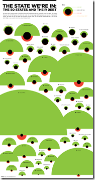
30 Sep 2010Interesting presentation of multiple debt related indicators. The alien invasion look is a bit strong, but they did refrain from including red circles and having them all look like ladybugs – just sayin.
Israeli Settlements (1990-2010)
27 Sep 2010From the Economist, a graph of public and private settlements. From the BBC, a map of the settlements and a summary of previous peace talks. note: we posted a (slightly better) WSJ settlement map in Feb.
Political Pledges
24 Sep 2010We’re All Stupid
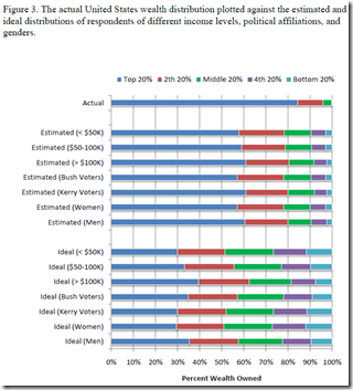
23 Sep 2010Actual wealth distribution versus what people think it is. (via)
This reminded me of a survey the Washington Post did a while ago which compared the ethnic distribution of the USA to what different ethnic groups thought it was – everyone got that horribly wrong too. Quick test: what percent of the population is White, Black, and Asian? Highlight the next line for the answer:
White: 75% Black: 12% Asian: 3.6% (2000 Census)
WWI-II Economics and Design
In: Culture Graphic Design (general) History Politics Science
21 Sep 2010Your Coming Tax Cut (or not)
20 Sep 2010A very nice analysis from the New York Times – as usual. (via)
Marijuana Price Map
19 Sep 2010The data is crowdsourced by consumer submissions. Amusing and interesting. (via)
Tea Party Demographics
16 Sep 2010Who supports the tea party? (entire poll)
Pentagon Procurement
14 Sep 2010Ok, this system certainly looks like a mess, but I have to admit that the chart is not as badly designed as it might first appear.
What is Chart Porn?
An addictive collection of beautiful charts, graphs, maps, and interactive data visualization toys -- on topics from around the world.
Categories
- Bailout (118)
- Chartporn Related (3)
- Commentary (21)
- Culture (669)
- Emerging Markets (66)
- Employment (245)
- Environment/weather (133)
- Finance (298)
- Food (92)
- Global Economy (373)
- Graphic Design (bad) (26)
- Graphic Design (general) (183)
- Graphic Tools (23)
- History (158)
- Housing (162)
- Humor (204)
- Innovative (183)
- Interactive (545)
- Internet/tech (97)
- Maps (578)
- News Media (34)
- Politics (329)
- Reference (97)
- Science (331)
- Source: Economist (101)
- Source: FT (92)
- Source: NYT (147)
- Source: Ritholtz (76)
- Source: USA Today (27)
- Source: Washington Post (90)
- Source: WSJ (135)
- Sports (58)
- Stock Market (74)
- Uncategorized (2)
- Updated regularly (76)
- US Economy (553)
- Video (22)
- Aram Korevaar: This chart is now being used as a projection in which countries such as China see themselves as in a [...]
- David: Welcome back Chart Porn! [...]
- J S: Thanks for the great story. Miss reading this blog. Hope to see you more active again. [...]
- jake: I lived in a DC row house for 6 years, and I'm writing this comment from my tiny 1 bedroom apartment [...]
- ronny pettersen: Hilarious and unfortunately accurate... ;-) [...]


