News Media Archive:
Obama Approval Ratings
20 Jan 2010Interactive timeline of approval since inauguration. Some dates are annotated. Apparently the Guardian used the Real Clear Politics rating (2nd chart), which is an average of many different polls – nice! And while we’re at it, USAToday’s Approval Tracker allows you to compare presidents’ ratings since Truman and is updated regularly.
2010 House Elections
8 Jan 2010The infamous election maps begin to spawn… This one includes fairly detailed analysis of the close races.
2009 Top News
In: News Media
4 Jan 2010Good Magazine presents a treemap of news coverage, colored by politics, culture, business, and “bad news”. Interestingly, Sociological Images notes that the data comes from the Pew Research Project’s Journalism.org, which presents a weekly report of media content – including additional breakdowns such as by media outlet.
The Naughts
In: Culture Humor News Media
4 Jan 2010A table of important things, time-relevant things, and stuff we’ve already forgotten about. Thanks to Nathan Sweet for passing it on.
Digg Year
15 Dec 2009View the top Diggs for any day using the calendar selector in the middle. Nicely done.
If you haven’t seen them before, the real-time Digg Stack and Swarm are very cool as well.
Obama Tracker
26 Oct 2009An odd little tool – it’s a timeline of major economic, domestic policy, and foreign policy events and developments. It’s not clear to me what use the bars are. Perhaps a calendar would have been better?
Who Knew?
30 Sep 2009It turns out the Economist has a series of very well produced explanatory videographics on a variety of economic and political topics:
Poor Header
In: News Media
23 Sep 2009The newspaper doesn’t always do that great a job of interpreting statistics. It appears someone in the graphics department forgot that the 2009 number was only for part of the event (or thought the footnote was sufficient). To be fair, according to this article, attendance was indeed up this year.
Google News Timeline
22 Sep 2009Browse visually through the news of time period (month, day, year) Click on “add more queries” to control the content sources displayed. Filter by date, or do a search. Unfortunately only goes back to 2005.
Suburbified New York
In: Culture Maps News Media
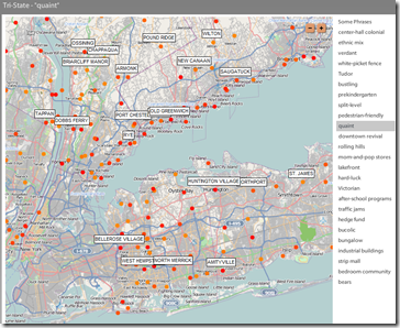
15 Sep 2009“Based on the New York Times ‘Living In‘ columns from the past ten years, this map uses color-coding to represent publication dates and provides a list of common phrases that describe the locations.” The phrases are pretty entertaining.
NYT News Classifier
15 Sep 2009MSNBC Spectra Visual Newsreader
11 Sep 2009Yet another news aggregator visualization. But this one spins and is in color!! Ok, perhaps that’s a little snarky — there is some clever design here, but I question how useful it is – maybe if it was on a wall sized touchscreen or something.
News Dots
10 Sep 2009Recent news items illustrated as a giant interactive network map. “Subjects-represented by the circles below-are connected to one another if they appear together in at least two stories, and the size of the dot is proportional to the total number of times the subject is mentioned.” The nice part is you can drill down to the actual news articles on the right. Updated daily by Slate.
Helicopter Crashes
In: Interactive Maps News Media Science Source: Washington Post
21 Aug 2009From a Washington Post article on fatal helicopter accidents. What first looked like just one kind of interesting chart turned out to be three solid ones once you started clicking around. (Thanks to Jane An for pointing them out).
Geeknews Treemap
In: Culture News Media
18 Aug 2009Much like the news map, the oursignal.com treemap aggregates headlines from Digg, Reddit, Del.icio.us and a couple others (should include slashdot, IMO). Spotted over at Information Aesthetics.
What is Chart Porn?
An addictive collection of beautiful charts, graphs, maps, and interactive data visualization toys -- on topics from around the world.
Categories
- Bailout (118)
- Chartporn Related (3)
- Commentary (21)
- Culture (669)
- Emerging Markets (66)
- Employment (245)
- Environment/weather (133)
- Finance (298)
- Food (92)
- Global Economy (373)
- Graphic Design (bad) (26)
- Graphic Design (general) (183)
- Graphic Tools (23)
- History (158)
- Housing (162)
- Humor (204)
- Innovative (183)
- Interactive (545)
- Internet/tech (97)
- Maps (578)
- News Media (34)
- Politics (329)
- Reference (97)
- Science (331)
- Source: Economist (101)
- Source: FT (92)
- Source: NYT (147)
- Source: Ritholtz (76)
- Source: USA Today (27)
- Source: Washington Post (90)
- Source: WSJ (135)
- Sports (58)
- Stock Market (74)
- Uncategorized (2)
- Updated regularly (76)
- US Economy (553)
- Video (22)
- Aram Korevaar: This chart is now being used as a projection in which countries such as China see themselves as in a [...]
- David: Welcome back Chart Porn! [...]
- J S: Thanks for the great story. Miss reading this blog. Hope to see you more active again. [...]
- jake: I lived in a DC row house for 6 years, and I'm writing this comment from my tiny 1 bedroom apartment [...]
- ronny pettersen: Hilarious and unfortunately accurate... ;-) [...]


