Maps Archive:
2012 Economic Freedom Map
In: Finance Global Economy History Interactive Maps Politics Updated regularly
6 Mar 2012I’m not a fan of the Heritage Foundation, and the one time I dug into the data of their Economic Freedom Index I found that they occasionally compare apples and oranges to get around data scarcity – BUT: they do put a large research effort into the report each year. The below interactive map is well executed – but you should drill down to country level data to get a feel for what is really being measured (click on a country, then the “learn more about this country” link that pops up in the lower left. Why this requires two steps I have no idea).
Improving on Minard?!?
2 Mar 2012How dare they! Well, actually, it’s a fun exercise. Declared by Tufte to be one of the best statistical graphics ever drawn, Joseph Minard’s graph of Napoleon’s march on Russia is definitely a classic (a copy hangs in my bathroom).
John Boykin recently took a crack at redesigning the classic, and goes into quite a bit of detail on his website about the choices he made:
John links to a series of other re-creations and re-interpretations of Minard’s dataset, as collected by Michael Friendly:
3D:
I particularly like this googlemap version:
And then there’s the executive summary version. Bwahahahahaha!
(via JunkCharts)
Old Maps Online
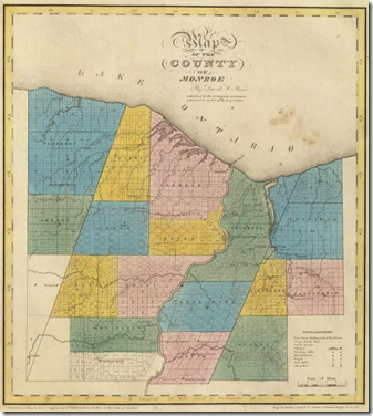
29 Feb 2012What’s cool about this repository of old maps is that you can just type in a city or zip code, select the period your are interested in, and it will you show you what maps cover that area. Below is my hometown in 1829. I think it’s great that they are preserving these online – I see the old surveyor books torn up for sale at flea markets all the time.(via Sean R and Flowing Data)
Magnificent Map of Rap Names
22 Feb 2012Pop Chart Lab has apparently updated their Grand Taxonomy of Rap Names (298 names) to a Magnificent Map of Rap Names (636 names)
Earth Photos
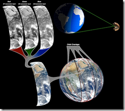
16 Feb 2012Interesting article on how they composite satellite photos of earth into those beautiful globe shots:
While we’re on the subject, below is NASA’s gateway for Astronaut photography of Earth, including some stunning videos:
While in NYC recently I noticed that most of the traffic seems to consist of Taxis. Tom McKeogh, Eliza Montgomery, and Juan F Saldarriag collected Manhattan taxi GPS data and created this beautiful map of Taxi trips over just 24 hours. Nice! (via FlowingData)
OECD Statistics Explorer and Some Other Cool Shit
In: Graphic Design (general) Graphic Tools Innovative Interactive Maps
2 Feb 2012This is an example of why you keep checking back on mediocre data visualization tools. The last time I looked at the OECD’s explorer, it was slow, kinda clunky, and not very innovative. This morning I took another look. Wow! It has interactive choropleth maps, motion scatter plots, profile plots, time graphs, and cool histogram tools – and all of them have excellent filters and fine tuning controls, can be viewed over time, are smoothly animated and you’re allowed to load your own data.
But wait! There’s more! MUCH more! It turns out the explorer is just one tool created by the Swedish National Center for Visual Analytics (NCVA), who have constructed a set of Geovisual Analytics Visualization (GAV) Flash tools, including what you need to create your own statistics explorer. The NCVA also has a spin-off company that sells a desktop version of the explorer, a Flow Map explorer that draws proportionate arrows on maps to track flows, and a multi-dimensional explorer (which I only played with a little – but is very very cool).
Check out the scatter tables in the MDIM as a way to select data in the other two panels:
I’m almost embarrassed I haven’t seen these before. On the other hand, I love that there is such innovation going on – all the time.
NOT a Global Warming Map?
26 Jan 2012The USDA has upgraded it’s plant hardiness map, which is based on average annual extreme temperatures. Horticulturists and gardeners use the maps as a gauge of what types of plants to grow. Some people think the new data indicates that temperatures are rising, and having visible effects on growing seasons and plant diversity. The USDA is (probably wisely) dodging the climate change aspects, pointing out that the methodologies used weren’t quite the same in the two versions. If you want to have fun, do a google news search for “plant hardiness” and see how different media coverage is of this (Chicago Sun Times, ThinkProgress, MSNBC).
The Washington Post used an interactive slider design on their map to let you flip between views of 1990 and 2012:
You can view static and interactive versions at the USDA site, as well as download the dataset.
Unfolding the Earth
25 Jan 2012An interesting algorithm based method of creating accurate globe projections. (via the Volume Project and NewScientist)
Mapping the earth is a classic problem. For thousands of years cartographers, mathematicians, and inventors have come up with methods to map the curved surface of the earth to a flat plane. The main problem is that you cannot do this perfectly, such that both the shape and size of the surface are depicted properly everywhere. This has intrigued me for a long time. Why not just take a map of a small part of the earth, which is almost perfect, glue neighboring maps to it, and repeat this until the whole earth is shown? Of course you get interrupts, but does this matter? What does such a map look like? To check this out, we developed myriahedral projections.
The Strait of Hormuz
In: Interactive Maps Politics
23 Jan 2012This FT map illustrates just how packed things are at the Persian Gulf’s bottleneck. The designers wisely chose to allow viewers to select which layers of information they wanted to see, and also provided useful related information as popups.
Here is the map with all layers turned on – which obviously would have been a disaster without the interactive filtering.
(note: some FT features require a subscription to view)
Where the Trees Are
18 Jan 2012A new high resolution (down to 30m) map of US forests created using a compilation of data from “space-based radar, satellite sensors, computer models, and a massive amount of ground-based data.” There’s also a detailed article about the project and the decisions that went into it. I guess I knew the midwest was sparse – but I didn’t think it was THAT sparse.
Ushahidi Visualization Platform
17 Jan 2012Ushahidi is a non-profit tech developer of free and open source software for collecting and real-time visualization crowd-sourced information. The project originated in a desire to map post-election violence in Kenya back in 2008 – but it has since expanded into a number of free toolsets that can be set up quickly during emergencies. To be honest, I haven’t dived too deep into this, but I wanted to post it in case others have a need.
What Percent Are You?
In: Culture Employment Interactive Maps Source: NYT US Economy
17 Jan 2012Enter your household income and see where you rank in 344 areas around the country:
There’s some interesting behind the scenes information on the news paper version here:
The World According to San Francisco
12 Jan 2012Gold
12 Jan 2012What is Chart Porn?
An addictive collection of beautiful charts, graphs, maps, and interactive data visualization toys -- on topics from around the world.
Categories
- Bailout (118)
- Chartporn Related (3)
- Commentary (21)
- Culture (669)
- Emerging Markets (66)
- Employment (245)
- Environment/weather (133)
- Finance (298)
- Food (92)
- Global Economy (373)
- Graphic Design (bad) (26)
- Graphic Design (general) (183)
- Graphic Tools (23)
- History (158)
- Housing (162)
- Humor (204)
- Innovative (183)
- Interactive (545)
- Internet/tech (97)
- Maps (578)
- News Media (34)
- Politics (329)
- Reference (97)
- Science (331)
- Source: Economist (101)
- Source: FT (92)
- Source: NYT (147)
- Source: Ritholtz (76)
- Source: USA Today (27)
- Source: Washington Post (90)
- Source: WSJ (135)
- Sports (58)
- Stock Market (74)
- Uncategorized (2)
- Updated regularly (76)
- US Economy (553)
- Video (22)
- Aram Korevaar: This chart is now being used as a projection in which countries such as China see themselves as in a [...]
- David: Welcome back Chart Porn! [...]
- J S: Thanks for the great story. Miss reading this blog. Hope to see you more active again. [...]
- jake: I lived in a DC row house for 6 years, and I'm writing this comment from my tiny 1 bedroom apartment [...]
- ronny pettersen: Hilarious and unfortunately accurate... ;-) [...]


