Maps Archive:
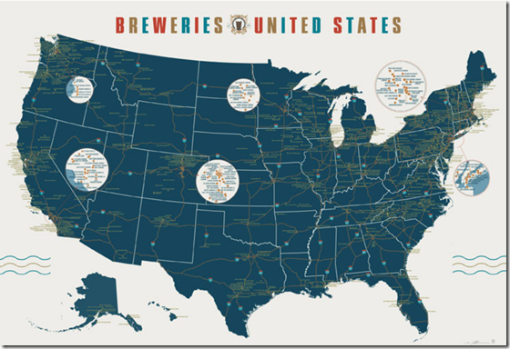
Map of 1000 US Breweries
4 Jun 2012A detailed map from Pop Chart Lab. Has all my favorites on it!
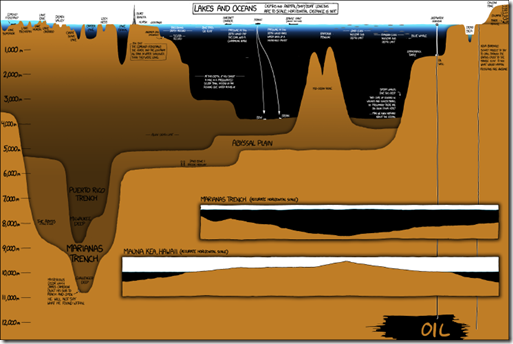
Everyone Go Swimming!
In: Housing Interactive Maps
25 May 2012A nice map of estimated US mortgages underwater (owe more than it’s worth) from Zillow. Interesting data, but the color ranges are too close in hue for my eyes. When I zoomed into Washington DC I couldn’t tell which range was which unless I used the rollover. I also had a question about the data: how could you end up >200% underwater? (via The Big Picture)
Coin World
In: Innovative Maps
20 Apr 2012Evolution of a Political Map
13 Apr 2012A nice progression of intermediate steps in preparing a newspaper map of Santorum’s campaign, using R.
Zombie Apocalypse Map
In: Culture Humor Interactive Maps
11 Apr 2012Use this interactive google-mashup-map to locate emergency supplies in the event of a zombie outbreak. This should help you not walk past guns and supplies like in that stupid Walking Dead show.
Augusta Then and Now
5 Apr 2012A nice look at how each hole has been modified over the years from Historyshots.
Tornados (1950-2011)
4 Apr 2012DC Terrorist Nuke Attack
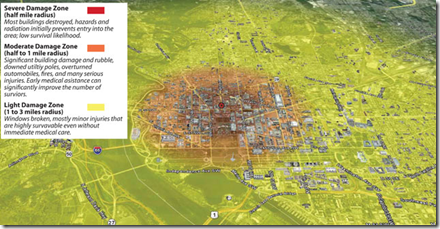
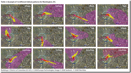
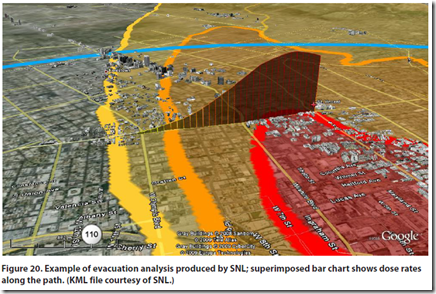
27 Mar 2012A government report analyzed the impact of a ground 10-kiloton explosion in Washington DC. Turns out it wouldn’t be quite as bad as you might think (well, compared to what it would have looked like during the cold war when the scenario was multiple megaton air bursts). The full report contains a number of nice map visualizations of the severe fallout threat. The bad news? I live and work within the “severe damage, lifesaving not likely” region. Oh well…
Geography of Government Benefits
26 Mar 2012Share of income that comes from government programs, broken down by type of benefit. (related article)
Why Gas Prices Vary Across the USA
In: Maps US Economy
23 Mar 2012James Hamilton takes a crack at explaining why gasoline prices vary so much across the country. I think he’s right that taxes, regulations, and transportation explain most of it, but I suspect that refinery shenanigans also play a role. Brad Plumer over at WashPost has additional insights.

(the original version of this map over at Gasbuddy is fun to zoom around in)
New Washington DC Metro Map
In: Maps
19 Mar 2012Not much difference from the old one. Some font and icon changes, and split coloring to indicate rush hour schedule changes.
CityMaps
In: Culture Food Interactive Maps
16 Mar 2012CityMaps is an interactive going out map service– something like a crowdsourced cross between google maps and yelp. Personally I found it to be a disturbing reminder of how surrounded we are by corporations and logos. For a fun game, see how many Starbucks logos you can fit in one screen – my record is eight, below. Currently available for NYC, San Francisco, and Austin.
Map of the US Melting Pot
In: Culture Interactive Maps
14 Mar 2012Bloomberg created this interactive map of heritages according to the 2010 census. You can select any two and see how they compare across the country. It struck me a bit odd that neither “native american” nor “african american” is included – it’s probably some strange dataset problem.
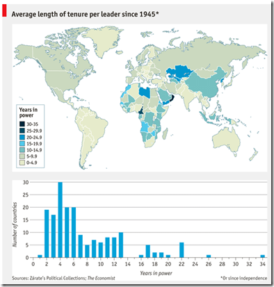
Country Tenure
7 Mar 2012What is Chart Porn?
An addictive collection of beautiful charts, graphs, maps, and interactive data visualization toys -- on topics from around the world.
Categories
- Bailout (118)
- Chartporn Related (3)
- Commentary (21)
- Culture (669)
- Emerging Markets (66)
- Employment (245)
- Environment/weather (133)
- Finance (298)
- Food (92)
- Global Economy (373)
- Graphic Design (bad) (26)
- Graphic Design (general) (183)
- Graphic Tools (23)
- History (158)
- Housing (162)
- Humor (204)
- Innovative (183)
- Interactive (545)
- Internet/tech (97)
- Maps (578)
- News Media (34)
- Politics (329)
- Reference (97)
- Science (331)
- Source: Economist (101)
- Source: FT (92)
- Source: NYT (147)
- Source: Ritholtz (76)
- Source: USA Today (27)
- Source: Washington Post (90)
- Source: WSJ (135)
- Sports (58)
- Stock Market (74)
- Uncategorized (2)
- Updated regularly (76)
- US Economy (553)
- Video (22)
- Aram Korevaar: This chart is now being used as a projection in which countries such as China see themselves as in a [...]
- David: Welcome back Chart Porn! [...]
- J S: Thanks for the great story. Miss reading this blog. Hope to see you more active again. [...]
- jake: I lived in a DC row house for 6 years, and I'm writing this comment from my tiny 1 bedroom apartment [...]
- ronny pettersen: Hilarious and unfortunately accurate... ;-) [...]

