Maps Archive:
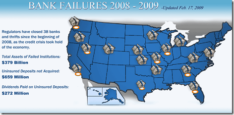
2008 Foreclosures
2 Mar 2009US Housing: 2000 vs 2007
2 Mar 20092009 FDI Projections and IMF Loans
In: Emerging Markets Finance Global Economy Interactive Maps Source: FT
2 Mar 2009Net capital flows to emerging markets are set to drop to $165.3bn this year, down from $928.6bn in 2007, according to the Institute of International Finance. IMF loans are shown on the second tab.
Persian Gulf Investment in Africa
In: Emerging Markets Global Economy Interactive Maps Source: WSJ
23 Feb 2009Interactive map of persian gulf investment in Africa. Related article.
Commodity Price Dive in Latin America
13 Feb 2009WSJ interactive maps/charts of commodity changes in Latin America. Related article.
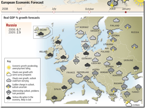
Asia Economic Weather Map
In: Emerging Markets Global Economy Interactive Maps Source: FT
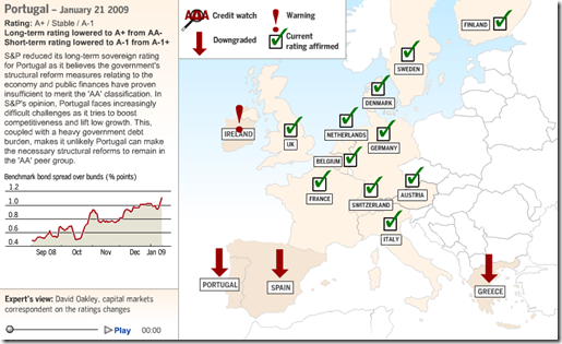
22 Jan 2009European Credit Ratings Map
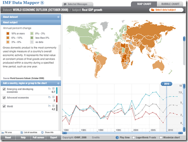
21 Jan 2009IMF Data Mapper
14 Jan 2009The IMF has an interesting interactive mapping tool for several of it’s economic and development datasets.
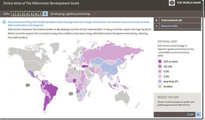
Map of the Millennium Development Goals
13 Jan 2009What is Chart Porn?
An addictive collection of beautiful charts, graphs, maps, and interactive data visualization toys -- on topics from around the world.
Categories
- Bailout (118)
- Chartporn Related (3)
- Commentary (21)
- Culture (669)
- Emerging Markets (66)
- Employment (245)
- Environment/weather (133)
- Finance (298)
- Food (92)
- Global Economy (373)
- Graphic Design (bad) (26)
- Graphic Design (general) (183)
- Graphic Tools (23)
- History (158)
- Housing (162)
- Humor (204)
- Innovative (183)
- Interactive (545)
- Internet/tech (97)
- Maps (578)
- News Media (34)
- Politics (329)
- Reference (97)
- Science (331)
- Source: Economist (101)
- Source: FT (92)
- Source: NYT (147)
- Source: Ritholtz (76)
- Source: USA Today (27)
- Source: Washington Post (90)
- Source: WSJ (135)
- Sports (58)
- Stock Market (74)
- Uncategorized (2)
- Updated regularly (76)
- US Economy (553)
- Video (22)
- Aram Korevaar: This chart is now being used as a projection in which countries such as China see themselves as in a [...]
- David: Welcome back Chart Porn! [...]
- J S: Thanks for the great story. Miss reading this blog. Hope to see you more active again. [...]
- jake: I lived in a DC row house for 6 years, and I'm writing this comment from my tiny 1 bedroom apartment [...]
- ronny pettersen: Hilarious and unfortunately accurate... ;-) [...]


