Maps Archive:
Global Recession Monitor
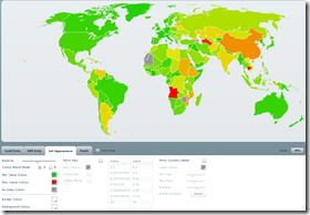
8 Apr 2009From Moody’s. Click on countries for more info. Appears to roughly use the 2 quarters of negative growth definition, based on “current” information(updated as data becomes available).
US Adversity Index
In: Employment Housing Interactive Maps Updated regularly US Economy
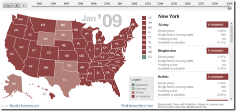
8 Apr 2009For major cities/states, based on employment, housing, and industrial production. Click on the slider to see monthly data back to 1994, click on a state to see cities on the right. (From MSNBC & Moody’s)
Gunnmap has created a nice online tool.
(hat tip to Cool Infographics for the find)
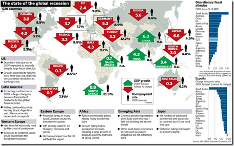
Global Recession Summary
2 Apr 2009Market Tree Map
In: Finance Interactive Maps Reference Stock Market Updated regularly US Economy
2 Apr 2009A tree map of more than 500 stocks, updated every 15 minutes. Click on the roll-over popups to bring up a pretty detailed drill down menu.
Name Wizard
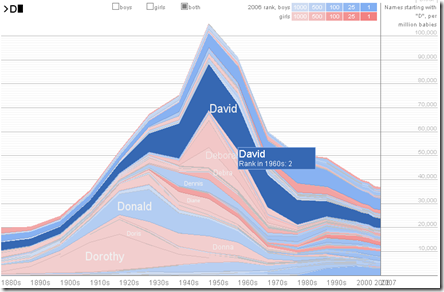
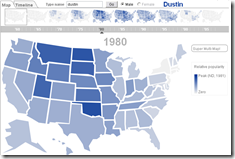
2 Apr 2009The Name Voyager is a classic (2005) interactive chart of the popularity of names from 1880 until today. Just start typing your name and the chart filters and rescales automatically.
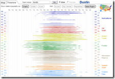
The same people created the NameMapper, which provides a US map or timeline of the name (the timeline in particular has some nifty options):
Stock Market Heat Map
In: Global Economy Interactive Maps Source: WSJ Stock Market US Economy
1 Apr 2009Interactive map of equity market performance (click on tabs to switch between quarters; click on dots for values)
Consumer Loan Balances
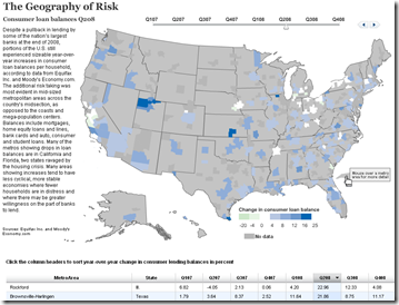
30 Mar 2009(note: appears to have some display problems related to updating the table at the bottom – it takes a few seconds for the map to update)
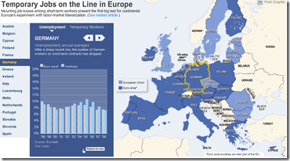
European Unemployment
13 Mar 2009Nice interactive map of european unemployment. Related article.
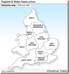
England and Wales House Price Map (Feb 09 data)
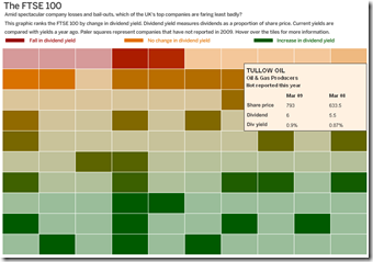
13 Mar 2009FTSE Dividends Heat Map
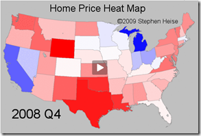
13 Mar 2009US Home Price Heat Map 1975-2008
6 Mar 2009What is Chart Porn?
An addictive collection of beautiful charts, graphs, maps, and interactive data visualization toys -- on topics from around the world.
Categories
- Bailout (118)
- Chartporn Related (3)
- Commentary (21)
- Culture (669)
- Emerging Markets (66)
- Employment (245)
- Environment/weather (133)
- Finance (298)
- Food (92)
- Global Economy (373)
- Graphic Design (bad) (26)
- Graphic Design (general) (183)
- Graphic Tools (23)
- History (158)
- Housing (162)
- Humor (204)
- Innovative (183)
- Interactive (545)
- Internet/tech (97)
- Maps (578)
- News Media (34)
- Politics (329)
- Reference (97)
- Science (331)
- Source: Economist (101)
- Source: FT (92)
- Source: NYT (147)
- Source: Ritholtz (76)
- Source: USA Today (27)
- Source: Washington Post (90)
- Source: WSJ (135)
- Sports (58)
- Stock Market (74)
- Uncategorized (2)
- Updated regularly (76)
- US Economy (553)
- Video (22)
- Aram Korevaar: This chart is now being used as a projection in which countries such as China see themselves as in a [...]
- David: Welcome back Chart Porn! [...]
- J S: Thanks for the great story. Miss reading this blog. Hope to see you more active again. [...]
- jake: I lived in a DC row house for 6 years, and I'm writing this comment from my tiny 1 bedroom apartment [...]
- ronny pettersen: Hilarious and unfortunately accurate... ;-) [...]







G-20 Stimulus Spending
In: Bailout Commentary Finance Global Economy Interactive Maps Source: Washington Post US Economy
30 Mar 2009Related Washington Post article.
Of course, not being in terms of GDP, that isn’t the best perspective.
Here’s the original data from Brookings:
And here’s a nice interactive heatmap of the plans (roll-over for country details):