Maps Archive:
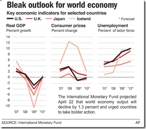
IMF Forecasts
17 May 2009A little old now, but I like this type of multi-indicator chart. The original was part of an AP interactive graphic that included maps.
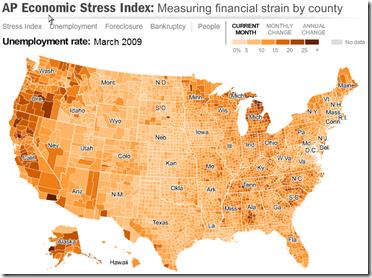
US Economic Stress Index (March 09 data)
17 May 2009More good work from AP. Shows unemployment, foreclosures, bankruptcy, and a composite “stress index”. Double click on a region to zoom in; click&hold to move around.
European GDP Map (Q109)
In: Emerging Markets Global Economy Interactive Maps Source: WSJ
17 May 2009Not much information here – just updated GDP data. Related article.
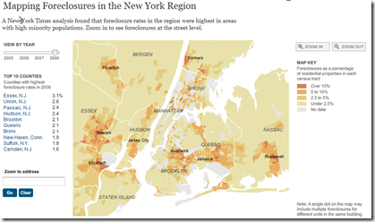
New York Foreclosures
17 May 2009Very detailed interactive map of NY area foreclosures – over time, zoom in, even just type in an address. Related article. (Hat tip to Ritholtz for the find)
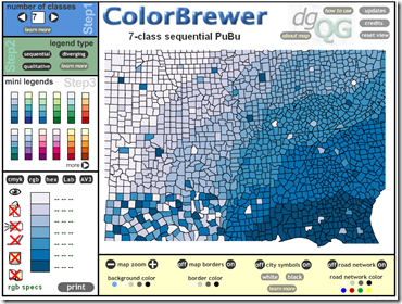
Colors
15 May 2009Picking colors for visualizations is always a tough chore. Cindy Brewer’s ColorBrewer is a helpful tool. Don’t forget to click on the “Learn More” button in each option group to see explanations of categorization and color theory.
European Economic Forecast Map (5/13/09 update)
In: Emerging Markets Global Economy Innovative Maps Source: FT Updated regularly
15 May 2009Click on the timeline at the top to view past versions. Roll over country names to see real GDP growth 2007-10.
Google News Treemap
11 May 2009I could have sworn I posted this before, but it took Kelso’s post to remind me that I hadn’t. It’s a very nice interactive google-news aggregator:
US Job Forecast (4/24/09 update)
In: Employment Interactive Maps Source: USA Today US Economy
11 May 2009Highly interactive display (by sector, region, time) of Moody’s forecast for US employment through 2012.
The Seven Deadly Sins
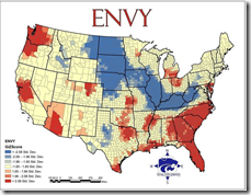
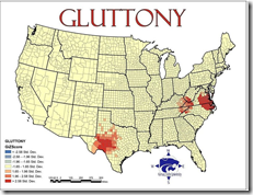
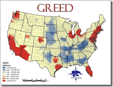
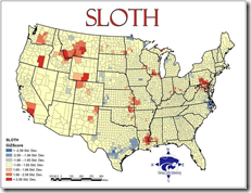
5 May 2009Greed was calculated by comparing average incomes with the total number of inhabitants living beneath the poverty line. Envy was calculated using the total number of thefts – robbery, burglary, larceny and stolen cars. Wrath was calculated by comparing the total number of violent crimes – murder, assault and rape – reported to the FBI per capita. Lust was calculated by compiling the number of sexually transmitted diseases – HIV, AIDS, syphilis, chlamydia and gonorrhea – reported per capita. Gluttony was calculated by counting the number of fast food restaurants per capita. Sloth was calculated by comparing expenditures on arts, entertainment and recreation with the rate of employment. And pride, lastly, is most important. The root of all sins, in this study, is the aggregate of all data. Vought and his Kansas colleagues combined all data from the six other sins and averaged it into an overview of all evil.
Related article with more details. (I couldn’t find the original study "The Spatial Distribution of the Seven Deadly Sins within Nevada” from Kansas State University)
European Economic Map
23 Apr 2009The data’s slightly old, but its a really nice presentation. Click on the different data series in the upper right box to switch between them on the map and graph.
Global Malaria Map
23 Apr 2009Data Density
In: Culture Employment Food Global Economy Housing Innovative Maps Science
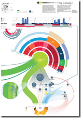
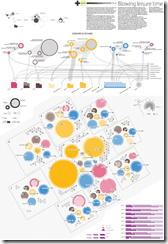
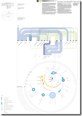
20 Apr 2009Visual Think Map recently turned me onto Design Density‘s Infographics – they include so much information it is almost hard to read them on a computer screen. truly “super-graphics” in Tufte’s meaning of the phrase.
Here’s a few examples on poverty related to housing, leisure, health care & food.
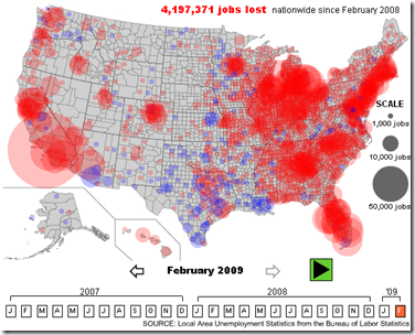
US Unemployment 2007-09
20 Apr 2009A nice interactive map showing the changes by month and the nationwide distribution.
(from Slate, via FlowingData)
Global Equity Performance Map
In: Emerging Markets Finance Global Economy Interactive Maps Source: FT Stock Market Updated regularly US Economy
14 Apr 2009Interactive map displays the performance of all the major global equity markets for today, or versus a selection of time periods (5days/10days/1month/etc up to a year). You can also click on any exchange to drill down to more information.
[Note: There is no direct link to the map (silly java), you have to click on the "Market Macromap" window on this page]
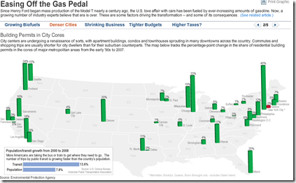
US Gasoline Consumption Falling?
14 Apr 2009Click along the header tabs to view different explanations/indicators of declining gas usage. Related article.
What is Chart Porn?
An addictive collection of beautiful charts, graphs, maps, and interactive data visualization toys -- on topics from around the world.
Categories
- Bailout (118)
- Chartporn Related (3)
- Commentary (21)
- Culture (669)
- Emerging Markets (66)
- Employment (245)
- Environment/weather (133)
- Finance (298)
- Food (92)
- Global Economy (373)
- Graphic Design (bad) (26)
- Graphic Design (general) (183)
- Graphic Tools (23)
- History (158)
- Housing (162)
- Humor (204)
- Innovative (183)
- Interactive (545)
- Internet/tech (97)
- Maps (578)
- News Media (34)
- Politics (329)
- Reference (97)
- Science (331)
- Source: Economist (101)
- Source: FT (92)
- Source: NYT (147)
- Source: Ritholtz (76)
- Source: USA Today (27)
- Source: Washington Post (90)
- Source: WSJ (135)
- Sports (58)
- Stock Market (74)
- Uncategorized (2)
- Updated regularly (76)
- US Economy (553)
- Video (22)
- Aram Korevaar: This chart is now being used as a projection in which countries such as China see themselves as in a [...]
- David: Welcome back Chart Porn! [...]
- J S: Thanks for the great story. Miss reading this blog. Hope to see you more active again. [...]
- jake: I lived in a DC row house for 6 years, and I'm writing this comment from my tiny 1 bedroom apartment [...]
- ronny pettersen: Hilarious and unfortunately accurate... ;-) [...]

