Maps Archive:
US Economic Stress Index (April 09 data)
In: Employment Finance Housing Interactive Maps Updated regularly US Economy
16 Jun 2009AP added to an already good interactive chart this month – you can now click through different periods with the slider at the bottom. The map displays unemployment, foreclosures, bankruptcy, or a composite “stress index”, by county. In the upper right you can change the period the %-change is calculated for. Double click on a region to zoom in; click&hold to move around.
Foreclosures Continue to Rise
14 Jun 2009Click on the image below to see RealtyTracs full report. For discussion I’d recommend the comments over at Ritholtz (some of them – they tend to wander a bit there nowadays).
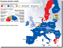
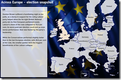
EU Elections
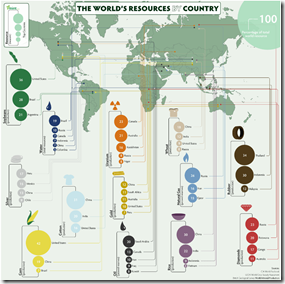
14 Jun 2009Resources by Country
14 Jun 2009The Global GM Picture
In: Bailout Maps US Economy
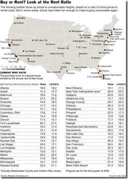
2 Jun 2009Nationwide Rent to Buy Ratios
In: Housing Maps Source: NYT
31 May 2009This data is from a year ago. but I’ve always been fascinated by it. Anyone know where to find more recent data? (yes, I know the source says “Moody’s”)
SubsidyScope Bailout Visualizations
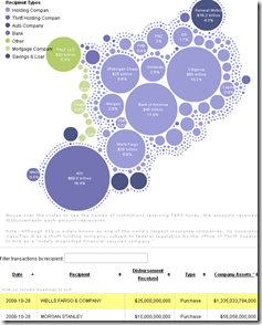
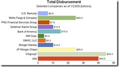
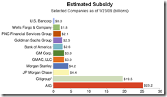
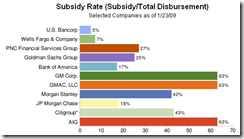
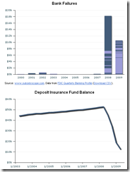
29 May 2009Created by the Pew Charitable Trusts, SubsidyScope.com has some interesting visualizations, and looks to be a great resource for tracking these issues going forward. The blog on the front page is great as well.
Tarp disbursements by recipient or date, and the transaction table at the bottom keeps up with your mouse clicks:
Estimates of the subsidy rates (also a good read on how TARP works):
Value of TARP government warrants:
US Unemployment Map
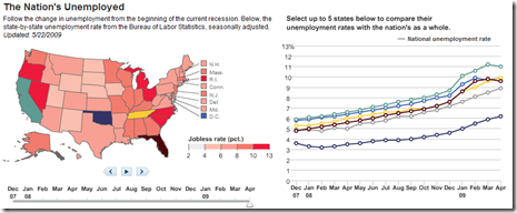
27 May 2009Data from Dec 07- Apr 09. There isn’t too much interesting here, unless you want to compare states using the chart on the right.
Map of Bank Failures Jan-08 to June 09
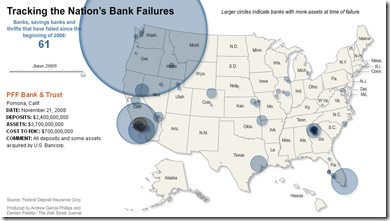
26 May 2009The interesting part are the bubble roll-overs: they show who tookover each bank’s assets, and how much each closure cost the FDIC.
Commitment to Development Index Map (2008)
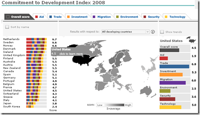
26 May 2009From the Center for Global Development, the Commitment to Development Index (CDI) rates 22 rich countries on how much they help poor countries build prosperity, good government, and security. Each rich country gets scores in seven policy areas, which are averaged for an overall score.
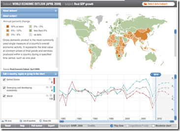
IMF Datamapper Updated with 2009-14 Projections
26 May 2009Updated with data from the latest World Economic Outlook report. Allows drill down, country and aggregate comparisons (via the chart at the bottom), and animation of the last 29 years (to watch the world change). You can also view other datasets (BOP, etc).
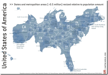
US Population Proportionate Map
26 May 2009Empty Ships: not a green shoot
In: Global Economy Maps
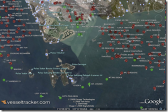
21 May 2009Foreign Policy has an article on how VesselTracker.com uses Google Earth to literally show the stalled world economy in the form of ships sitting idle off the shore of Singapore.
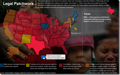
Map Of Same Sex Marriage Laws
19 May 2009What is Chart Porn?
An addictive collection of beautiful charts, graphs, maps, and interactive data visualization toys -- on topics from around the world.
Categories
- Bailout (118)
- Chartporn Related (3)
- Commentary (21)
- Culture (669)
- Emerging Markets (66)
- Employment (245)
- Environment/weather (133)
- Finance (298)
- Food (92)
- Global Economy (373)
- Graphic Design (bad) (26)
- Graphic Design (general) (183)
- Graphic Tools (23)
- History (158)
- Housing (162)
- Humor (204)
- Innovative (183)
- Interactive (545)
- Internet/tech (97)
- Maps (578)
- News Media (34)
- Politics (329)
- Reference (97)
- Science (331)
- Source: Economist (101)
- Source: FT (92)
- Source: NYT (147)
- Source: Ritholtz (76)
- Source: USA Today (27)
- Source: Washington Post (90)
- Source: WSJ (135)
- Sports (58)
- Stock Market (74)
- Uncategorized (2)
- Updated regularly (76)
- US Economy (553)
- Video (22)
- Aram Korevaar: This chart is now being used as a projection in which countries such as China see themselves as in a [...]
- David: Welcome back Chart Porn! [...]
- J S: Thanks for the great story. Miss reading this blog. Hope to see you more active again. [...]
- jake: I lived in a DC row house for 6 years, and I'm writing this comment from my tiny 1 bedroom apartment [...]
- ronny pettersen: Hilarious and unfortunately accurate... ;-) [...]


