Maps Archive:
Where Are We From?
28 Jun 2009I missed this back in march but just spotted a reference at Infographics. The NYT took 120 years of immigration data and threw it perfectly at a map – you can filter by country of origin, then move through time with the slider.
Best State to Be Unemployed?
26 Jun 2009Map of each States’ unemployment benefits. Related article.
Global Boiling
25 Jun 2009Have you taken the time to follow the detailed science behind the global warming debate? Me neither. But I’m starting to read the “Global Climate Change Impacts in the United States” report, which has a number of very effective data visualizations, in addition to laying out all the different climate change arguments. (Thanks to my friend Brad Johnson for pointing out the report.)
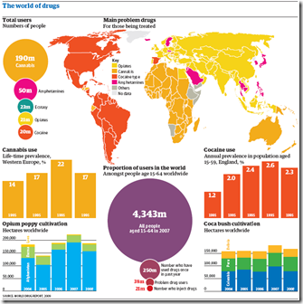
World Drug Report
25 Jun 2009Below is a chart from the UNODC’s 2009 World Drug Report. I focus a lot on media sources and blogs, but a lot of great information visualization is being done by NGOs/thinks tanks/etc.
Hurricanes
22 Jun 2009Two part interactive toy from AP. The first one takes you on a cool animated walk through the 5 point Saffir-Simpson Hurricane scale, simulating the amount of damage along the way. The second maps out the path and category of every hurricane from 1851-2009.
ooops: Missed one, though it’s separate from the others… It includes a map of the empty homes in Florida (from foreclosures, amongst other causes) and animates the types of different types of damage a hurricane can cause (click along the top):
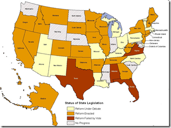
Unemployment Reform
22 Jun 2009Many states are modifying their unemployment benefit laws, some in connection to the recession and some to take advantage of federal stimulus money. Related NYT blog post.
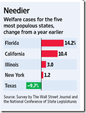
Welfare Rolls Swelling
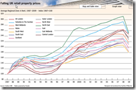
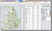
22 Jun 2009UK Retail Property Prices
19 Jun 2009NYC Murder Map
19 Jun 2009Homicide data cut, chopped, sorted, and mapped in all kinds of interesting ways (especially if you live in NYC). Supposedly will be updated regularly. Related article. Hat-tip to Information aesthetics for the find.
Ring Roads of the World
In: Innovative Maps
19 Jun 2009I wish I could find a larger version of this. seems to be lacking a scale too. Strangemaps noticed a few other problems – check out the comments.
Rochester NY Subway?
In: Maps
19 Jun 2009I grew up in Rochester, so this was pretty fascinating to me. I’ve seen references to the abandoned tunnels and always wanted to do some urban spelunking. Originally from rochestersubway.com.
More Auto Data
In: Bailout Maps US Economy
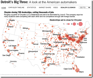
16 Jun 2009Ok, I know we’ve all about had it with visualizations of the history, market share, sales, brands, blah blah blah, concerning the US automotive industry — but here’s one last one from NPR. In addition to the map of Chrysler dealership closings shown below, there are several others of moderate interest if you click on the drop down menu in the upper right.
US Religion Map
16 Jun 2009I should probably send this over to Junk Charts for a proper critique. The transition animations are pretty, and the topic is interesting, but damn there just isn’t anything actually informative popping out at me here that seems worth all that effort. Maybe the data just wasn’t “deep” enough in detail.
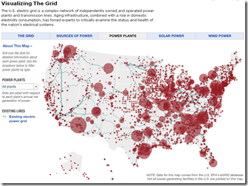
The Grid
16 Jun 2009This interactive map provides obscene amount of information on the structure and composition of the United States electrical grid, including breakdowns by type of power (wind, solar, etc), info roll-overs, potential alternative capacity, and proposed upgrades. Related article(s).
What is Chart Porn?
An addictive collection of beautiful charts, graphs, maps, and interactive data visualization toys -- on topics from around the world.
Categories
- Bailout (118)
- Chartporn Related (3)
- Commentary (21)
- Culture (669)
- Emerging Markets (66)
- Employment (245)
- Environment/weather (133)
- Finance (298)
- Food (92)
- Global Economy (373)
- Graphic Design (bad) (26)
- Graphic Design (general) (183)
- Graphic Tools (23)
- History (158)
- Housing (162)
- Humor (204)
- Innovative (183)
- Interactive (545)
- Internet/tech (97)
- Maps (578)
- News Media (34)
- Politics (329)
- Reference (97)
- Science (331)
- Source: Economist (101)
- Source: FT (92)
- Source: NYT (147)
- Source: Ritholtz (76)
- Source: USA Today (27)
- Source: Washington Post (90)
- Source: WSJ (135)
- Sports (58)
- Stock Market (74)
- Uncategorized (2)
- Updated regularly (76)
- US Economy (553)
- Video (22)
- Aram Korevaar: This chart is now being used as a projection in which countries such as China see themselves as in a [...]
- David: Welcome back Chart Porn! [...]
- J S: Thanks for the great story. Miss reading this blog. Hope to see you more active again. [...]
- jake: I lived in a DC row house for 6 years, and I'm writing this comment from my tiny 1 bedroom apartment [...]
- ronny pettersen: Hilarious and unfortunately accurate... ;-) [...]


