Maps Archive:
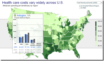
Health Care Map
In: Maps US Economy
9 Jul 2009FlowingData spotted this map of medicare expenditures. Roll overs show details for “hospital referral regions”.
(another) US Unemployment Map
In: Employment Maps Source: NYT Updated regularly US Economy
9 Jul 2009Quite similar to the AP map I mentioned last month, the NYT has created a map of national unemployment (with data through May09). Some of the filters are interesting in this version:
The Global Happy Planet Index
In: Global Economy Maps
8 Jul 20092009 version just released by the New Economics Foundation. The overall index (which measures “the ecological efficiency with which human well being is delivered”) and it’s components (life expectancy, life satisfaction, and some environmental vectors) can be viewed on an interactive map.
European Housing Prices (Q109 update)
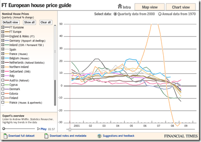
8 Jul 2009In this case, the map view seems not very useful, but the chart view is well done, allowing a view of quarterly data from 2000 as well as annual from 1970. The links to the raw and meta data at the bottom is a nice touch I hope to see more often from everyone. Related article.
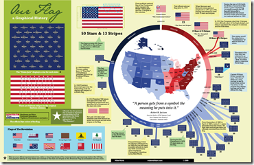
History of Our Flag
5 Jul 2009One more July 4th themed infographic to end the weekend. Spotted by CoolInfographics.
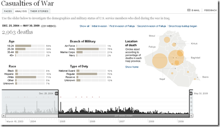
Casualties of War
In: Culture Graphic Design (general) Innovative Interactive Maps Politics Source: NYT
2 Jul 2009The breakdown by age, race, branch, and type of duty is fascinations, and the adjustable time scale is a nice touch.
From the Neolithic till today, filter by country, zoom in to specific historic events, or take a journey based on certain topics. Very well done, from the BBC.
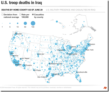
US Troop Deaths in Iraq
2 Jul 2009Iraq Oil
2 Jul 2009Interactive map showing the results of recent oil and gas partnerships/negotiations/auctions. I found the map of the different oil fields interesting – considering how many maps of Iraq we’ve seen in the past 5 years, this is the first time I’ve seen this info. Will be updated over time.
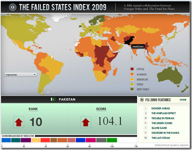
Failed States Index 2009
2 Jul 2009Produced by Foreign Policy. Lots of good analysis in this years report.
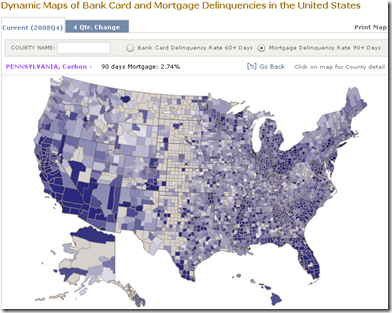
Credit Card and Mortgage Delinquency Map
29 Jun 2009From the NY Fed. Data available by county.
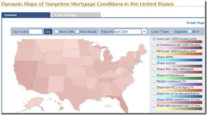
Non-Prime Mortgage Map
29 Jun 2009Produced by the NY Fed, this is an interactive map of non-prime mortgages. You can zoom down by zip code, view either the current or 6 month change, and pick from an assortment of loan-type indicators.
What is Chart Porn?
An addictive collection of beautiful charts, graphs, maps, and interactive data visualization toys -- on topics from around the world.
Categories
- Bailout (118)
- Chartporn Related (3)
- Commentary (21)
- Culture (669)
- Emerging Markets (66)
- Employment (245)
- Environment/weather (133)
- Finance (298)
- Food (92)
- Global Economy (373)
- Graphic Design (bad) (26)
- Graphic Design (general) (183)
- Graphic Tools (23)
- History (158)
- Housing (162)
- Humor (204)
- Innovative (183)
- Interactive (545)
- Internet/tech (97)
- Maps (578)
- News Media (34)
- Politics (329)
- Reference (97)
- Science (331)
- Source: Economist (101)
- Source: FT (92)
- Source: NYT (147)
- Source: Ritholtz (76)
- Source: USA Today (27)
- Source: Washington Post (90)
- Source: WSJ (135)
- Sports (58)
- Stock Market (74)
- Uncategorized (2)
- Updated regularly (76)
- US Economy (553)
- Video (22)
- Aram Korevaar: This chart is now being used as a projection in which countries such as China see themselves as in a [...]
- David: Welcome back Chart Porn! [...]
- J S: Thanks for the great story. Miss reading this blog. Hope to see you more active again. [...]
- jake: I lived in a DC row house for 6 years, and I'm writing this comment from my tiny 1 bedroom apartment [...]
- ronny pettersen: Hilarious and unfortunately accurate... ;-) [...]

