Maps Archive:
Brookings Metro Monitor (Sept 09 report)
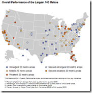
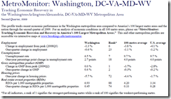
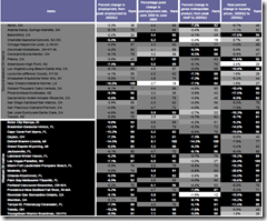
21 Sep 2009Brookings is tracking the economic health of 100 USA metro areas using a variety of indicators. Below are the maps for overall performance and REOs (there are more on the site). You can look up summary reports for individual cities. Also interesting are the rankings, which appear in the appendix of the full report.
Global Debt
In: Global Economy Interactive Maps Politics Source: Economist
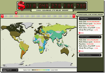
18 Sep 2009From the Economist, an interactive map and clock of global debt (1999-2011). Spotted over at Infectious Greed.
Suburbified New York
In: Culture Maps News Media
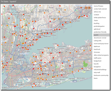
15 Sep 2009“Based on the New York Times ‘Living In‘ columns from the past ten years, this map uses color-coding to represent publication dates and provides a list of common phrases that describe the locations.” The phrases are pretty entertaining.
Rising Health Insurance Costs
In: Interactive Maps Politics
13 Sep 2009Roll over a state to compare costs in 1996 to 2006. Colors show number of uninsured workers (should have shown percentages).
Wildfires
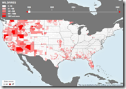
10 Sep 2009Along the lines of the interactive hurricane trackers, but if you click around you also find information on historical trends, how wildfires grow, and even some basic fire ecology info and an explanation of why prescribed fires are a good idea.
News Dots
10 Sep 2009Recent news items illustrated as a giant interactive network map. “Subjects-represented by the circles below-are connected to one another if they appear together in at least two stories, and the size of the dot is proportional to the total number of times the subject is mentioned.” The nice part is you can drill down to the actual news articles on the right. Updated daily by Slate.
Live Storm Tracker
10 Sep 2009Kind of fun, with good roll-overs and animation; only shows current storms and projections. Click on the little hurricane icons around the sides of the map to shift to other storms.
Best Movies of All Time
In: Culture Innovative Maps
10 Sep 2009A clever metro-style map of the top 250 movies of all time (as voted by IMDB users), organized by movie type. Spotted at Dataviz.
Global Diseases
In: Global Economy Interactive Maps Science Updated regularly
10 Sep 2009A map of the “current global state of infectious diseases and their effect on human and animal health.” Filter by country, type of disease, etc. Spotted at Cool Infographics.
Nuclear is Making a Comeback
10 Sep 2009Maps of operational reactors, those under construction, planned, and as a percent of total electricity:
Asia Economic Weather Forecast (Aug. 09 version)
10 Sep 2009Helicopter Crashes
In: Interactive Maps News Media Science Source: Washington Post
21 Aug 2009From a Washington Post article on fatal helicopter accidents. What first looked like just one kind of interesting chart turned out to be three solid ones once you started clicking around. (Thanks to Jane An for pointing them out).
European Economic Weather Map (updated Aug 09)
In: Emerging Markets Global Economy Innovative Interactive Maps Source: FT Updated regularly
21 Aug 2009I’ve been tempted to steal this design many times. it’s a nice way to present mostly qualitative information for a large number of countries – and people understand it intuitively.
Housing: The United States vs Vermont
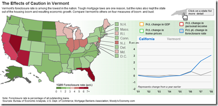
21 Aug 2009Compare some interesting housing variables (foreclosure rate, home price %change, personal income %change, and GDP). The related article talks about Vermont missing the boom and the bust.
Hurricane Season 2009
In: Environment/weather Interactive Maps Science Source: WSJ Updated regularly
21 Aug 2009A map of the paths of several hurricanes. Looks like they plan to update it throughout the hurricane season. This is very similar to the AP tool I mentioned in June.
What is Chart Porn?
An addictive collection of beautiful charts, graphs, maps, and interactive data visualization toys -- on topics from around the world.
Categories
- Bailout (118)
- Chartporn Related (3)
- Commentary (21)
- Culture (669)
- Emerging Markets (66)
- Employment (245)
- Environment/weather (133)
- Finance (298)
- Food (92)
- Global Economy (373)
- Graphic Design (bad) (26)
- Graphic Design (general) (183)
- Graphic Tools (23)
- History (158)
- Housing (162)
- Humor (204)
- Innovative (183)
- Interactive (545)
- Internet/tech (97)
- Maps (578)
- News Media (34)
- Politics (329)
- Reference (97)
- Science (331)
- Source: Economist (101)
- Source: FT (92)
- Source: NYT (147)
- Source: Ritholtz (76)
- Source: USA Today (27)
- Source: Washington Post (90)
- Source: WSJ (135)
- Sports (58)
- Stock Market (74)
- Uncategorized (2)
- Updated regularly (76)
- US Economy (553)
- Video (22)
- Aram Korevaar: This chart is now being used as a projection in which countries such as China see themselves as in a [...]
- David: Welcome back Chart Porn! [...]
- J S: Thanks for the great story. Miss reading this blog. Hope to see you more active again. [...]
- jake: I lived in a DC row house for 6 years, and I'm writing this comment from my tiny 1 bedroom apartment [...]
- ronny pettersen: Hilarious and unfortunately accurate... ;-) [...]

