Maps Archive:
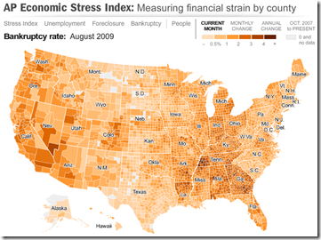
The well designed map displays unemployment, foreclosures, bankruptcy, or a composite “stress index”, by county. In the upper right you can change the period the %-change is calculated for (try it, it’s pretty nifty). To look at data over time, click on the “Oct.2007 to present” option and a historical slider will appear at the bottom (very slick to play with). Double click on a region to zoom in; click & hold to move around.
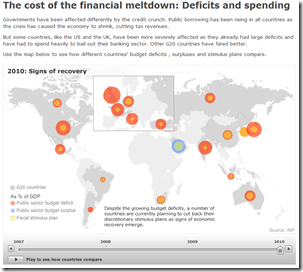
G20 Financial Support
5 Oct 2009It’s unclear what the vintage of the data is, but the below map shows G20 crisis spending. Thanks to Silona for the heads up.
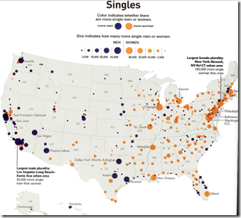
A little old (circa 2007), and probably the wrong thing to follow that last post with, but here’s a map of where the ratios of single men-to-women are imbalanced in America. Have a nice weekend!
FDI Flows
2 Oct 2009A map of foreign direct investment inflows, in percent of GDP. Somewhat oddly, you have to click on the different ratio ranges at the bottom to color the relevant countries – at a minimum, they should have included the option to see the whole map (all ranges) colored at once.
Death in America
2 Oct 2009Great: Washington DC has the lowest life expectancy in the country. Thanks to FlowingData for depressing me on a Friday. Interestingly, today’s Guardian says that babies born today are likely to live to be 100 years old.
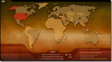
CO2 Emissions Simulator
30 Sep 2009Breathing Earth’s “real-time simulation displays the CO2 emissions of every country in the world, as well as their birth and death rates.” Also has good links on climate change info. (via)
People Still Try to Ban Books?
30 Sep 2009A map of cases where people tried to get books removed from libraries or reading lists 2007-2009. Click on the items to drill down to descriptions of the different cases. Scary! Spotted at one of my newest favorite blogs: Sociological Images.
The World According to Ronald Reagan
30 Sep 2009An oldie but a goodie, dug up by Kelso’s Corner.
Airline Delays
In: Culture Interactive Maps
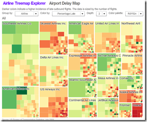
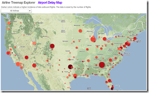
30 Sep 2009Juice Analytics has put together two visualizations of air travel.
The first is a treemap where size equals number of flights, and you can filters the color to either indicate number or type of delays.
The second is a map showing the number of flights and the delay statistics. (note, click on “Airport Delay Map” in the title to switch to the map)
Real Competition
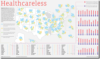
30 Sep 2009Good has put together a good data filled map illustrating how little regional competition there is between insurance companies.
Death of Detroit
In: Culture Maps US Economy
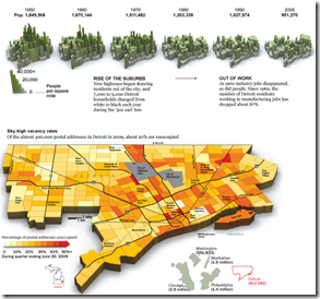
25 Sep 2009Half the population has left (since 1950). Unemployment is at 29%. Average price of a house: $15 thousand. Related article. Beautiful horrible photos.
State of the Union
In: Culture Housing Maps US Economy
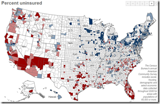
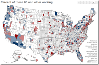
25 Sep 2009A number of interesting maps: percent of people uninsured (below), percent of people 65+ years old still working (below), median income, homeowners, percent of carpoolers, commute time.
EU Expenditure
In: Emerging Markets Global Economy Interactive Maps Politics
24 Sep 2009EU 2007 spending by country, or on a map. (via)
Twitter Trends Map
In: Culture Interactive Maps
23 Sep 2009Real time interactive map of tweets. Scroll in and see what people are talking about around the world.
Mickey-D Map
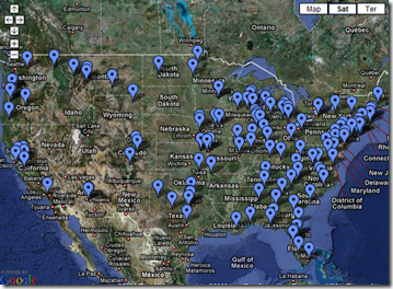
23 Sep 2009A map of the United States, colored by the distance to the nearest McDonalds. In case you were wondering, the furthest point from a McDonalds you can get to in the country is 107 miles (145 miles by car).
What is Chart Porn?
An addictive collection of beautiful charts, graphs, maps, and interactive data visualization toys -- on topics from around the world.
Categories
- Bailout (118)
- Chartporn Related (3)
- Commentary (21)
- Culture (669)
- Emerging Markets (66)
- Employment (245)
- Environment/weather (133)
- Finance (298)
- Food (92)
- Global Economy (373)
- Graphic Design (bad) (26)
- Graphic Design (general) (183)
- Graphic Tools (23)
- History (158)
- Housing (162)
- Humor (204)
- Innovative (183)
- Interactive (545)
- Internet/tech (97)
- Maps (578)
- News Media (34)
- Politics (329)
- Reference (97)
- Science (331)
- Source: Economist (101)
- Source: FT (92)
- Source: NYT (147)
- Source: Ritholtz (76)
- Source: USA Today (27)
- Source: Washington Post (90)
- Source: WSJ (135)
- Sports (58)
- Stock Market (74)
- Uncategorized (2)
- Updated regularly (76)
- US Economy (553)
- Video (22)
- Aram Korevaar: This chart is now being used as a projection in which countries such as China see themselves as in a [...]
- David: Welcome back Chart Porn! [...]
- J S: Thanks for the great story. Miss reading this blog. Hope to see you more active again. [...]
- jake: I lived in a DC row house for 6 years, and I'm writing this comment from my tiny 1 bedroom apartment [...]
- ronny pettersen: Hilarious and unfortunately accurate... ;-) [...]

