Maps Archive:
Timeline of recession and recovery (the Adversity Index) from Moodys/MSNBC (1995-2009). You can drill down to individual metro areas by clicking on a state. The Adversity Index page has a number of related articles.
There’s also a map of “recession resistant areas” (has had no more than 9 months of recession over the past 15 years).
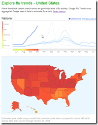
Google Flu Trends
In: Interactive Maps Science
25 Oct 2009Google uses aggregated google search data to estimate flu activity around the world (for 21 countries at the moment).
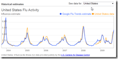
Do you doubt the accuracy of this method? There’s a chart comparing historical CDC reports to the google method:
Health Care Demographics
25 Oct 2009The content is interesting, but I’m posting it just as much for being a good example of “many smalls” design, in this case small maps. (via)
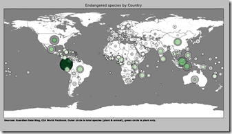
Endangered Species Map
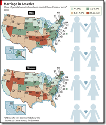
25 Oct 2009If at First (or second) You Don’t Succeed
21 Oct 2009Percent of population that has been married three times or more (of those that have ever been married).
Coal Plants
21 Oct 2009Coal is central to a lot of energy and environment issues, but I’d never seen a map of where they were.
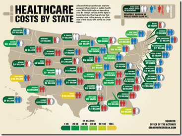
Health Spending Map
In: Maps Politics US Economy
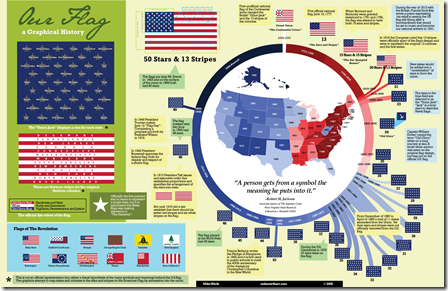
20 Oct 2009Stars and Stripes
20 Oct 2009More trivia than you can shake a flag at. (via)
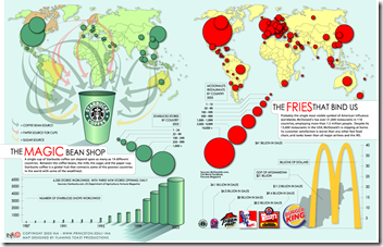
Human Transportation
20 Oct 2009Similar in concept to the US McDonalds map, this map colors how long it takes to get to a city of 50,000 people from any location in the world. (via Simple Complexity & Visual Complexity)
the same New Scientist gallery has a map of roads, trains, shipping lanes, and navigable rivers (we’re pretty much everywhere).

BBC G20
In: Bailout Emerging Markets Finance Global Economy Interactive Maps Politics US Economy
19 Oct 2009A bit dated as these were prepared in the lead up to the Pittsburgh summit a few weeks ago. Worth passing on nonetheless.
A checklist of the G20’s April London Summit pledges and whether they’ve been fulfilled. Included some nice graphics on IMF and tax reforms.
G20 Stimulus and Fiscal Deficit map. Use the slider to look at the changes 2007-2010. Mouse over a country to view popup data details.
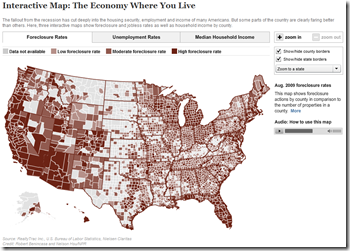
NPR Economy Map
18 Oct 2009Foreclosures, unemployment, and median household income. The scales are a little vague on two of the maps — but it’s ok for broad comparative purposes.
Stimulate Those Jobs
In: Bailout Employment Innovative Interactive Maps Source: USA Today US Economy
16 Oct 2009A funky little interactive map from USA Today. Click on a state on the map and the appropriate little dot on the sorted chart on the right will highlight to show you it’s ranking. When you change the indicator using the drop down box at the top (jobs created/total funds awarded/total funds received/unemployment rate) the dots in the chart all bounce around and resort themselves.
Blog Action Day 2009: Climate Change
15 Oct 2009In honor of today being 2009’s Blog Action Day, I present below a series of recent climate change visualizations:
First up, “Kyoto: Who’s on Target”, which uses interesting nested circles for indicators of compliance. (via)
From the Washington Post, an interactive view of carbon emissions from G20 countries (either total or per capita) with a slider to move from 1950 through 2006. Easily missed, you can also click on a countries name on a list below that bubble chart (or on the “country profile” tab) to drilldown to individual countries. The October 5 part of the “special report” also contained a nice overview map.
Next, a treemap of cumulative CO2 emissions (1751-2006):
Breathing Earth‘s CO2 emissions simulator:
another interactive CO2 emissions map:
and if you doubt what effects CO2 levels are having, and whether global warming is something to worry about, please go read the “Global Climate Change Impacts in the United States” report.
or take a look at the Climate Orb, which is gathering stories of environmental impacts around the globe:
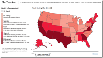
Flu Tracker
In: Maps Science Source: WSJ
8 Oct 2009There are a lot of these maps out there. This one is interesting because the historical week-by-week animation illustrates the seasonality of the outbreak.
What is Chart Porn?
An addictive collection of beautiful charts, graphs, maps, and interactive data visualization toys -- on topics from around the world.
Categories
- Bailout (118)
- Chartporn Related (3)
- Commentary (21)
- Culture (669)
- Emerging Markets (66)
- Employment (245)
- Environment/weather (133)
- Finance (298)
- Food (92)
- Global Economy (373)
- Graphic Design (bad) (26)
- Graphic Design (general) (183)
- Graphic Tools (23)
- History (158)
- Housing (162)
- Humor (204)
- Innovative (183)
- Interactive (545)
- Internet/tech (97)
- Maps (578)
- News Media (34)
- Politics (329)
- Reference (97)
- Science (331)
- Source: Economist (101)
- Source: FT (92)
- Source: NYT (147)
- Source: Ritholtz (76)
- Source: USA Today (27)
- Source: Washington Post (90)
- Source: WSJ (135)
- Sports (58)
- Stock Market (74)
- Uncategorized (2)
- Updated regularly (76)
- US Economy (553)
- Video (22)
- Aram Korevaar: This chart is now being used as a projection in which countries such as China see themselves as in a [...]
- David: Welcome back Chart Porn! [...]
- J S: Thanks for the great story. Miss reading this blog. Hope to see you more active again. [...]
- jake: I lived in a DC row house for 6 years, and I'm writing this comment from my tiny 1 bedroom apartment [...]
- ronny pettersen: Hilarious and unfortunately accurate... ;-) [...]


