Maps Archive:
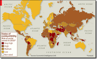
2010 Social Unrest
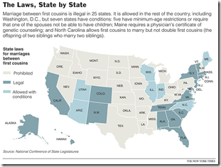
28 Dec 2009Apparently, marrying your first cousin is legal in 25 states. The related article talks about whether the risks are real. (via)
Why are Europeans White? Cereal?!
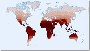
14 Dec 2009Using maps to investigate a simple puzzle. (via)
Four Degrees? So what?
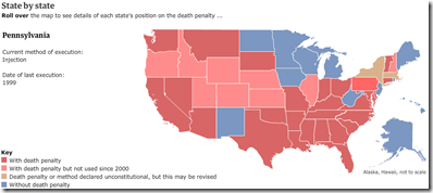
14 Dec 2009Death Penalty
14 Dec 2009Climate Anomalies, 2007-09
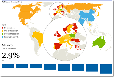
14 Dec 2009Recovery?
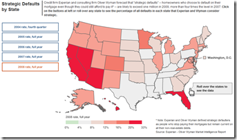
14 Dec 2009Strategic Defaults
14 Dec 2009Copenhagen
In: Environment/weather Interactive Maps Science Source: NYT
9 Dec 2009Who Can Afford to Live in NYC?
2 Dec 2009Click on any section of NYC to see the income distribution in that area, and what the average rents are. (via)
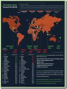
Freedom of Labor
1 Dec 2009Oil and Gas Executive Pay
1 Dec 2009A fairly detailed analysis of pay vs performance. You can pick from 10 indicators of compensation and 8 indicators of corporate performance. Click on any bubble to popup details of that company and executive. Related article.
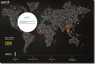
Aids Research
1 Dec 2009Interactive map of the activities of the amfAR organization in 2008.
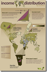
Income Distribution
In: Global Economy Maps
29 Nov 2009What is Chart Porn?
An addictive collection of beautiful charts, graphs, maps, and interactive data visualization toys -- on topics from around the world.
Categories
- Bailout (118)
- Chartporn Related (3)
- Commentary (21)
- Culture (669)
- Emerging Markets (66)
- Employment (245)
- Environment/weather (133)
- Finance (298)
- Food (92)
- Global Economy (373)
- Graphic Design (bad) (26)
- Graphic Design (general) (183)
- Graphic Tools (23)
- History (158)
- Housing (162)
- Humor (204)
- Innovative (183)
- Interactive (545)
- Internet/tech (97)
- Maps (578)
- News Media (34)
- Politics (329)
- Reference (97)
- Science (331)
- Source: Economist (101)
- Source: FT (92)
- Source: NYT (147)
- Source: Ritholtz (76)
- Source: USA Today (27)
- Source: Washington Post (90)
- Source: WSJ (135)
- Sports (58)
- Stock Market (74)
- Uncategorized (2)
- Updated regularly (76)
- US Economy (553)
- Video (22)
- Aram Korevaar: This chart is now being used as a projection in which countries such as China see themselves as in a [...]
- David: Welcome back Chart Porn! [...]
- J S: Thanks for the great story. Miss reading this blog. Hope to see you more active again. [...]
- jake: I lived in a DC row house for 6 years, and I'm writing this comment from my tiny 1 bedroom apartment [...]
- ronny pettersen: Hilarious and unfortunately accurate... ;-) [...]

