Maps Archive:
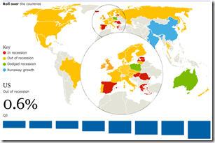
Recovery? (Jan 10 ver)
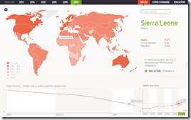
26 Jan 2010Global Health, Living Standards, and Education
25 Jan 2010A nice interactive display of rankings based on UNDP data. (via VizWorld)
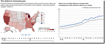
Unemployment
25 Jan 2010Bing Destination Maps
20 Jan 2010Sending directions to a party? Want to embed a funky map somewhere? Bing now offers “Destination maps” that look like a choice of four stylistic hand drawings. The production interface is a little clunky, and the result doesn’t appear to allow for quick access to directions, but I think the result is pretty cool. Apparently this is only one of Bing’s new “Map Apps” (click on the button at the bottom of that page)
New Haiti Satellite Pictures
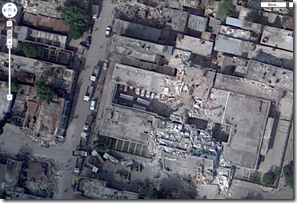
20 Jan 2010Google has released a series of higher quality satellite pictures taken on Jan 17th. Crazy resolution of the destruction.
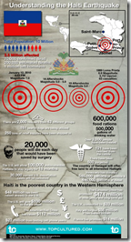
Understanding Haiti’s Earthquakes
20 Jan 2010BRICs 2007-14
In: Emerging Markets Global Economy Interactive Maps Source: FT US Economy
17 Jan 2010Haiti
In: Culture Environment/weather Global Economy Maps Science Source: NYT Source: USA Today Source: Washington Post Source: WSJ
15 Jan 2010Crazy amount of damage. and Haiti wasn’t in very good shape to start with. I’ll keep adding finds to this same post as I come across them.
I kept hearing that the shipping port was out of commission and was wondering what exactly that meant. Here it is. (via Washington Post print edition) 
Damage zone and location of aftershocks : 
Faultlines, cities, population density, shaking: 
Zoomable satellite map of Port-au-Prince from 10:30 Wednesday:
NYT side-by-side before and after satellite pictures: 
Languages
In: Culture Interactive Maps
13 Jan 2010Maps of the different languages spoken in the USA. Via a discussion at Sociological Images which also critiques the methodology a bit.
Spanish:
You can also do side-by-side comparisons. French vs Spanish in New York: 
As much as I dislike pie charts, I like the simple information here and the popup detail mediates somewhat the radial perception issues.
Netflix Map
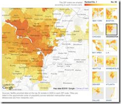
10 Jan 2010Most rented and least rented movies in major metro areas. Roll over to view details by zipcode. Clearly contains some errors though. Benjamin Button was No1 and True Blood season 1 was 47? Thanks to Jack Lucky for pointing it out.
2010 House Elections
8 Jan 2010The infamous election maps begin to spawn… This one includes fairly detailed analysis of the close races.
Overlapping Management
7 Jan 2010The overlapping memberships of 15 Fortune 500 board members. (From 2008) The site allows construction of all kinds of people-maps (bands, funerals, etc).
Climate Wizard
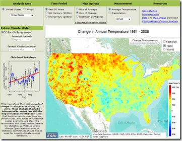
6 Jan 2010Take a look at temperature changes over the past 50 years, then select from several different models to simulate changes for the next 100. Produced by the Nature Conservancy, University of Washington, and University of Southern Mississippi, the amount of detail and explanation is welcome versus some of the more popular projection maps out there. (via)
NYC Subway Travel Times
4 Jan 2010Enter an address on the triptrop site and a Googlemap will come up overlaid with subway travel times to various part of NYC. (via)
What is Chart Porn?
An addictive collection of beautiful charts, graphs, maps, and interactive data visualization toys -- on topics from around the world.
Categories
- Bailout (118)
- Chartporn Related (3)
- Commentary (21)
- Culture (669)
- Emerging Markets (66)
- Employment (245)
- Environment/weather (133)
- Finance (298)
- Food (92)
- Global Economy (373)
- Graphic Design (bad) (26)
- Graphic Design (general) (183)
- Graphic Tools (23)
- History (158)
- Housing (162)
- Humor (204)
- Innovative (183)
- Interactive (545)
- Internet/tech (97)
- Maps (578)
- News Media (34)
- Politics (329)
- Reference (97)
- Science (331)
- Source: Economist (101)
- Source: FT (92)
- Source: NYT (147)
- Source: Ritholtz (76)
- Source: USA Today (27)
- Source: Washington Post (90)
- Source: WSJ (135)
- Sports (58)
- Stock Market (74)
- Uncategorized (2)
- Updated regularly (76)
- US Economy (553)
- Video (22)
- Aram Korevaar: This chart is now being used as a projection in which countries such as China see themselves as in a [...]
- David: Welcome back Chart Porn! [...]
- J S: Thanks for the great story. Miss reading this blog. Hope to see you more active again. [...]
- jake: I lived in a DC row house for 6 years, and I'm writing this comment from my tiny 1 bedroom apartment [...]
- ronny pettersen: Hilarious and unfortunately accurate... ;-) [...]

