Maps Archive:
The Female Sex Drive
25 Feb 2010More great work from okCupid in the same article “The Case for an Old Woman“. I’m posting it separately because of the great charts.
First up, a map of “Ideally, how often would you have sex?”. (Move the slider to change the age) 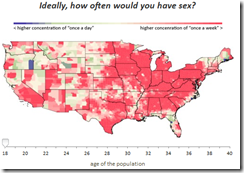
Is contraception morally wrong: 
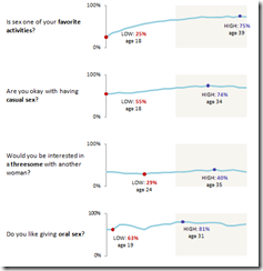
Sparklines of preferences:
We are FAT
19 Feb 2010The CDC has a number of maps tracking rising obesity levels (1985-2008). Thanks to Allison for passing them on.
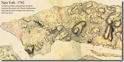
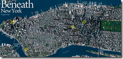
NYC 1782 vs Today
17 Feb 2010Use the blue slider in the lower right to fade between a 1782 map that shows old streams and hills, and a modern map.
Native American Names
In: Culture Interactive Maps
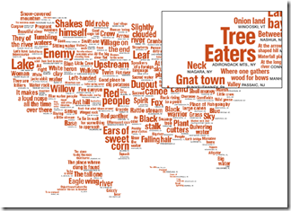
17 Feb 2010A cool interactive map that shows the translation of many US geographic names that have native american origins.
Global Climate Dashboard
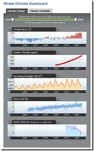
17 Feb 2010From NOAA. Nice quick display of data and indices.
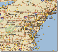
They also have an interactive Map of weather stations from which you can download raw data:
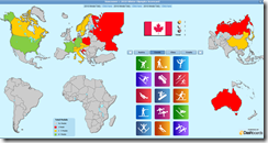
Olympic Dashboard
In: Culture Interactive Maps
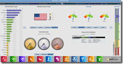
17 Feb 2010Highly stylized. Too many of the controls seem to be conveying the same information. (via)
There’s also a map version:
Israeli Settlements in the West Bank
9 Feb 2010An impressively detailed mapping analysis of settlements in disputed territories over time. Related article.
DC Metro (1976-2010)
In: Maps
9 Feb 2010Heavy Medal
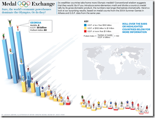
2 Feb 2010Interactive bar chart of Olympic medals divided by GDP. Rollover for details. (via VizWorld)
Crowdsourcing Crisis Management
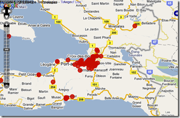
31 Jan 2010Several articles about the Ushahidi system : TED blog. Washington post. Guardian.
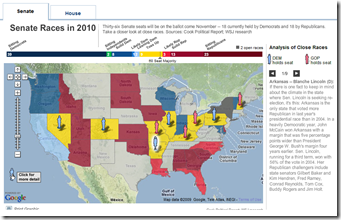
Election 2010
In: Maps Politics Source: WSJ
31 Jan 2010Winter Weather – ummmm and More Weather
In: Environment/weather Interactive Maps Science Source: USA Today
29 Jan 2010I think most of us absorbed this in earth science class, but if you need a refresher on how different air layers create different types of precipitation, here it is. (Also, the animations are quite pretty).
Looking around the site it turns out this is just one in a very large series of weather related interactives. Check it out. Some very cool stuff, including my hometown favorite: Lake Effect Snow (Irondequoit, NY).
World Bailouts and Stimulus
In: Bailout Finance Global Economy Maps Source: Ritholtz US Economy
27 Jan 2010Powerful summary from the Harvard Business Review (hardcopy apparently) via The Big Picture.
What is Chart Porn?
An addictive collection of beautiful charts, graphs, maps, and interactive data visualization toys -- on topics from around the world.
Categories
- Bailout (118)
- Chartporn Related (3)
- Commentary (21)
- Culture (669)
- Emerging Markets (66)
- Employment (245)
- Environment/weather (133)
- Finance (298)
- Food (92)
- Global Economy (373)
- Graphic Design (bad) (26)
- Graphic Design (general) (183)
- Graphic Tools (23)
- History (158)
- Housing (162)
- Humor (204)
- Innovative (183)
- Interactive (545)
- Internet/tech (97)
- Maps (578)
- News Media (34)
- Politics (329)
- Reference (97)
- Science (331)
- Source: Economist (101)
- Source: FT (92)
- Source: NYT (147)
- Source: Ritholtz (76)
- Source: USA Today (27)
- Source: Washington Post (90)
- Source: WSJ (135)
- Sports (58)
- Stock Market (74)
- Uncategorized (2)
- Updated regularly (76)
- US Economy (553)
- Video (22)
- Aram Korevaar: This chart is now being used as a projection in which countries such as China see themselves as in a [...]
- David: Welcome back Chart Porn! [...]
- J S: Thanks for the great story. Miss reading this blog. Hope to see you more active again. [...]
- jake: I lived in a DC row house for 6 years, and I'm writing this comment from my tiny 1 bedroom apartment [...]
- ronny pettersen: Hilarious and unfortunately accurate... ;-) [...]

