Maps Archive:
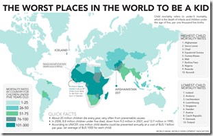
Worst Places in the World to be a Kid
22 Mar 2010Only counts child mortality. (via)
Best Cities for Working Mothers
22 Mar 2010Eleven indicator rankings, based on Forbes research.
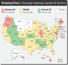
Average Driving Speeds
22 Mar 2010Based on data collected (voluntarily) by TomTom. Related WSJ article.
The original data from Tela Atlas also has some interesting maps:
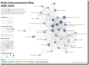
Risk Interconnection Map
In: Graphic Design (general) Innovative Interactive Maps Politics
21 Mar 2010From the World Economic Forum, based on this year’s Global Risk report. Thanks to Sean R. for passing it on!
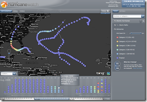
Hurricane Watch
20 Mar 2010Global Mergers and Acquisitions (2000-09)
18 Mar 2010A particularly useless pie chart, but the map and table are interesting to use with the timeline slider.
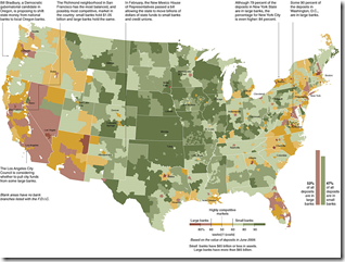
Bank Competition Map
16 Mar 2010Big banks vs small. (via)
NYC’s Best Coffee
14 Mar 2010I don’t know what standard they used, but the NYT has mapped out NYC’s “outstanding coffee bars.” (I hate coffee so didn’t bother to read the related article)
Rock-n-Roll Metro Map
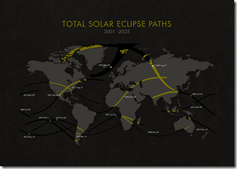
14 Mar 2010Solar Eclipse Map 2001-25
14 Mar 20101870 Census Maps
10 Mar 201054 maps and charts. The level of detail and sophistication is pretty damn impressive for the period. (again from Radical Cartography — can you tell I’m digging through that site? Love it.)
Map Projections
10 Mar 2010A lot of people are familiar with the distortions of the standard Mercator projection, but Radical Cartography has a pretty comprehensive annotated library for browsing if you’re into that sort of thing.
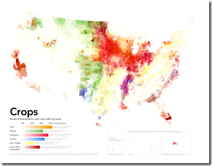
Food Maps
In: Food Global Economy Maps
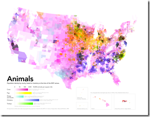
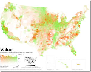
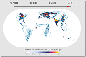
10 Mar 2010Cool maps of farming, via Sociological images and F.A.D (check them out for some discussion), originally from Radical Cartography.
What is Chart Porn?
An addictive collection of beautiful charts, graphs, maps, and interactive data visualization toys -- on topics from around the world.
Categories
- Bailout (118)
- Chartporn Related (3)
- Commentary (21)
- Culture (669)
- Emerging Markets (66)
- Employment (245)
- Environment/weather (133)
- Finance (298)
- Food (92)
- Global Economy (373)
- Graphic Design (bad) (26)
- Graphic Design (general) (183)
- Graphic Tools (23)
- History (158)
- Housing (162)
- Humor (204)
- Innovative (183)
- Interactive (545)
- Internet/tech (97)
- Maps (578)
- News Media (34)
- Politics (329)
- Reference (97)
- Science (331)
- Source: Economist (101)
- Source: FT (92)
- Source: NYT (147)
- Source: Ritholtz (76)
- Source: USA Today (27)
- Source: Washington Post (90)
- Source: WSJ (135)
- Sports (58)
- Stock Market (74)
- Uncategorized (2)
- Updated regularly (76)
- US Economy (553)
- Video (22)
- Aram Korevaar: This chart is now being used as a projection in which countries such as China see themselves as in a [...]
- David: Welcome back Chart Porn! [...]
- J S: Thanks for the great story. Miss reading this blog. Hope to see you more active again. [...]
- jake: I lived in a DC row house for 6 years, and I'm writing this comment from my tiny 1 bedroom apartment [...]
- ronny pettersen: Hilarious and unfortunately accurate... ;-) [...]

