Maps Archive:
Global Debt Map
11 Apr 2010Countries re-sized in proportion to government debt. (via)
UK Swing
8 Apr 2010Lots of people appear to be concerned with the potential “swing” in the upcoming UK elections.
BBC’s interactive “Swingometer”: 
Opinion polls (with nice interactive features): 
I don’t know who copied who, but the Guardian also has it’s own “swingometer” (move the dot on the little pie chart on the right to adjust swing amount) and interactive poll-chart. 
Tweeking DC’s Metro Map
In: Maps
7 Apr 2010Designer Cameron Booth takes a crack at improving the iconic Washington DC Metro Map. It also shows where the new Silver Line to Dulles airport will be constructed. The comments are worth a read if you’re a graphic designer.
AP Economic Stress Map (March ‘10 update)
6 Apr 2010The map displays unemployment, foreclosures, bankruptcy, or a composite “stress index”, by county. Easy to miss: in the upper right you can change the scale of the mapping (rates, m-t-m, y-t-y). To look at data over time, click on the “monthly rates” option and a historical slider will appear at the bottom. Double click on a region to zoom in; click & hold to move around, point at a county for popup detail.
G20 Interest Rates
6 Apr 2010NY Cabs – Where to Find One
5 Apr 2010Interactive map of cab pickups in NYC Jan-Mar, 2009, based on millions of taxi trips. Apparently they also used the data to create a phone app. (via FlowingData).
Housing Booms and Busts
31 Mar 2010Although this NY FED article is primarily focused on explaining Upstate NY’s immunity from the boom/bust cycle, it includes some interesting analysis of nation wide trends. (via The Big Picture).
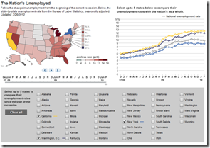
US Unemployment (updated 3/26/10)
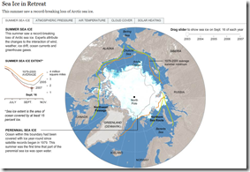
28 Mar 2010Sea Ice in Retreat?
In: Environment/weather Interactive Maps Science Source: NYT
25 Mar 2010I really liked the below NYT feature until I realized it was from 2007.
Looking around, I found this quicktime movie that shows 1979-2009:
So 2007 was a bad year, but now it’s rebounding? Well, not really.
So is it melting or not? I recommend watching the below:
China: International Investment (2004-08)
23 Mar 2010Banks at Risk
23 Mar 2010What is Chart Porn?
An addictive collection of beautiful charts, graphs, maps, and interactive data visualization toys -- on topics from around the world.
Categories
- Bailout (118)
- Chartporn Related (3)
- Commentary (21)
- Culture (669)
- Emerging Markets (66)
- Employment (245)
- Environment/weather (133)
- Finance (298)
- Food (92)
- Global Economy (373)
- Graphic Design (bad) (26)
- Graphic Design (general) (183)
- Graphic Tools (23)
- History (158)
- Housing (162)
- Humor (204)
- Innovative (183)
- Interactive (545)
- Internet/tech (97)
- Maps (578)
- News Media (34)
- Politics (329)
- Reference (97)
- Science (331)
- Source: Economist (101)
- Source: FT (92)
- Source: NYT (147)
- Source: Ritholtz (76)
- Source: USA Today (27)
- Source: Washington Post (90)
- Source: WSJ (135)
- Sports (58)
- Stock Market (74)
- Uncategorized (2)
- Updated regularly (76)
- US Economy (553)
- Video (22)
- Aram Korevaar: This chart is now being used as a projection in which countries such as China see themselves as in a [...]
- David: Welcome back Chart Porn! [...]
- J S: Thanks for the great story. Miss reading this blog. Hope to see you more active again. [...]
- jake: I lived in a DC row house for 6 years, and I'm writing this comment from my tiny 1 bedroom apartment [...]
- ronny pettersen: Hilarious and unfortunately accurate... ;-) [...]


