Maps Archive:
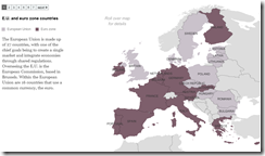
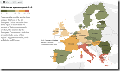
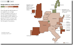
There are a lot of these out there, but most of them are pretty crappy. This one is very well done – data dense, yet easy to read.
Europe Debt Maps
4 May 2010How We Transport
In: Maps US Economy
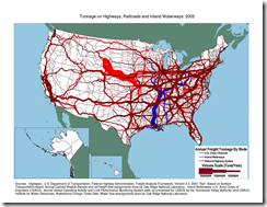
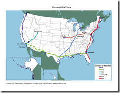
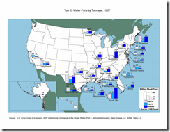
3 May 2010Cool maps of transportation in the USA. (via)
Here are some more from the same DOT site.
50 Best Restaurants in the World
3 May 2010According to “Restaurant Magazine”. I’m not sure what mapping them accomplishes — besides making it obvious how few are in the USA.
Global Interest Rate Tracker
In: Finance Global Economy Interactive Maps Politics Source: WSJ Updated regularly US Economy
26 Apr 2010Central bank rates from 2004-present (updated 4/20). See how countries are exiting from their stimulus policies.
Napkin Map of NYC
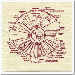
26 Apr 2010A map of the NYC skyline as seen from the rotating restaurant the View. I like the simplicity and practicality.
European Airport Status Map
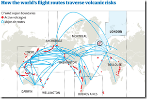
19 Apr 2010Looks like they might be updating this periodically (was showing 9:50am Monday when I posted). Related article.
Here’s another one from the Guardian that also shows the spread of the ash over time:
Dirty Priest Relocation Map
In: Culture Interactive Maps
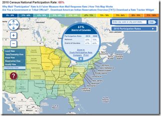
15 Apr 2010Census Participation Map
In: Interactive Maps Politics
12 Apr 2010Atlas of Global Conservation
In: Environment/weather Interactive Maps Science Source: Washington Post
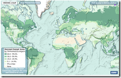
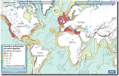
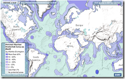
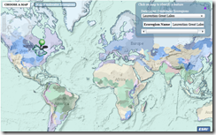
12 Apr 2010The Nature Conservancy has developed an atlas of ecodiversity and conservation. The hard copy will be published on Earth Day 2010, but some maps are available online now.(Related Washington Post article and photo gallery).
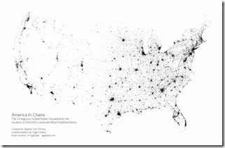
American Chains
In: Culture Food Maps US Economy
12 Apr 2010Another cool proximity map from Weather Sealed. This one of 330 retail chain company locations.
What is Chart Porn?
An addictive collection of beautiful charts, graphs, maps, and interactive data visualization toys -- on topics from around the world.
Categories
- Bailout (118)
- Chartporn Related (3)
- Commentary (21)
- Culture (669)
- Emerging Markets (66)
- Employment (245)
- Environment/weather (133)
- Finance (298)
- Food (92)
- Global Economy (373)
- Graphic Design (bad) (26)
- Graphic Design (general) (183)
- Graphic Tools (23)
- History (158)
- Housing (162)
- Humor (204)
- Innovative (183)
- Interactive (545)
- Internet/tech (97)
- Maps (578)
- News Media (34)
- Politics (329)
- Reference (97)
- Science (331)
- Source: Economist (101)
- Source: FT (92)
- Source: NYT (147)
- Source: Ritholtz (76)
- Source: USA Today (27)
- Source: Washington Post (90)
- Source: WSJ (135)
- Sports (58)
- Stock Market (74)
- Uncategorized (2)
- Updated regularly (76)
- US Economy (553)
- Video (22)
- Aram Korevaar: This chart is now being used as a projection in which countries such as China see themselves as in a [...]
- David: Welcome back Chart Porn! [...]
- J S: Thanks for the great story. Miss reading this blog. Hope to see you more active again. [...]
- jake: I lived in a DC row house for 6 years, and I'm writing this comment from my tiny 1 bedroom apartment [...]
- ronny pettersen: Hilarious and unfortunately accurate... ;-) [...]

