Maps Archive:
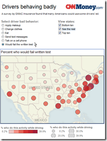
Map: USA’s Dumbest Drivers
In: Culture Interactive Maps
28 May 2010Tracking Indexes for the Global Economic Recovery (TIGER)
In: Finance Global Economy Interactive Maps Source: FT Updated regularly
26 May 2010Joint effort of the Brookings Institute and the Financial Times. Click on a country to open a PDF with detailed information. Or, you can look at the summary for all countries. Related Brookings post.
A Tourist World
24 May 2010Tourist intensity, based on photos posted on Panoramio. (via Information is Beautiful)
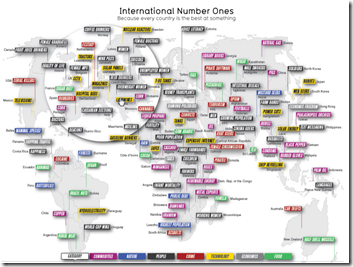
We’re All Number One!!!
19 May 2010Underfunded State Pensions
18 May 2010Yay! Another few trillion dollars to worry about. Related article.
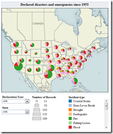
FEMA Disasters 1953-2010
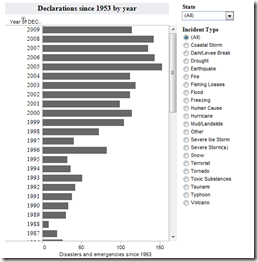
18 May 2010Filter by state, year, and type of disaster. (note: you can zoom by selecting the arrow pointer tool at the bottom). The number of disasters has apparently increased over time because we’ve changed the definition. Related story.
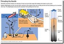
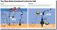
Oil Gusher: What, Where, How to Fix
17 May 2010World Bank “Open Data” Initiative
7 May 2010The World Bank has recently expanded public access to their datasets on a huge scale (many previously only available by subscription). You can view data by country or topic, create a map out of any indicator, download the raw data, and there’s even an iphone app. They are also reaching out to developers to create additional tools and apps. Unlike many UN/WB/IMF online databases, this one is intuitive and easy to explore. (List of available datasets)
Superb 2010 US Election Map
In: Interactive Maps News Media Politics Source: Washington Post Updated regularly
6 May 2010The Washington Post’s new “Post Politics” online section has an excellent map of elections (Senate, House, and Governor), all updated regularly. Click around for a while – there are a large number of filters, drill downs, and highlights to play with.
Chinese Investment Tracker
5 May 2010The Economist Redraws Europe
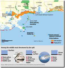
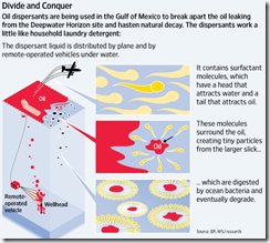
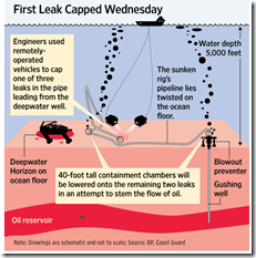
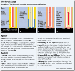
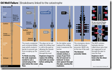
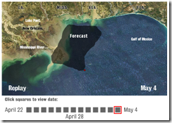
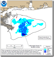
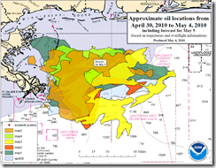
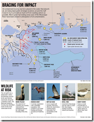
4 May 2010More Oil Graphics
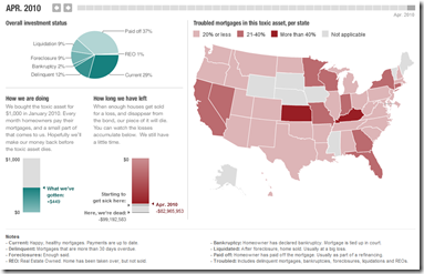
4 May 2010The Planet Money blog at NPR bought their very own mortgage based toxic asset a few months ago (and named it “Toxie”). Not surprisingly, it’s not performing very well. The related articles are worth a read if you want a solid, simple explanation of how this stuff works.
What is Chart Porn?
An addictive collection of beautiful charts, graphs, maps, and interactive data visualization toys -- on topics from around the world.
Categories
- Bailout (118)
- Chartporn Related (3)
- Commentary (21)
- Culture (669)
- Emerging Markets (66)
- Employment (245)
- Environment/weather (133)
- Finance (298)
- Food (92)
- Global Economy (373)
- Graphic Design (bad) (26)
- Graphic Design (general) (183)
- Graphic Tools (23)
- History (158)
- Housing (162)
- Humor (204)
- Innovative (183)
- Interactive (545)
- Internet/tech (97)
- Maps (578)
- News Media (34)
- Politics (329)
- Reference (97)
- Science (331)
- Source: Economist (101)
- Source: FT (92)
- Source: NYT (147)
- Source: Ritholtz (76)
- Source: USA Today (27)
- Source: Washington Post (90)
- Source: WSJ (135)
- Sports (58)
- Stock Market (74)
- Uncategorized (2)
- Updated regularly (76)
- US Economy (553)
- Video (22)
- Aram Korevaar: This chart is now being used as a projection in which countries such as China see themselves as in a [...]
- David: Welcome back Chart Porn! [...]
- J S: Thanks for the great story. Miss reading this blog. Hope to see you more active again. [...]
- jake: I lived in a DC row house for 6 years, and I'm writing this comment from my tiny 1 bedroom apartment [...]
- ronny pettersen: Hilarious and unfortunately accurate... ;-) [...]

