Maps Archive:
Habitat Gap Map
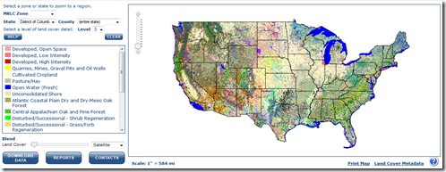
14 Jun 2010Through ground and satellite surveys of land cover, the U. S. Geological Survey’s Gap Analysis Program has generated data that conservationists may be able to use to create and sustain habitat for wildlife.
The Gap Analysis Program is charged with figuring out which common species’ habitats may not be well represented by existing parks and conservation areas. The only way to do that is to mash up a bunch of data about species and land use (via)
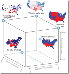
A detailed article discussing using alpha values (transparency) instead of standard cartograms. I really really like the cube of thematic map typography. Related paper.
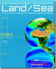
The World: Top to Bottom
In: Maps
9 Jun 2010The below image is just a tiny bit of the Top. the whole annotated graphic is quite LOOONNGGGG. (via Cool Infographics)
Emerging Africa: in Depth
In: Emerging Markets Environment/weather Global Economy Interactive Maps Politics Source: FT
9 Jun 2010Several interactive graphics related to the FT’s June 2010 “in depth” analysis of Africa.
From the Guardian, a detailed history from 1930-2006.
From the Washington Post, an interesting Map/Calendar menu leads to team info and recent news.
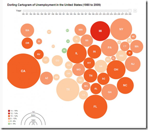
Unemployment 1980-2009
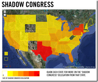
4 Jun 2010The Shadow Congress
3 Jun 2010A map of Congressmen who are now lobbyists. Related article. (via)
EPI’s Economy Track
In: Employment Interactive Maps Updated regularly US Economy
3 Jun 2010The Economic Policy Institute has a collection of interactive charts covering employment, GDP, and capacity utilization. There are also filters to facilitate quick comparisons across recession periods.
Unemployment Length by State
3 Jun 2010Roll-over the states for the rates. (via The Big Picture)
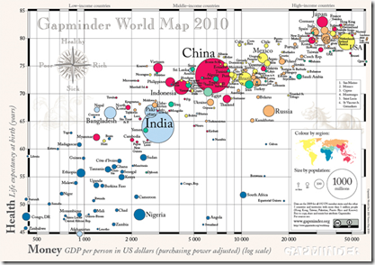
Wealth vs Health
In: Global Economy Maps
2 Jun 2010Gapminder 2010 World Map of countries’ GDP per capita vs life expectancy. Bubbles are sized by population.
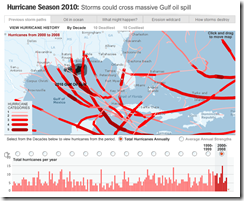
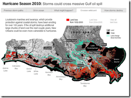
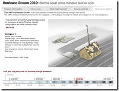
Hurricane Season 2010
2 Jun 2010A multi-part interactive. They’ve included one of my favorites: an animation of the effects of different Hurricane Category storms.
Maps: Iraq and Afghanistan Casualties
In: Interactive Maps Politics
1 Jun 2010An extremely well designed dual-map interface that shows individual casualties – where they lived and where they were killed. Clicking on any dot brings up a photo and detailed information about the person. You can view coalition deaths by scrolling the map to those countries. There’s even a place to leave notes about each person. (via)
What is Chart Porn?
An addictive collection of beautiful charts, graphs, maps, and interactive data visualization toys -- on topics from around the world.
Categories
- Bailout (118)
- Chartporn Related (3)
- Commentary (21)
- Culture (669)
- Emerging Markets (66)
- Employment (245)
- Environment/weather (133)
- Finance (298)
- Food (92)
- Global Economy (373)
- Graphic Design (bad) (26)
- Graphic Design (general) (183)
- Graphic Tools (23)
- History (158)
- Housing (162)
- Humor (204)
- Innovative (183)
- Interactive (545)
- Internet/tech (97)
- Maps (578)
- News Media (34)
- Politics (329)
- Reference (97)
- Science (331)
- Source: Economist (101)
- Source: FT (92)
- Source: NYT (147)
- Source: Ritholtz (76)
- Source: USA Today (27)
- Source: Washington Post (90)
- Source: WSJ (135)
- Sports (58)
- Stock Market (74)
- Uncategorized (2)
- Updated regularly (76)
- US Economy (553)
- Video (22)
- Aram Korevaar: This chart is now being used as a projection in which countries such as China see themselves as in a [...]
- David: Welcome back Chart Porn! [...]
- J S: Thanks for the great story. Miss reading this blog. Hope to see you more active again. [...]
- jake: I lived in a DC row house for 6 years, and I'm writing this comment from my tiny 1 bedroom apartment [...]
- ronny pettersen: Hilarious and unfortunately accurate... ;-) [...]

