Maps Archive:
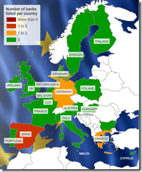
Map: European Bank Stress Tests
26 Jul 2010This is kind of a silly map considering only 7 of 91 banks failed. Related article.
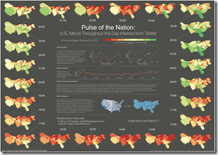
Tweet Mood Ring Maps
In: Culture Internet/tech Maps
23 Jul 2010Researchers analyzed the words of 300 million tweets for “happiness” content and plotted the changes over time. The findings are kind of cool, but this would have looked a lot better with non-contiguous cartograms.
Top Secret America
19 Jul 2010Interactive exploration of the 45 Government agencies, 2000+ companies, and 854,000+ people working on government security. Part of the Washington Post’s 3-part series on the growth of national security infrastructure since 9/11.
Map: Amtrak Routes in Subway Style
In: Maps
13 Jul 2010For comparison, the official Amtrak national map is the second one below. It’s interesting to see how much additional clarity comes from breaking state geography just a little. Designer’s blog post.
8-bit Washington DC
13 Jul 2010These maps are very odd. At first, I thought, why bother? Is there really a need for low-res maps based on 1980s video game graphic style? Then I typed in my address and realized how much was really going on. It’s still pretty silly, but it’s an impressive silly – and not everything has to be utilitarian. Available for 10 different cities.
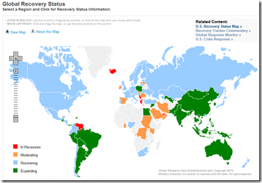
Update: Moody’s Global Recovery Map
In: Global Economy Maps
12 Jul 2010I gave this map a bit of grief when I first posted about it, so it’s only fair that I point out that they now appear to be keeping it up to date, and annotating the analysis better.
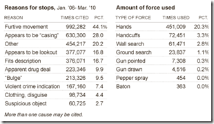
Where to Get Harassed by Cops in NYC
12 Jul 2010The NYT has an interactive map and related charts of where NYC police have been utilizing the “stop, question, and frisk” policy. Related article.
DCA Flight Restrictions
7 Jul 2010Ever wonder why you can’t fly directly into Washington’s DCA airport (which is on the metro and only 15 minutes away from downtown, and have to fly into BWI or IAD instead (45 minutes away, if you’re lucky)? It’s all based on agreements with the Virginia locals on how many long distance flights are allowed to land. Congress is considering stretching that boundary a bit (which I am in complete favor of). Related article.
Global Debt
In: Finance Global Economy Interactive Maps Source: Economist
25 Jun 2010Often these charts only deal with government or household debt – this one covers it all. Click on any country to bring up a time series chart – use the tabs at the top to view time series of debt types.
Map: Same-Sex Marriage Laws
16 Jun 2010American Migrations: 2008
16 Jun 2010More than 10 million Americans moved from one county to another during 2008. The map below visualizes those moves. Click on any county to see comings and goings: black lines indicate net inward movement, red lines net outward movement.
What is Chart Porn?
An addictive collection of beautiful charts, graphs, maps, and interactive data visualization toys -- on topics from around the world.
Categories
- Bailout (118)
- Chartporn Related (3)
- Commentary (21)
- Culture (669)
- Emerging Markets (66)
- Employment (245)
- Environment/weather (133)
- Finance (298)
- Food (92)
- Global Economy (373)
- Graphic Design (bad) (26)
- Graphic Design (general) (183)
- Graphic Tools (23)
- History (158)
- Housing (162)
- Humor (204)
- Innovative (183)
- Interactive (545)
- Internet/tech (97)
- Maps (578)
- News Media (34)
- Politics (329)
- Reference (97)
- Science (331)
- Source: Economist (101)
- Source: FT (92)
- Source: NYT (147)
- Source: Ritholtz (76)
- Source: USA Today (27)
- Source: Washington Post (90)
- Source: WSJ (135)
- Sports (58)
- Stock Market (74)
- Uncategorized (2)
- Updated regularly (76)
- US Economy (553)
- Video (22)
- Aram Korevaar: This chart is now being used as a projection in which countries such as China see themselves as in a [...]
- David: Welcome back Chart Porn! [...]
- J S: Thanks for the great story. Miss reading this blog. Hope to see you more active again. [...]
- jake: I lived in a DC row house for 6 years, and I'm writing this comment from my tiny 1 bedroom apartment [...]
- ronny pettersen: Hilarious and unfortunately accurate... ;-) [...]

