Maps Archive:
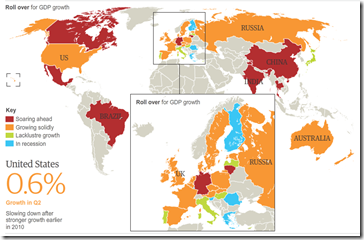
Recession Recovery Map
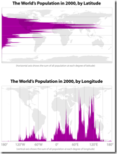
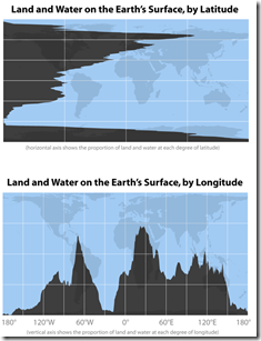
16 Aug 2010Latitude and Longitude
In: Maps
12 Aug 2010Interesting cartographic analysis by Bill Rankin. (via)
Fire!
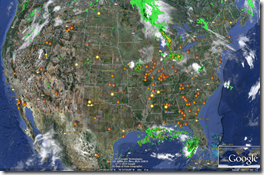
11 Aug 2010Recent blog posts on Russia’s summer of fire (Wired; Jotman) led me to the University of Maryland’s Fire Information for Resource Management System (FIRMS) which provides online or Google Earth Based maps of fires from all over the world based on satellite data.
Fires in Russia and the USA in the past 24 hours: 
FIRMs online map of the past 7 days: 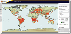
Also, apparently the fires are emitting dangerous amount of CO2 and may be radioactive: 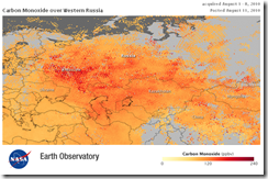
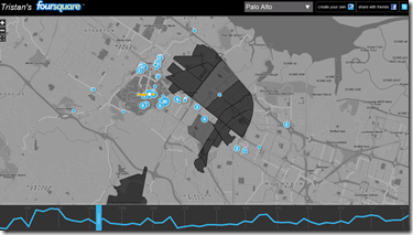
Foursquare Visualization
10 Aug 2010I haven’t gotten the Foursquare bug yet, but some of you may be interested in this map-based visualization of you and your friends. (The authors’ blog).
2010 Social Networking Map
In: Internet/tech Maps
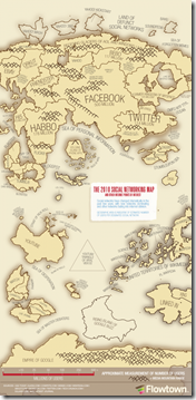
9 Aug 2010An update of xkcd’s 2007 map, this one by Flowtown. It’s interesting to see what they consider to be “social networking” (besides facebook and twitter).
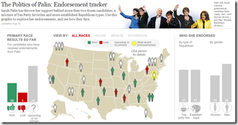
As much as I hate to draw more attention to anything this woman has to say, I thought some of you wonks might find this interesting in the run-up to this November.
To counterbalance the bad taste that left in my throat, I’ll give another shoutout to the WashPost’s overall Campaign tracker, which is excellent:
Whales
In: Environment/weather Graphic Design (general) Interactive Maps Science
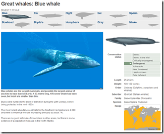
4 Aug 2010A well designed and simple interactive of the 10 “great” whale species. It conveys images, scale, history, endangered status, and region all on one screen.
Walking on the Moon: Apollo 11
3 Aug 2010Some cool map overlays showing how little of the moon we actually explored on that one day. On a soccer and baseball field: 

on a photo:
(via)
First Global Census of Marine Life
In: Environment/weather Graphic Design (bad) Interactive Maps Science
3 Aug 2010I think this project has been cursed by the data visualization gods. First, take a look at the Guardian’s interactive map below. There’s no legend to explain the colors, and the popups show a picture of just one animal (which they apparently included only because they happen to have a nice picture of it). The only information conveyed here at all is in the small bubbles at the bottom — which aren’t labeled and are presumably in percent of all marine life, but you can’t be sure because they don’t add up to 100%.
So I tracked down the original study, and their project map is actually worse! In addition to being quite possibly the most butt-ugly acronym ridden map I’ve ever seen, it has a bizarre infinity scrolling feature that allows you to view five earths at once.
But wait, there’s more: a huge interactive rotating globe that takes up 3/4s of the screen. See the tiny red dots on the map? – those are how you call up the related info that is squeezed into the small box on the left. There are other critiques, but I think I’ve picked on this poor project enough.
All of this is a shame, of course, because it looks like a very worthwhile project that has accomplished a lot of valuable work. Here is the Guardian’s related article, and the project’s press release.
State Budget Deficits
2 Aug 2010Yields on top-rated, tax exempt US municipal bonds have dropped to near-record lows, allowing many local borrowers to access cheap financing in spite of their recent fiscal troubles. Following concerns over public finances in Europe, the $2,800bn market for “munis” has come into the spotlight after several years of budget deficits. Related articles.
Update: AP Economic Stress Map
2 Aug 2010This map displays unemployment, foreclosures, bankruptcies, or a composite “stress index”, by county. Easy to miss: in the upper right you can change the scale of the mapping (rates, m-t-m, y-t-y). To look at data over time, click on the “monthly rates” option and a historical slider will appear at the bottom. Double click on a region to zoom in. Updated 8/2/10.
Reforming the Global Financial System
In: Finance Global Economy Interactive Maps Politics Source: FT
28 Jul 2010From Dodd-Frank to Basel III, this graphic explains the current plans for global financial regulatory reform in advanced economies, from the US to the eurozone.
(note: some FT items require a subscription – you can view up to 10 articles a month for free)
Durham Univeristy’s International Boundaries Research Unit (IBRU) maintains some interesting maps and history.
SF-NY-CHI-BOS Marathons
26 Jul 2010Map: Wikileaks Afghan Incidents
In: Interactive Maps Politics
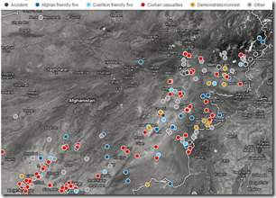
26 Jul 2010Interactive map of 300 accidents, friendly fires, civilian casualties, and demonstrations. Drill down to detailed reports.
What is Chart Porn?
An addictive collection of beautiful charts, graphs, maps, and interactive data visualization toys -- on topics from around the world.
Categories
- Bailout (118)
- Chartporn Related (3)
- Commentary (21)
- Culture (669)
- Emerging Markets (66)
- Employment (245)
- Environment/weather (133)
- Finance (298)
- Food (92)
- Global Economy (373)
- Graphic Design (bad) (26)
- Graphic Design (general) (183)
- Graphic Tools (23)
- History (158)
- Housing (162)
- Humor (204)
- Innovative (183)
- Interactive (545)
- Internet/tech (97)
- Maps (578)
- News Media (34)
- Politics (329)
- Reference (97)
- Science (331)
- Source: Economist (101)
- Source: FT (92)
- Source: NYT (147)
- Source: Ritholtz (76)
- Source: USA Today (27)
- Source: Washington Post (90)
- Source: WSJ (135)
- Sports (58)
- Stock Market (74)
- Uncategorized (2)
- Updated regularly (76)
- US Economy (553)
- Video (22)
- Aram Korevaar: This chart is now being used as a projection in which countries such as China see themselves as in a [...]
- David: Welcome back Chart Porn! [...]
- J S: Thanks for the great story. Miss reading this blog. Hope to see you more active again. [...]
- jake: I lived in a DC row house for 6 years, and I'm writing this comment from my tiny 1 bedroom apartment [...]
- ronny pettersen: Hilarious and unfortunately accurate... ;-) [...]

