Maps Archive:
Tea Party Faces, Beefs, and Races
In: Interactive Maps Politics
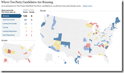
15 Oct 2010Faces and names, organized loosely by their complaints. Also, a map of where they are running and what the polls are saying.
Gay Sex vs Straight Sex
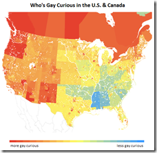
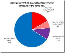
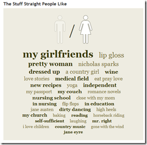
12 Oct 2010OkTrends has analyzed it’s database of user behavior to examine several rumors about homosexual behavior, compared to heterosexuals. Not surprisingly, none of them are true. The whole article is fascinating.
Google Election Maps
In: Interactive Maps Politics
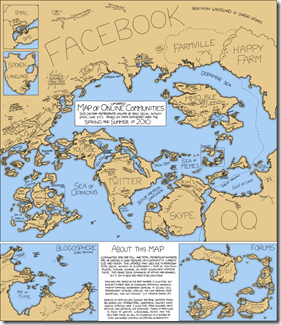
12 Oct 2010Map: Online Communities
In: Culture Internet/tech Maps
7 Oct 2010Another beautiful thematic map from xkcd.
Israeli Settlements (1990-2010)
27 Sep 2010From the Economist, a graph of public and private settlements. From the BBC, a map of the settlements and a summary of previous peace talks. note: we posted a (slightly better) WSJ settlement map in Feb.
Bank Failures
27 Sep 2010Interactive map of banks that have been shut down in 2010. You can also resize markers by metrics such as total deposits, number of branches, or cost to FDIC. The related WSJ article is very depressing to read.
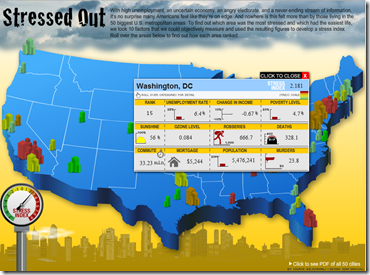
American Stress
23 Sep 2010Interactive map of stress based on unemployment, change in income, poverty, sunshine, ozone, crime, and cost of living.
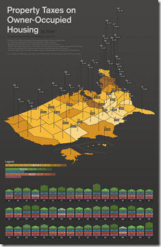
Even When you Own, You’re Really Renting
23 Sep 2010Property taxes nation-wide. Uses “median property tax paid” rather than the actual tax rate, so might be saying more about the size and value of houses in that state rather than the tax differential.
Marijuana Price Map
19 Sep 2010The data is crowdsourced by consumer submissions. Amusing and interesting. (via)
Topographic Map of the Moon
In: Maps
19 Sep 2010The map was created using data from NASA’s Lunar Reconnaissance Orbiter that has been circling the moon since June 2009. The orbiter measured the height of the surface by sending billions of laser pulses towards the surface and measuring the time it took for the pulses to return. The method is precise enough it would have been able to detect a small house if there were one
Global Competitiveness Report 2010-11
In: Employment Finance Global Economy Interactive Maps Politics Updated regularly
10 Sep 2010The World Economic Forum has a number of interactive tools for examining the results of it’s Global Competitiveness Report. You can view the aggregate index or any of the many (very interesting) sub-components as maps, bar charts, scatter plots, rankings, or individual profiles. FYI – The United States has slipped from 2nd to 4th overall.
Trail Maps and Trips
In: Maps
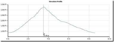
9 Sep 2010Backpacker Magazine’s Destinations tool (based on Trimble Outdoors) lets you find free detailed information on hiking and biking trails across the country. You can read descriptions, view photos, print out topo maps, download gpx waypoints, filter by hike/bike/run, and even post your own trips. The “quick search” can be a little janky, bringing up only Backpacker trips – use the zip code search for the best results.
Below is the topo and elevation profile for Old Rag Mountain – one of the best hikes on the east coast:
Undersea Cable Map
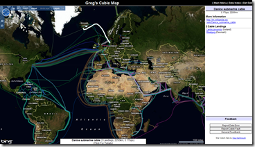
19 Aug 2010The information isn’t terribly interesting, but this interactive Bing-based map of undersea communications cables is a nice example of what can be done with public data and a little hard work. (Thanks to mapgirl for the link!)
China Leads World in Beer Consumption
In: Food Global Economy Maps
18 Aug 2010Forget GDP, China now drinks more beer than either the US or Europe, and is growing by 10 percent a year.
What is Chart Porn?
An addictive collection of beautiful charts, graphs, maps, and interactive data visualization toys -- on topics from around the world.
Categories
- Bailout (118)
- Chartporn Related (3)
- Commentary (21)
- Culture (669)
- Emerging Markets (66)
- Employment (245)
- Environment/weather (133)
- Finance (298)
- Food (92)
- Global Economy (373)
- Graphic Design (bad) (26)
- Graphic Design (general) (183)
- Graphic Tools (23)
- History (158)
- Housing (162)
- Humor (204)
- Innovative (183)
- Interactive (545)
- Internet/tech (97)
- Maps (578)
- News Media (34)
- Politics (329)
- Reference (97)
- Science (331)
- Source: Economist (101)
- Source: FT (92)
- Source: NYT (147)
- Source: Ritholtz (76)
- Source: USA Today (27)
- Source: Washington Post (90)
- Source: WSJ (135)
- Sports (58)
- Stock Market (74)
- Uncategorized (2)
- Updated regularly (76)
- US Economy (553)
- Video (22)
- Aram Korevaar: This chart is now being used as a projection in which countries such as China see themselves as in a [...]
- David: Welcome back Chart Porn! [...]
- J S: Thanks for the great story. Miss reading this blog. Hope to see you more active again. [...]
- jake: I lived in a DC row house for 6 years, and I'm writing this comment from my tiny 1 bedroom apartment [...]
- ronny pettersen: Hilarious and unfortunately accurate... ;-) [...]


