Maps Archive:
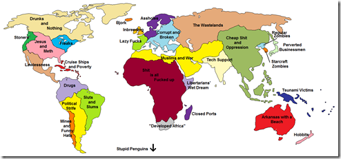
Some additional entertaining stereotypical cartography. My favorite is “Europe According to the Vatican”. All part of Yanko Tsvetkov’s Mapping Stereotypes project.
Falling TV Subscriptions
22 Nov 2010For the first time since the dawn of cable TV, the number of U.S. households paying for TV subscriptions is falling, marking a potential turning point in the TV business.
Part of a multi-part Washington Post Investigation. Each dot represents a death; word clouds illustrate information on the circumstances, sentencing, and other details.
American Human Development Index
In: Employment Food Housing Interactive Maps Science US Economy
21 Nov 2010Based on the idea that well-being cannot be measured by GDP alone, the Human Development Index looks at over 100 indicators, which you can explore on maps and charts at the most detailed level, or as aggregates (health, education, income). The chart display does seem to have problems separating out Washington DC, however – since we don’t actually have a congressional district — <sigh>. (via)
European Banks’ Sovereign Debt Exposure
15 Nov 2010Pick a country and view the bilateral exposures on the map. You can also drill-down at the bank level.
note: access to some Financial Times features requires a subscription.
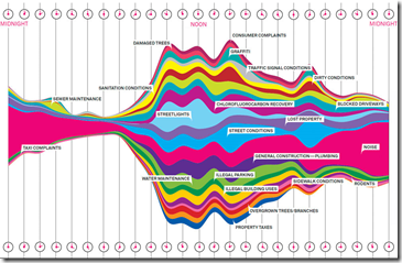
What New Yorkers Complain About
10 Nov 2010Based on 34,522 complaint calls to 311 over a one week period. (via Flowingdata)
2010 Election Results
3 Nov 2010As usual, the best graphical analysis comes from the New York Times. Click through this map to understand the big shifts in the clearest possible way.
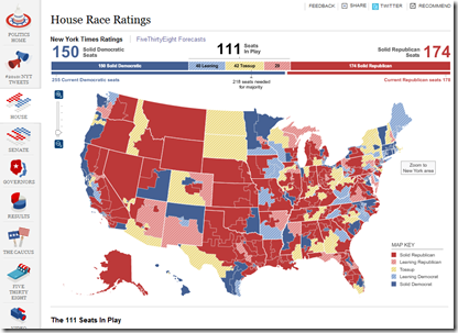
Election Forecast Map
1 Nov 2010Interactive map of forecasts from the NYT’s FiveThirtyEight blog, covering all the races. (via Ritholtz)
Chinese Imports
In: Global Economy Maps
29 Oct 2010CHINA is now the biggest export market for countries as far afield as Brazil (accounting for 12.5% of Brazilian exports in 2009), South Africa (10.3%) Japan (18.9%) and Australia (21.8%). Each surge or wobble in China’s economy has a material impact in these places.
Update: The State of the Economy
25 Oct 2010October’s update of the Economic Indicators Dashboard:
and while we’re at it, here is the AP’s Economic Stress Map, which shows unemployment, foreclosures, and bankruptcies from 2007-today, by county.
American Poverty
In: Employment Maps US Economy
22 Oct 2010And keep in mind that the “poverty rate” for a single person is less than $11,000. In other words, the majority of us should be skipping happily to work in the morning instead of popping prozac and lamenting our “tough” lives. Thanks to Kelly Brooks for the link.
Homebuyer Tax Credits
21 Oct 2010Personally, I don’t know why we’re still subsidizing homebuying. (via Ritholtz, who points out per-capita would probably have been more useful)
Science Subway Map
19 Oct 2010I’m getting pretty sick of subway style maps (when used for anything other than a subway), but this one is actually pretty good.
What is Chart Porn?
An addictive collection of beautiful charts, graphs, maps, and interactive data visualization toys -- on topics from around the world.
Categories
- Bailout (118)
- Chartporn Related (3)
- Commentary (21)
- Culture (669)
- Emerging Markets (66)
- Employment (245)
- Environment/weather (133)
- Finance (298)
- Food (92)
- Global Economy (373)
- Graphic Design (bad) (26)
- Graphic Design (general) (183)
- Graphic Tools (23)
- History (158)
- Housing (162)
- Humor (204)
- Innovative (183)
- Interactive (545)
- Internet/tech (97)
- Maps (578)
- News Media (34)
- Politics (329)
- Reference (97)
- Science (331)
- Source: Economist (101)
- Source: FT (92)
- Source: NYT (147)
- Source: Ritholtz (76)
- Source: USA Today (27)
- Source: Washington Post (90)
- Source: WSJ (135)
- Sports (58)
- Stock Market (74)
- Uncategorized (2)
- Updated regularly (76)
- US Economy (553)
- Video (22)
- Aram Korevaar: This chart is now being used as a projection in which countries such as China see themselves as in a [...]
- David: Welcome back Chart Porn! [...]
- J S: Thanks for the great story. Miss reading this blog. Hope to see you more active again. [...]
- jake: I lived in a DC row house for 6 years, and I'm writing this comment from my tiny 1 bedroom apartment [...]
- ronny pettersen: Hilarious and unfortunately accurate... ;-) [...]

