Maps Archive:
The Bermuda Triangle of Productivity
In: Humor Internet/tech Maps
23 Dec 2010Forget all those “TOP TEN” lists, this pretty much sums up 2010 for me. (via)
Washington DC Metro Map Distortion
In: Maps
21 Dec 2010A very cool comparison, by Don Whiteside, of Washington DC’s stylized subway map versus what it would look like if the stations were mapped accurately. It’s shocking how different it looks, particularly as it heads out to the suburbs. (related WELOVEDC blog post)
Accurate map with station names:
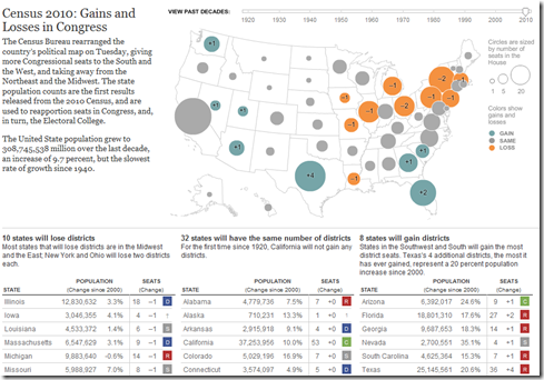
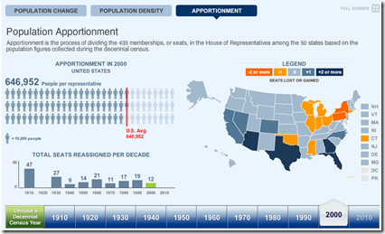
10 states will lose congressional districts (mostly in the northeast) ; 8 will gain (mostly in the south and southwest), and the other 32 will stay the same. The tables below the map show the change in state populations since 2000. You can also use the timeline to view the re-apportionments back to 1920. (related article; related NYT political blog; Census press release)
And the official total? There are 308,745,538 people in the United States.
Baltimore Trash Migration
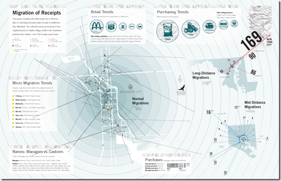
20 Dec 2010Artist Cameron Zotter collected discarded receipts over a 48 hour period and mapped out how far they had traveled. I love the resulting infographic. Note, the image below is linked to Cameron’s site; here is a higher resolution version of the image on Flickr. (via)
FYI, MIT has a higher tech version of this idea, where they tag trash with GSM cellular phone markers that periodically call home with their location:
DC Commuters
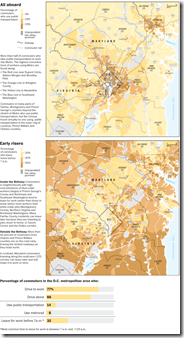
16 Dec 2010Maps of who commutes using public transport, and who has to get up before 7am to make it to work (an odd metric, no?). Related story.
Mapping America
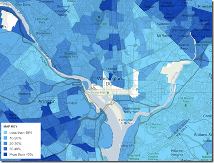
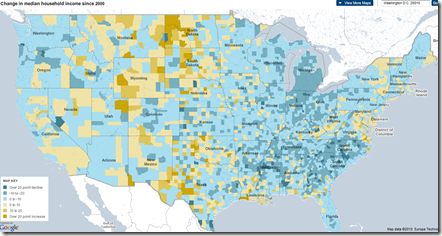
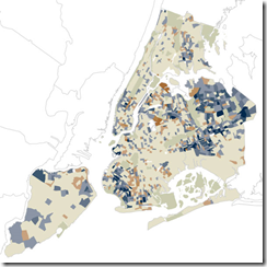
15 Dec 2010The NYT’s has created a huge variety of interactive maps based on the Census Bureau’s American Community Survey. Click on “view more maps” to see different breakdowns (income, race, housing, education). Roll-overs popup details at the county or census area level. Related article.
Here’s the percentage of foreign born population in Washington DC:
Change in income level since 2000:
This one shows how racially divided DC still is (green vs blue)”:
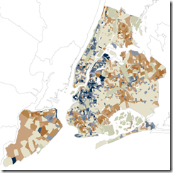
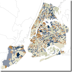
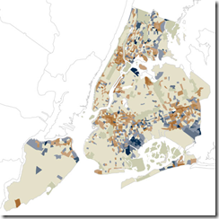
They also used the data for some more detailed analysis, such as “How NYC’s Racial Makeup has changed since 2000” (clockwise from upper left: white, hipanic, asian, black). Related article.
Map of American Slavery:1860
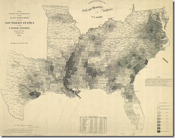
14 Dec 2010Contrary to my expectations, the use of slaves across the pre-civil war South was pretty diverse – as this map and accompanying article in the NYT shows. There is also an interactive version with annotated popups. (via)
Facebook Friends
In: Culture Internet/tech Maps
14 Dec 2010Facebook engineering intern Paul Butler mapped out a global network of 10 million friendships. Some interesting things about the image: there aren’t any country outlines on the map – the countries “appear” as drawn by the network lines themselves; China, Russia, and Brazil are barely visible because they are dominated by non-Facebook social networks
Foreclosure Delays (2007-2010)
13 Dec 2010This map timeline shows how the average number of days owners spend in delinquency before being foreclosed on has more than doubled since 2007.
Census Map (1910-2010)
13 Dec 2010The 2010 data isn’t being released until next week, but the Census Bureau has pre-staged a very nice multi-part interactive map displaying state level data and related congressional apportionments from 1910-2010. (thanks to Samantha O’Neil for the link!)
Map of Metal
In: History Interactive Maps
9 Dec 2010A truly impressive interactive map of Heavy Metal music. Scroll through the decades of genres (separated by chains) from the 60s til today. Click on any skull to read a description and hear related tracks. (Thanks to Michael Lewis for the link!)
\m/
Google Foreclosure Maps
8 Dec 2010If you select map type “More…/Real Estate”, and check “Foreclosure” as the listing type, Google will map out all the foreclosures for you. Every dot in the below map is a foreclosure in the Washington DC region (yikes!).
Justin O’Beirne has written up a very nice analysis of what design tweaks make Google maps easier to read than Bing or Yahoo’s. (Thanks to Sean R for the link!)
America’s Health (1990-2010)
In: Interactive Maps Science
7 Dec 2010A nice interactive exploration of America’s health based on 42 different indicators. One minor complaint: There’s no data for Washington, DC (where I live).
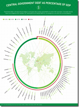
Ok, the content of this chart is nothing new – and the intent is basically linkbait. But the design is fairly intriguing: it’s an exploding map to a badly overlapped radial chart, with categories. It both works and doesn’t work. I love it and hate it at the same time. Bravo!
What is Chart Porn?
An addictive collection of beautiful charts, graphs, maps, and interactive data visualization toys -- on topics from around the world.
Categories
- Bailout (118)
- Chartporn Related (3)
- Commentary (21)
- Culture (669)
- Emerging Markets (66)
- Employment (245)
- Environment/weather (133)
- Finance (298)
- Food (92)
- Global Economy (373)
- Graphic Design (bad) (26)
- Graphic Design (general) (183)
- Graphic Tools (23)
- History (158)
- Housing (162)
- Humor (204)
- Innovative (183)
- Interactive (545)
- Internet/tech (97)
- Maps (578)
- News Media (34)
- Politics (329)
- Reference (97)
- Science (331)
- Source: Economist (101)
- Source: FT (92)
- Source: NYT (147)
- Source: Ritholtz (76)
- Source: USA Today (27)
- Source: Washington Post (90)
- Source: WSJ (135)
- Sports (58)
- Stock Market (74)
- Uncategorized (2)
- Updated regularly (76)
- US Economy (553)
- Video (22)
- Aram Korevaar: This chart is now being used as a projection in which countries such as China see themselves as in a [...]
- David: Welcome back Chart Porn! [...]
- J S: Thanks for the great story. Miss reading this blog. Hope to see you more active again. [...]
- jake: I lived in a DC row house for 6 years, and I'm writing this comment from my tiny 1 bedroom apartment [...]
- ronny pettersen: Hilarious and unfortunately accurate... ;-) [...]


