Maps Archive:
Evolution of Western Dance Music
In: Culture Interactive Maps
2 Nov 2011An interactive timeline showing (roughly) the origins and evolution of different genres of dance music. I wish you could filter to see the connections a little clearer.
The Road to 7 Billion
27 Oct 2011The Financial Times has pulled together some interactive visualizations of world demographics as we approach 7 billion people. I would have liked to see the population pyramids for more countries. The fertility/education graph is a bit shocking.
Note: Some FT features require a subscription.
Washington DC Housing Prices
11 Oct 2011A nicely annotated analysis of changing house prices in the DC region. The main graphic shows how much you would need to earn to buy a “typical single family home”. There is also an interactive version which lets you compare information for different time periods and look at condo vs house sales. (related article)
Chinese Investment Abroad
4 Oct 2011A nice interactive analysis of Chinese investment. Click on the sector symbols below the colored bar graph to filter the data.
Female World Leaders
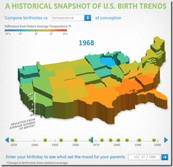
29 Sep 2011Weather and Conception
26 Sep 2011Statistics indicate that more people are born in the fall (in the USA anyway), with the quick explanation being that we have more sex during the winter holidays (9 months earlier). GE takes a cut at this notion by comparing average temperatures and deviations from the national average birthrate. Statistically, however, using annual data adds enough noise in my mind to make drawing conclusions kind of tough. Anyone want to dig up the monthly data (even for one state) and do a lagged scatter plot? Hmmmm… how would you seasonally adjust this data?
(one minor complaint: the 3d scale is interesting for comparing states, but you can’t tell what the values are for any of them because of the angle)
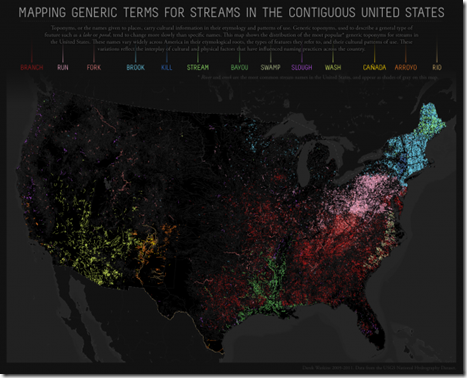
Sometimes a Stream is just a Stream
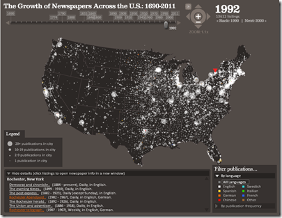
19 Sep 2011Newspapers (1690-2011)
16 Sep 2011Much like the post office timeline movie I posted last month, below we have the history of newspaper expansion across the USA. Interestingly, this movie is actually an extraction from a very well done interactive visualization of the Library of Congress’s newspaper database. You can even drill down to individual towns and see information about each newspaper. (via)
Capital Inflows
In: Emerging Markets Finance Global Economy Interactive Maps Source: WSJ
15 Sep 2011Cheap money and slow growth in the advanced countries has led to large capital flows to emerging market countries, as this interactive tool from the WSJ shows. If you mouse over each country you can view countries’ policy responses. I really like these map/graph combo designs – the two go very well together.
Post Offices 1700-1900
In: History Interactive Maps
10 Aug 2011Derek Watkins created this beautiful animated map proxying the expansion of “civilization” across the United States during the 18th and 19th centuries. I particularly like the running timeline at the bottom.
Sovereign Debt Ratings
1 Aug 2011I’m posting this more because it’s an example of a well designed cartogram map, more than because of the content. (via)
Satellites in Google Earth
In: Interactive Maps Science
25 Jul 2011Real-time mapping of ~13,000 satellite in Google Earth (updated every 30 seconds). Completely ridiculous.
European Bank Stress Tests
21 Jul 2011An interactive map and table of the test results, showing debt levels by bank.
note: access to some FT features require a subscription.
We’re Having a Heat Wave…
12 Jul 2011Most of the US is quite warm today. This map is from NOAA which maintains the Environmental Visualization Laboratory, which is chock full of cool maps and data and worth exploring.
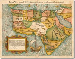
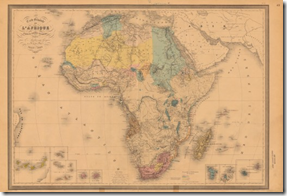
Evolution of the Map of Africa (1554-1880)
7 Jul 201111 maps showing the evolution of what we thought Africa looked like. Personally, I’m fairly impressed by quickly they had it figured out. By the way, the site where I found this: www.howtobearetronaut.com is fantastic.
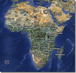
For comparison, here is Google’s satellite version, which I suppose is cheating:
What is Chart Porn?
An addictive collection of beautiful charts, graphs, maps, and interactive data visualization toys -- on topics from around the world.
Categories
- Bailout (118)
- Chartporn Related (3)
- Commentary (21)
- Culture (669)
- Emerging Markets (66)
- Employment (245)
- Environment/weather (133)
- Finance (298)
- Food (92)
- Global Economy (373)
- Graphic Design (bad) (26)
- Graphic Design (general) (183)
- Graphic Tools (23)
- History (158)
- Housing (162)
- Humor (204)
- Innovative (183)
- Interactive (545)
- Internet/tech (97)
- Maps (578)
- News Media (34)
- Politics (329)
- Reference (97)
- Science (331)
- Source: Economist (101)
- Source: FT (92)
- Source: NYT (147)
- Source: Ritholtz (76)
- Source: USA Today (27)
- Source: Washington Post (90)
- Source: WSJ (135)
- Sports (58)
- Stock Market (74)
- Uncategorized (2)
- Updated regularly (76)
- US Economy (553)
- Video (22)
- Aram Korevaar: This chart is now being used as a projection in which countries such as China see themselves as in a [...]
- David: Welcome back Chart Porn! [...]
- J S: Thanks for the great story. Miss reading this blog. Hope to see you more active again. [...]
- jake: I lived in a DC row house for 6 years, and I'm writing this comment from my tiny 1 bedroom apartment [...]
- ronny pettersen: Hilarious and unfortunately accurate... ;-) [...]


