Interactive Archive:
The Strait of Hormuz
In: Interactive Maps Politics
23 Jan 2012This FT map illustrates just how packed things are at the Persian Gulf’s bottleneck. The designers wisely chose to allow viewers to select which layers of information they wanted to see, and also provided useful related information as popups.
Here is the map with all layers turned on – which obviously would have been a disaster without the interactive filtering.
(note: some FT features require a subscription to view)
Population Pyramids
23 Jan 2012I’ve loved these types of charts since I first saw them used for insight into the Arab Spring discontent. What’s great about the version linked below is the country coverage that Worldlifeexpectancy.com has managed to pull together – it’s very impressive. If you wander the site, there are a lot of additional maps and charts on global causes of death, life expectancy, and other fun demographic topics. (via)
On a design note: Wow. I haven’t seen someone attempt a black background and glowing neon fonts in such a manner since the earliest days of the internet. I don’t know whether to applaud the boldness and bust out some glowsticks, or put on sunglasses to prevent a seizure. I suppose since it’s all about death, the black kinda works.
100 Best Companies to Work For (2012)
20 Jan 2012The Fortune Magazine website for this study has lots of related articles and indicators. My favorite it the interactive “Perkfinder” – you select the benefits most important to you, and it tells you which of the top 100 companies provide them:
What Jobs are the 1% Doing?
17 Jan 2012A treemap of the jobs that the 1% are doing – showing a lot of variety. I wish there was more detail about the dataset source. The related article provides some anecdotal examples.
What Percent Are You?
In: Culture Employment Interactive Maps Source: NYT US Economy
17 Jan 2012Enter your household income and see where you rank in 344 areas around the country:
There’s some interesting behind the scenes information on the news paper version here:
Candidate Blind Date
11 Jan 2012Answer a series of 11 questions to see which presidential candidate’s views are most like your own. At the end, you can also roll over each candidates columns to see what their specific positions are. Personally, I thought some of the questions were slanted and missing answers that fit my beliefs – no shock, I suppose, considering they had to fit the answers to candidate platforms.
Press Freedom Map
9 Jan 2012I went to the Newseum this weekend (a great museum – recommend it to everyone) and saw the below wall sized map of freedom of the press. The online version of it isn’t much to look at, but the pop-up/drill down information for each country is very rich.
Online version (which was also available at the Museum at the kiosks you see above):
The Post is doing a great job visualizing the election so far, with a number of clear tools that they are keeping very up to date.
First up: Maps and interactive filtering of spending on ads, including videos of the ads themselves:
A Primary Tracker: mapping out candidate visits, “pre-game analysis”, results by county, and “post-game analysis” – for EACH state!
And a campaign finance explorer:
They also have something called the @MentionMachine that supposedly tracks candidates by twitter mentions and other media references that you can drill down through. Unfortunately, it isn’t working for me on either Firefox or IE.
NASA iPad Visualization Explorer
27 Dec 2011Who has some of the coolest data around? NASA, of course. While you can dig around their numerous websites looking for gems, they have pulled together many of their best work into a free iPad App. The quality of the visualizations is incredible, and most of them are well annotated/narrated. They add 8-10 new visualizations each month.
Here are stills from some of the videos:
Wind currents:
Ocean currents:
Snow cover:
Carbon absorption:
Iraq and Afghanistan Casualties
In: Graphic Design (bad) Interactive Maps Politics Source: Washington Post Source: WSJ
19 Dec 2011There are a lot of these graphs out there. What I like about this presentation from the WSJ is that each dot in each bar can be clicked on for a short biography of the person who died – a nice combination of information and gravitas.
CNN’s tool maps out where they came from and where they died, and provides an area for others to leave memories for each fallen. While information rich, this one felt very sterile to me, and I couldn’t find anyone that had the “memories” section filled in.
The NYT’s went strangely artsy, with a digitized mosaic menu of the fallen’s faces:
The Washington Post’s Faces of the Fallen feature does a good job of presenting summary information, as well as photos of each soldier:
And the Huffington post comes up with the least interactive, self-identified as interactive (ALL CAPS IN THE TITLE!!!), series of charts I’ve even seen. Pretty sad.
Marriage on the Decline
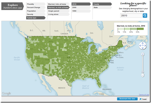
14 Dec 2011The Washington Post added family type to it’s interactive map of census data (the map also allows you to filter over time, race, density, etc). You can zoom in and see how your county compares to the rest of the country. Interesting observations: Married people with children only make up 7% of Washington DC?!? Utah is one of the few remaining regions with high “married w/children” percentages, compared to previous years when it was more common across the country.
Just 51 percent of all adults who are 18 and older are married, placing them on the brink of becoming a minority, according to a Pew Research Center analysis of census statistics to be released Wednesday. That represents a steep drop from 57 percent who were married in 2000… In 1960, for example, when most baby boomers were children, 72 percent of all adults were married. The median age for brides was barely 20, and the grooms were just a couple of years older. (related article)
Presidential Primary Calendar
1 Dec 2011An interesting comparison of state primary and caucus dates 2000-2012, both for the Democrats and Republicans. You can watch Iowa and New Hampshire keep moving back the opening day to stay before other states trying to steal the spotlight. The bad news: Super Tuesday isn’t until March 6th – so we have 3 more months to go of lame media coverage of the Republican field.
Road Casualties (2001-09)
In: History Interactive Maps
29 Nov 2011Economic Indicators Dashboard
In: Employment Finance Housing Interactive Stock Market US Economy
22 Nov 2011Updated for November: one of my favorite economic dashboards. It highlights major macro indicators, what direction they are trending, and what the typical ranges are. It also lets you drill down to explanations of why you should care, and historical values.
Eurozone Debt Crisis Dashboard
18 Nov 2011Some very well organized statistics on the Eurozone debt crisis, aggregated from the IMF, OECD, Eurostat, and the World Bank. It includes data on EFSF commitments, debt, SGP criteria, employment, trade, pensions, and mortgages. There are multiple dashboards, each with multiple tabs – so take the time to explore a bit. I particularly like the little sparklines – which I think do a great job of quickly illustrating trends, and don’t get used often enough.
What is Chart Porn?
An addictive collection of beautiful charts, graphs, maps, and interactive data visualization toys -- on topics from around the world.
Categories
- Bailout (118)
- Chartporn Related (3)
- Commentary (21)
- Culture (669)
- Emerging Markets (66)
- Employment (245)
- Environment/weather (133)
- Finance (298)
- Food (92)
- Global Economy (373)
- Graphic Design (bad) (26)
- Graphic Design (general) (183)
- Graphic Tools (23)
- History (158)
- Housing (162)
- Humor (204)
- Innovative (183)
- Interactive (545)
- Internet/tech (97)
- Maps (578)
- News Media (34)
- Politics (329)
- Reference (97)
- Science (331)
- Source: Economist (101)
- Source: FT (92)
- Source: NYT (147)
- Source: Ritholtz (76)
- Source: USA Today (27)
- Source: Washington Post (90)
- Source: WSJ (135)
- Sports (58)
- Stock Market (74)
- Uncategorized (2)
- Updated regularly (76)
- US Economy (553)
- Video (22)
- Aram Korevaar: This chart is now being used as a projection in which countries such as China see themselves as in a [...]
- David: Welcome back Chart Porn! [...]
- J S: Thanks for the great story. Miss reading this blog. Hope to see you more active again. [...]
- jake: I lived in a DC row house for 6 years, and I'm writing this comment from my tiny 1 bedroom apartment [...]
- ronny pettersen: Hilarious and unfortunately accurate... ;-) [...]


