Interactive Archive:
Heat vs Thunder
13 Jun 2012An excellent analysis of the players from both teams. The colors map out where shots were taken from, and how accurate they were.
French Open Tracker
30 May 2012Interesting scatter plot of service and return performance. Grey dots indicate players already out of the tournament. I don’t like that the top players are indicated with bigger circles – I think a color indicator would have been better, but perhaps the intention was to make them easier to click on? Content wise, it appears that you need both a service and return game to win (which I suppose is no surprise).
Everyone Go Swimming!
In: Housing Interactive Maps
25 May 2012A nice map of estimated US mortgages underwater (owe more than it’s worth) from Zillow. Interesting data, but the color ranges are too close in hue for my eyes. When I zoomed into Washington DC I couldn’t tell which range was which unless I used the rollover. I also had a question about the data: how could you end up >200% underwater? (via The Big Picture)
How Would You Cut Defense?
18 May 2012The NYT presents a list of options for you to decide how to trim defense spending. As usual, it’s not quite as easy as you might think – but I still got it up over $800 billion. I like this interactive way of educating people about budget issues.
Gay Rights
In: Culture Interactive
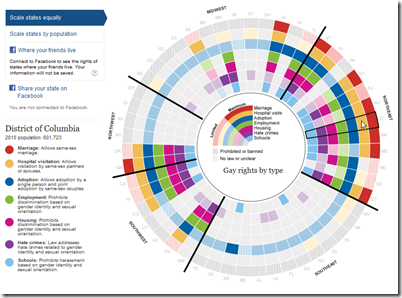
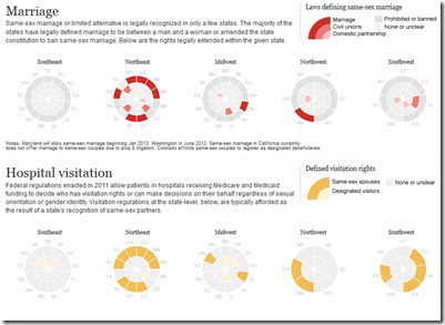
9 May 2012A nice interactive visualization of gay rights in the United States, by State. This was created by the Guardian in the UK – where, interestingly, the conservatives support gay rights.
Update: Scale of the Universe
In: Interactive Science
1 May 2012Cary and Michael Huang have updated their zoomable scale of everything (first seen in 2010). The graphics are nicer and smoother, they’ve replaced the annotations with a scale in the corner, and everything can be clicked on for popup detail. Thankfully, they also now let you turn off the dreadful music. Thanks to Shrub for sending me the link!
Zombie Apocalypse Map
In: Culture Humor Interactive Maps
11 Apr 2012Use this interactive google-mashup-map to locate emergency supplies in the event of a zombie outbreak. This should help you not walk past guns and supplies like in that stupid Walking Dead show.
Geography of Government Benefits
26 Mar 2012Share of income that comes from government programs, broken down by type of benefit. (related article)
CityMaps
In: Culture Food Interactive Maps
16 Mar 2012CityMaps is an interactive going out map service– something like a crowdsourced cross between google maps and yelp. Personally I found it to be a disturbing reminder of how surrounded we are by corporations and logos. For a fun game, see how many Starbucks logos you can fit in one screen – my record is eight, below. Currently available for NYC, San Francisco, and Austin.
Map of the US Melting Pot
In: Culture Interactive Maps
14 Mar 2012Bloomberg created this interactive map of heritages according to the 2010 census. You can select any two and see how they compare across the country. It struck me a bit odd that neither “native american” nor “african american” is included – it’s probably some strange dataset problem.
2012 Economic Freedom Map
In: Finance Global Economy History Interactive Maps Politics Updated regularly
6 Mar 2012I’m not a fan of the Heritage Foundation, and the one time I dug into the data of their Economic Freedom Index I found that they occasionally compare apples and oranges to get around data scarcity – BUT: they do put a large research effort into the report each year. The below interactive map is well executed – but you should drill down to country level data to get a feel for what is really being measured (click on a country, then the “learn more about this country” link that pops up in the lower left. Why this requires two steps I have no idea).
2013 Federal Budget
In: Interactive Politics Source: NYT Source: Washington Post Source: WSJ
14 Feb 2012A number of news agencies took a crack at visualizing Obama’s 2013 budget proposal. (If you want to try it yourself, a shocking amount of detailed data is available in spreadsheet form at the OMB website).
Below is the Washington Post’s version. You can click on any box to see a column chart of historical values. It would have been nice to be able to drill down further, but this is a good start:
The NYT created a beautiful animated – ummm – I’m not sure what this is. A dorling diagram? Well, it looks pretty, and it’s slightly more detailed than the WashPost version, but I think the brain processes square area better than circles.
The WSJ posted five charts, but they’re nothing special:
2012 Global Risk Map
In: Employment Environment/weather Finance Global Economy Interactive
3 Feb 2012The World Economic Forum always has some interesting visualizations and info-videos.
Global Risk Map:
Interactive Risk Explorer (be sure to play with the menu tabs on the right):
OECD Statistics Explorer and Some Other Cool Shit
In: Graphic Design (general) Graphic Tools Innovative Interactive Maps
2 Feb 2012This is an example of why you keep checking back on mediocre data visualization tools. The last time I looked at the OECD’s explorer, it was slow, kinda clunky, and not very innovative. This morning I took another look. Wow! It has interactive choropleth maps, motion scatter plots, profile plots, time graphs, and cool histogram tools – and all of them have excellent filters and fine tuning controls, can be viewed over time, are smoothly animated and you’re allowed to load your own data.
But wait! There’s more! MUCH more! It turns out the explorer is just one tool created by the Swedish National Center for Visual Analytics (NCVA), who have constructed a set of Geovisual Analytics Visualization (GAV) Flash tools, including what you need to create your own statistics explorer. The NCVA also has a spin-off company that sells a desktop version of the explorer, a Flow Map explorer that draws proportionate arrows on maps to track flows, and a multi-dimensional explorer (which I only played with a little – but is very very cool).
Check out the scatter tables in the MDIM as a way to select data in the other two panels:
I’m almost embarrassed I haven’t seen these before. On the other hand, I love that there is such innovation going on – all the time.
Browser Market Share
24 Jan 2012Aesthetically this is obviously quite nice. The roll-over data is snappy quick. The color selection is clear and intuitive. But there’s something about these nested arc charts that I just don’t like – they don’t seem like a very good way to illustrate historical data. It was created as a simple example of the Axiis data visualization framework – which offers several other Flex based graphic tools. (Hat tip to Ryan C for sending this along!)
What is Chart Porn?
An addictive collection of beautiful charts, graphs, maps, and interactive data visualization toys -- on topics from around the world.
Categories
- Bailout (118)
- Chartporn Related (3)
- Commentary (21)
- Culture (669)
- Emerging Markets (66)
- Employment (245)
- Environment/weather (133)
- Finance (298)
- Food (92)
- Global Economy (373)
- Graphic Design (bad) (26)
- Graphic Design (general) (183)
- Graphic Tools (23)
- History (158)
- Housing (162)
- Humor (204)
- Innovative (183)
- Interactive (545)
- Internet/tech (97)
- Maps (578)
- News Media (34)
- Politics (329)
- Reference (97)
- Science (331)
- Source: Economist (101)
- Source: FT (92)
- Source: NYT (147)
- Source: Ritholtz (76)
- Source: USA Today (27)
- Source: Washington Post (90)
- Source: WSJ (135)
- Sports (58)
- Stock Market (74)
- Uncategorized (2)
- Updated regularly (76)
- US Economy (553)
- Video (22)
- Aram Korevaar: This chart is now being used as a projection in which countries such as China see themselves as in a [...]
- David: Welcome back Chart Porn! [...]
- J S: Thanks for the great story. Miss reading this blog. Hope to see you more active again. [...]
- jake: I lived in a DC row house for 6 years, and I'm writing this comment from my tiny 1 bedroom apartment [...]
- ronny pettersen: Hilarious and unfortunately accurate... ;-) [...]


